JorgeCaloca

Amazon Creative Director & E-commerce Designer
Selected Works 2024–2026
11 Case Studies
Mexico · Worldwide

I build conversion-driven creative strategies for Amazon and retail marketplaces — from competitive analysis and creative brief through final asset delivery. Combining strategic visual thinking, brand intelligence, and AI-powered imagery to create listing experiences that convert.

From luxury beauty to global automotive brands, I build complete visual ecosystems for Amazon, Walmart, and beyond: creative strategy, PDP sets, A+ content, Brand Story, Storefronts, and brand identities — all from scratch.

01
Luxury Beauty PDP + A+ Creative Strategy AI Imagery Editorial Direction
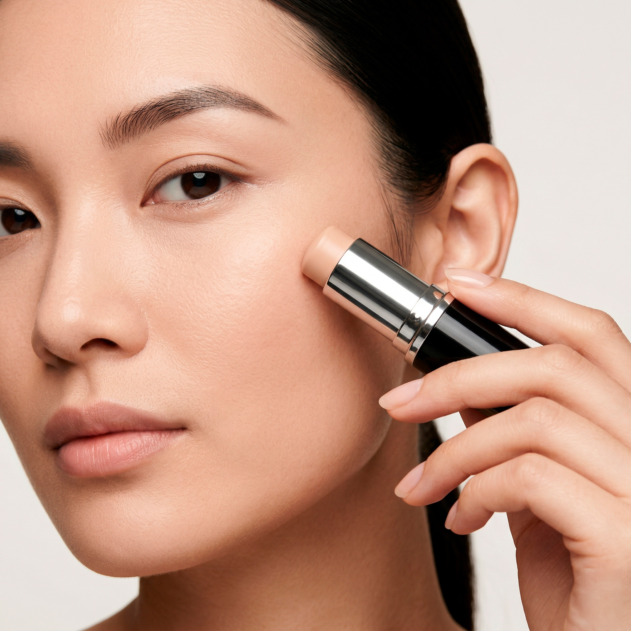
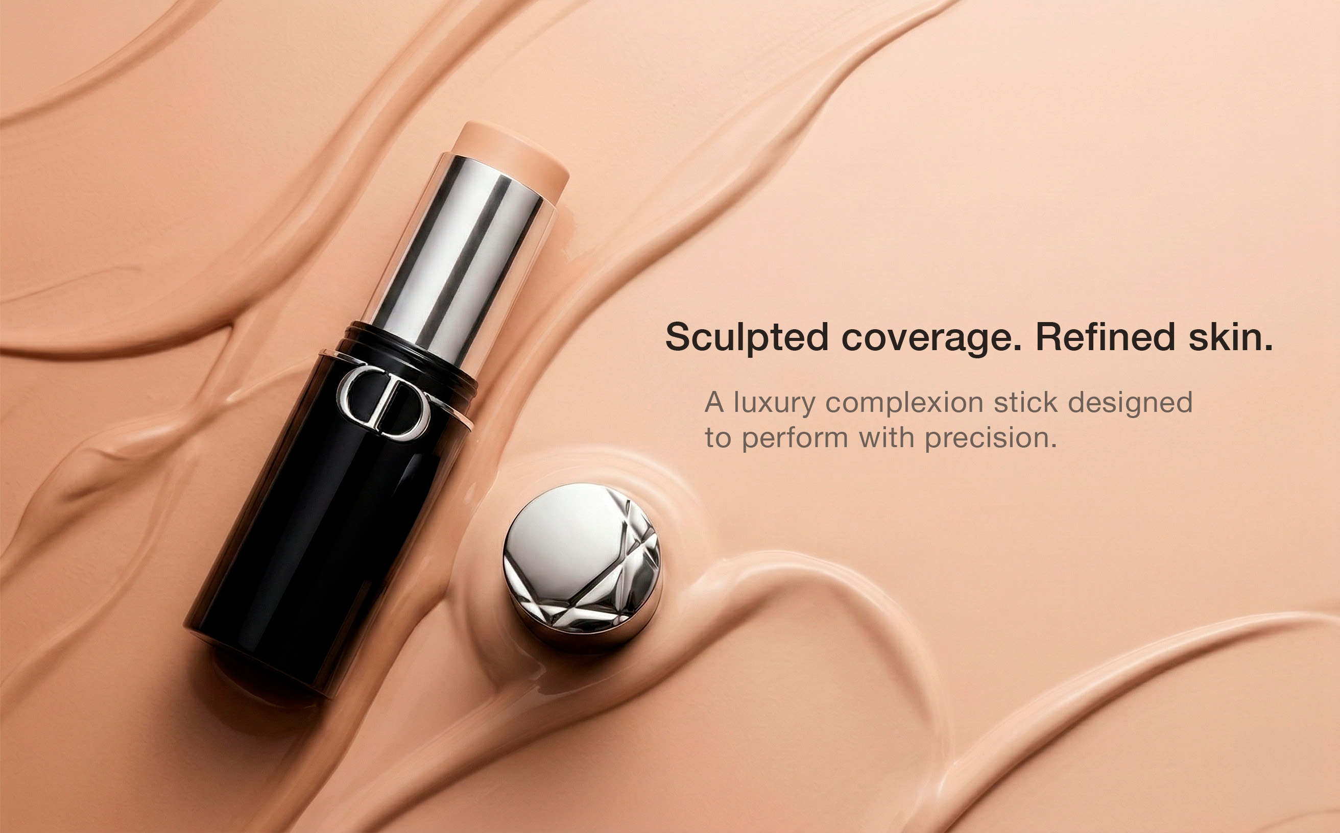
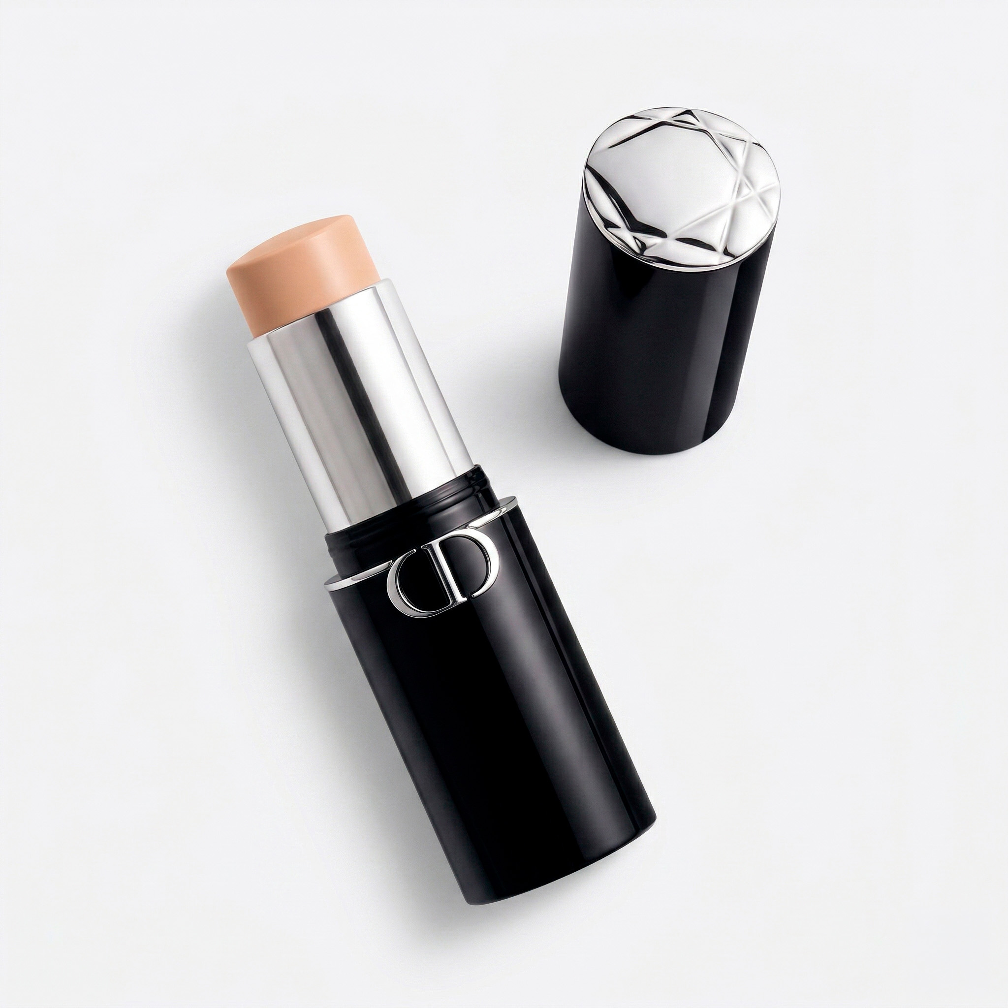
Foundation Stick
Luxury Complexion — Amazon Listing Design
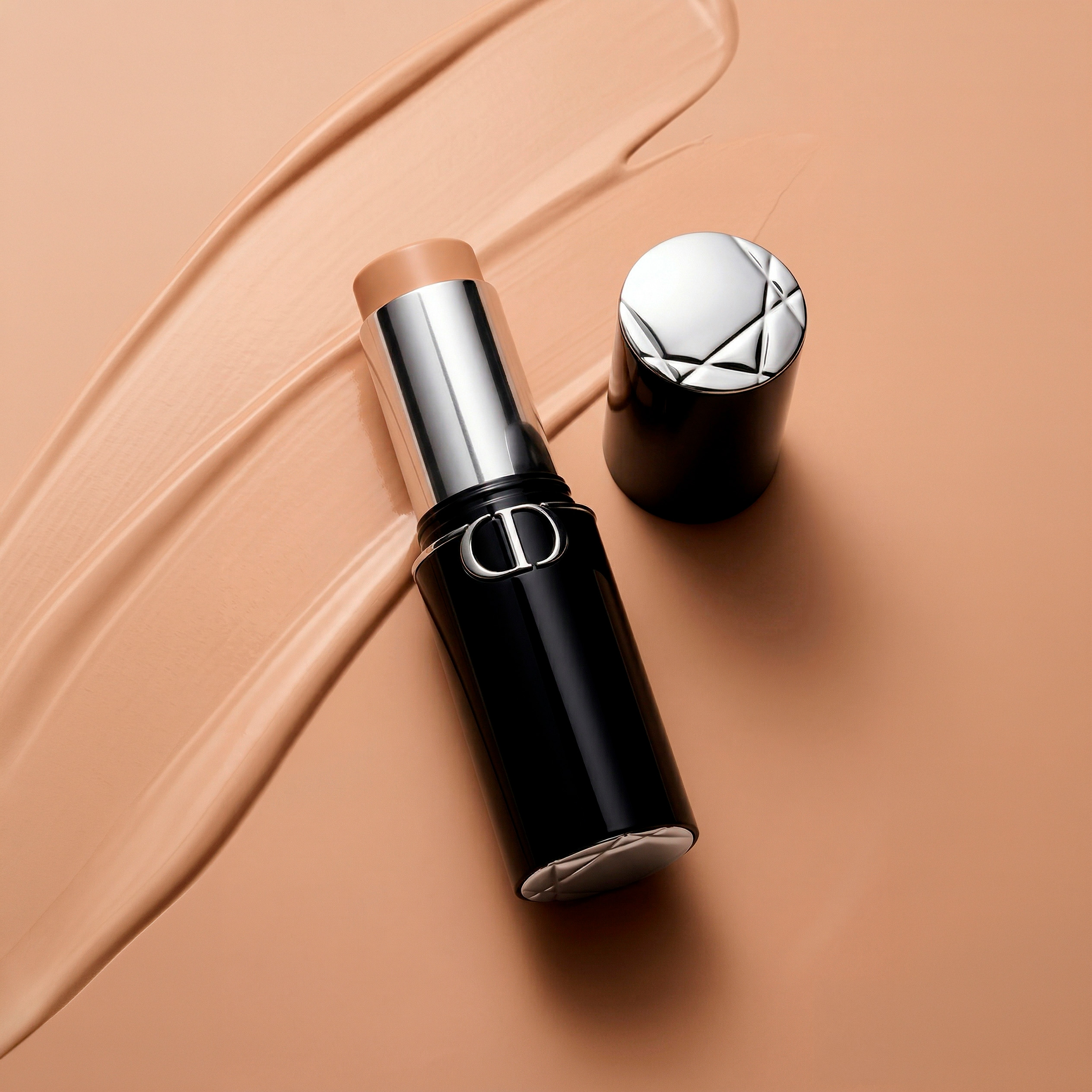
Foundation hero
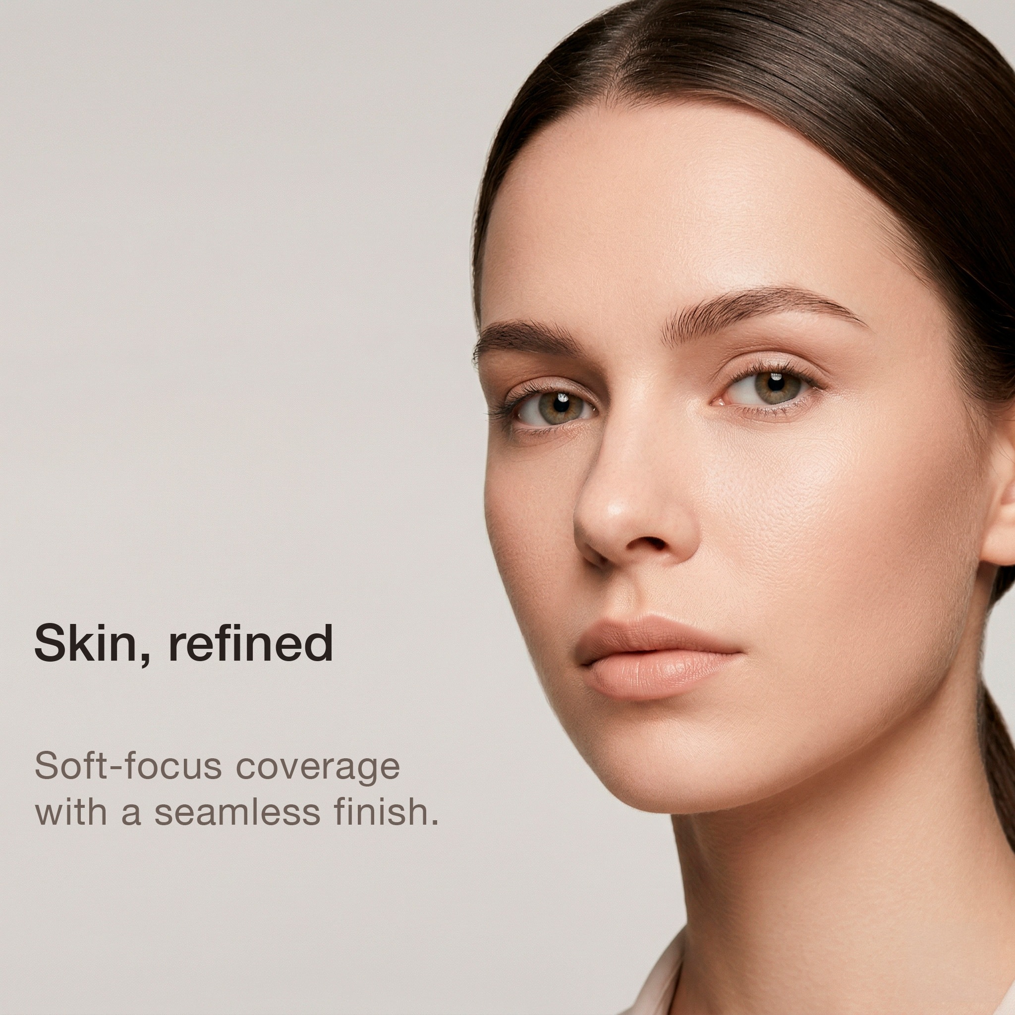
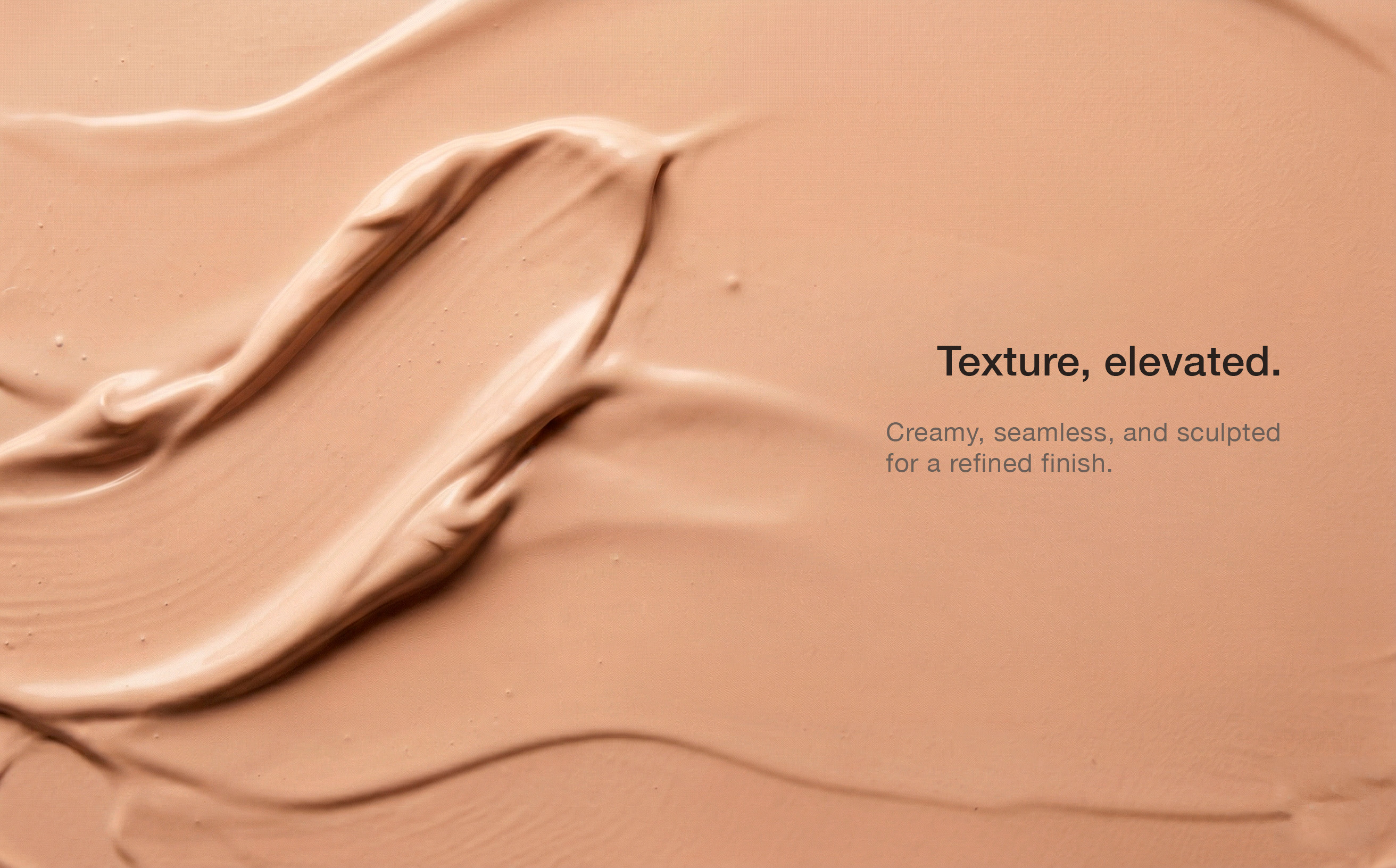
Skin refined
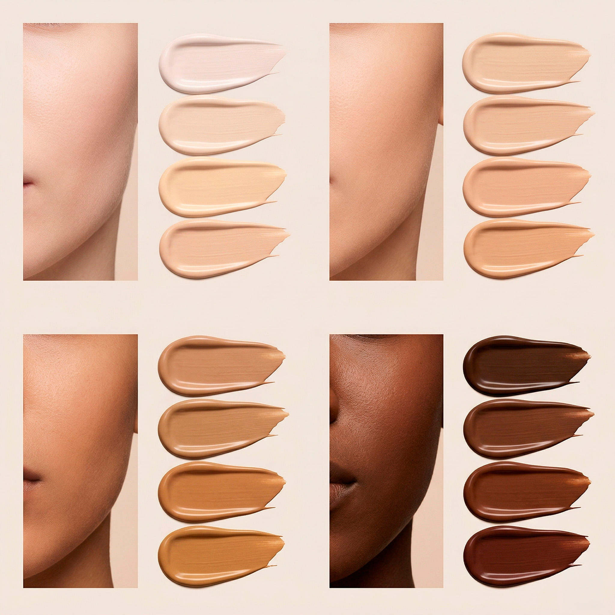
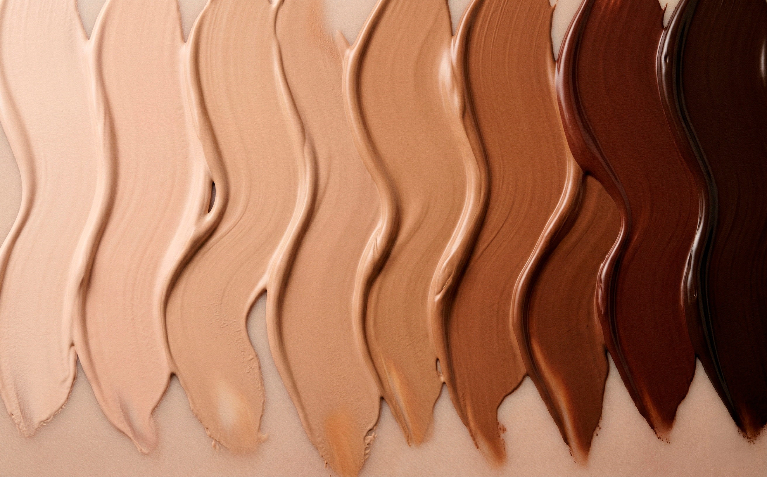
Shade range
The Challenge

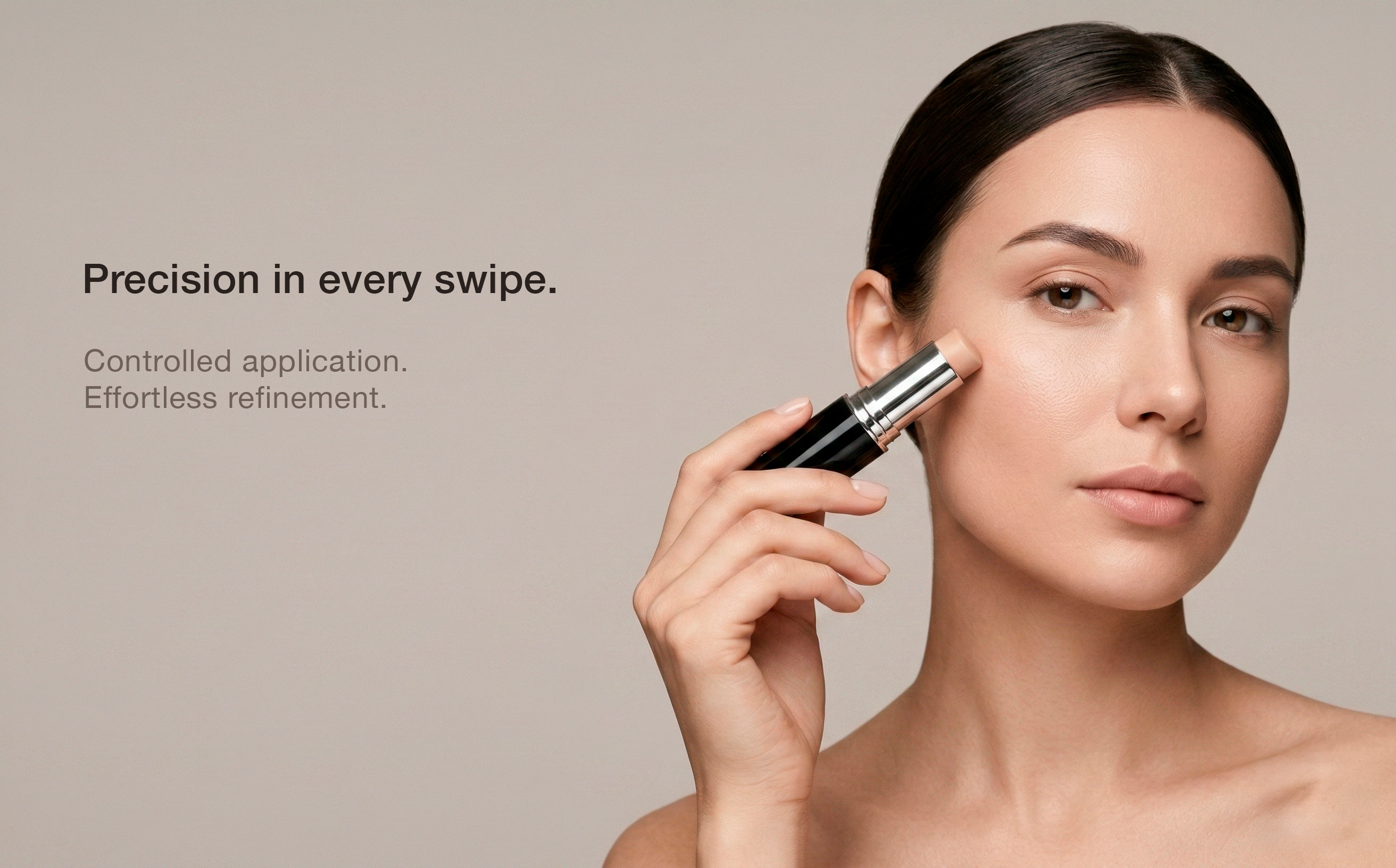
Most foundation listings follow the same visual formula: white backgrounds, bold badges, and feature callouts. For a premium complexion stick, that approach would have buried the product's core value — its luxury positioning. I proposed a full departure from Amazon's conventional beauty aesthetic, borrowing from high-end editorial rather than e-commerce convention.

Visual Language
No colored badges, no callout boxes. Typography-driven hierarchy with generous breathing room — functioning as campaign language, not product description.
AI Imagery Direction
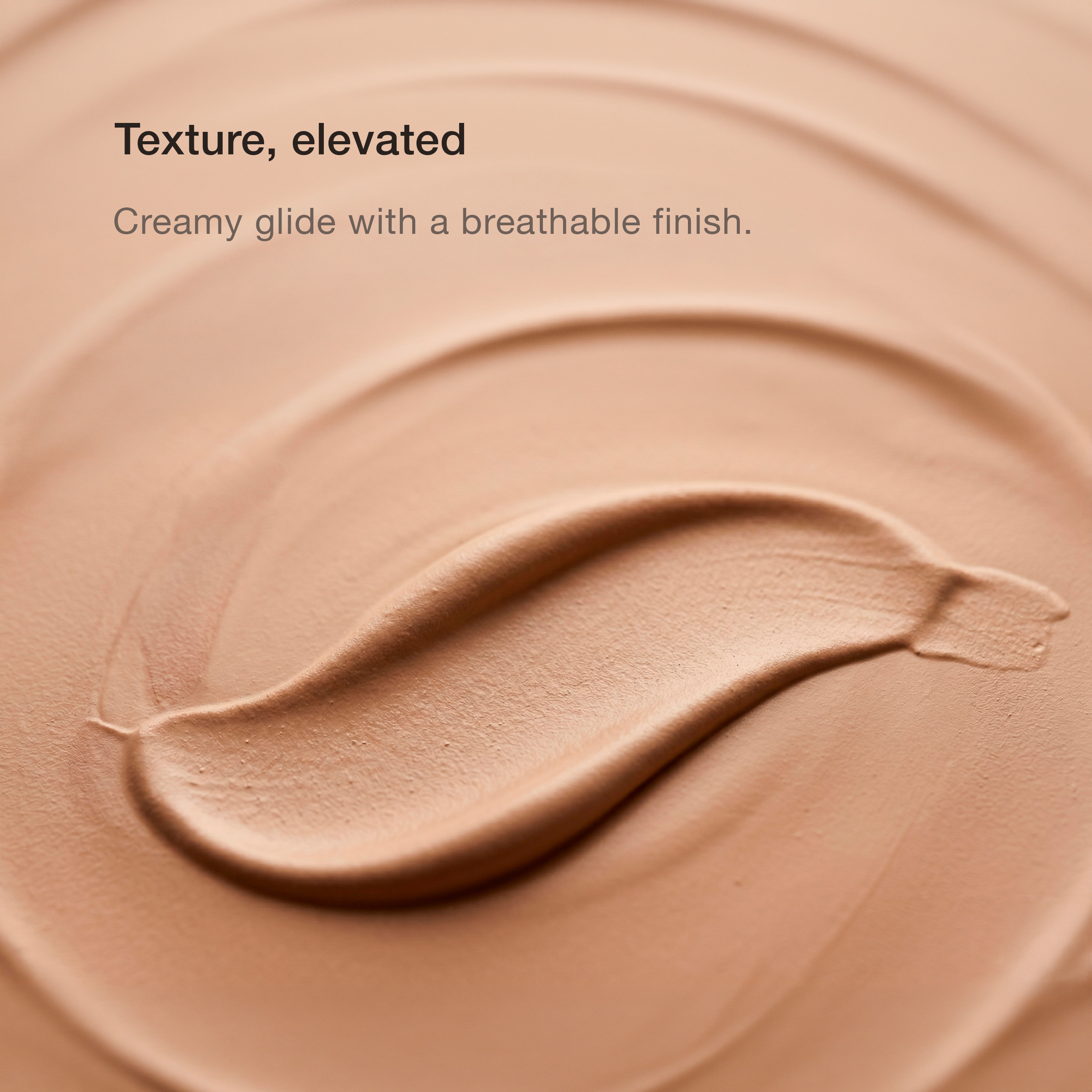
All imagery produced via AI generation with prompts I designed — directing lighting quality, skin texture realism, model casting, and color grading.
Shade Range Design
Prestige-inspired swatch panels with real skin reference crops — communicating inclusivity while maintaining premium identity.
02
Beauty / Skincare Brand Building PDP + A+ Creative Strategy Full Identity
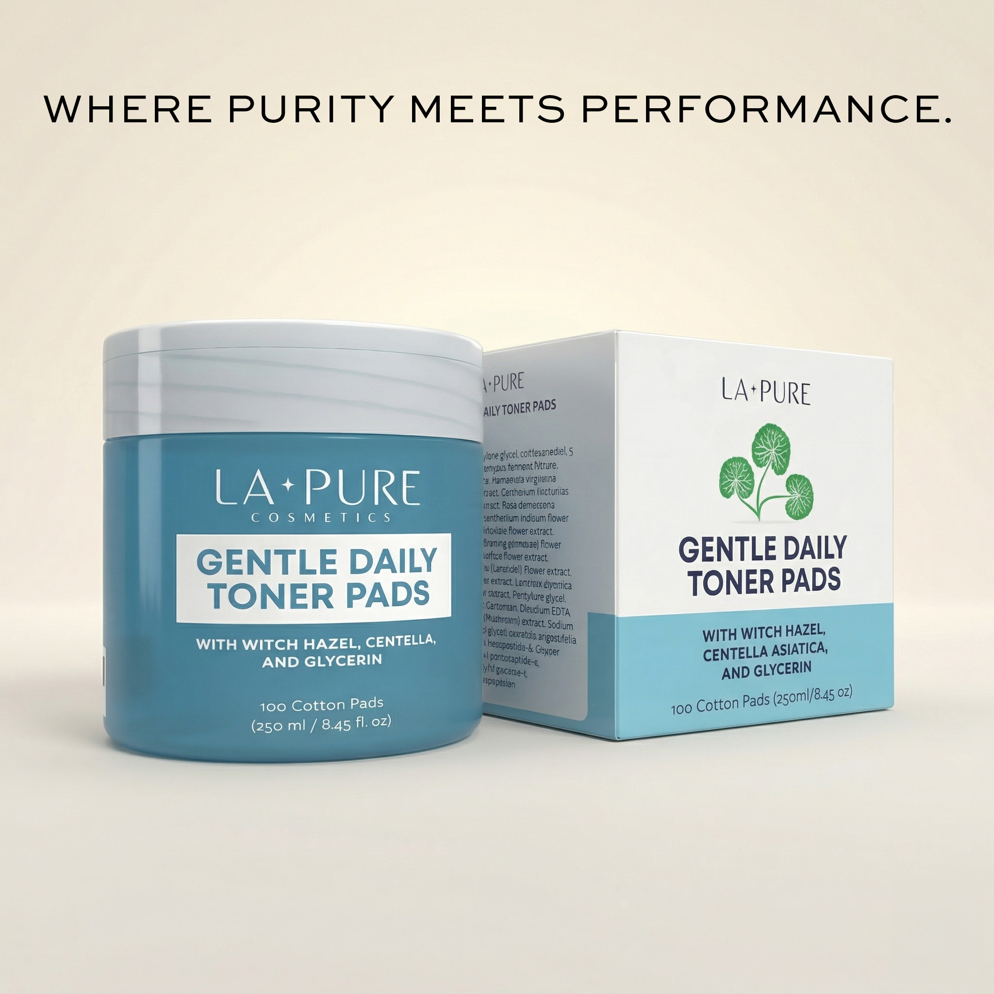
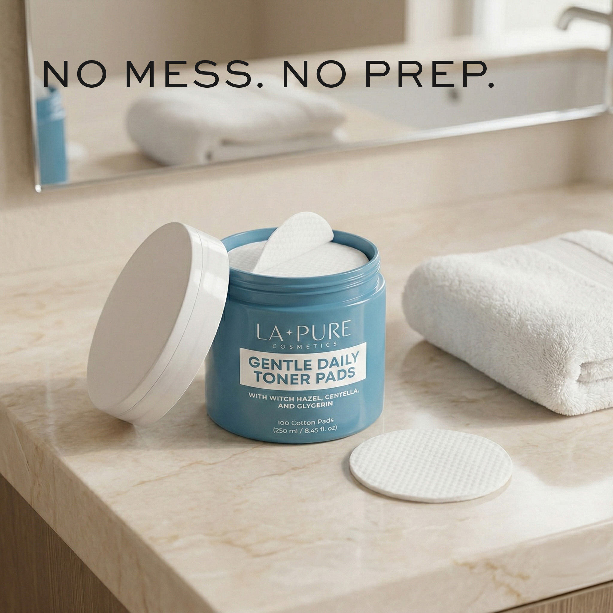
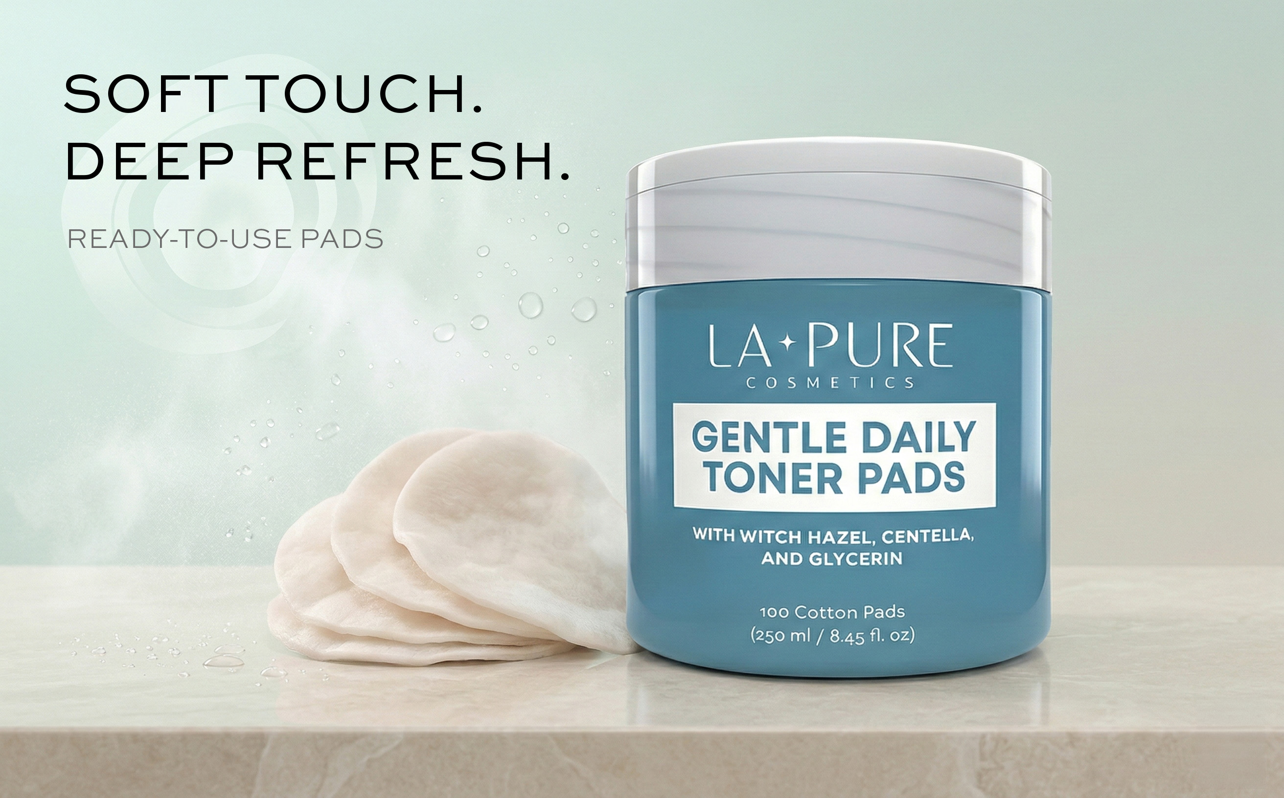
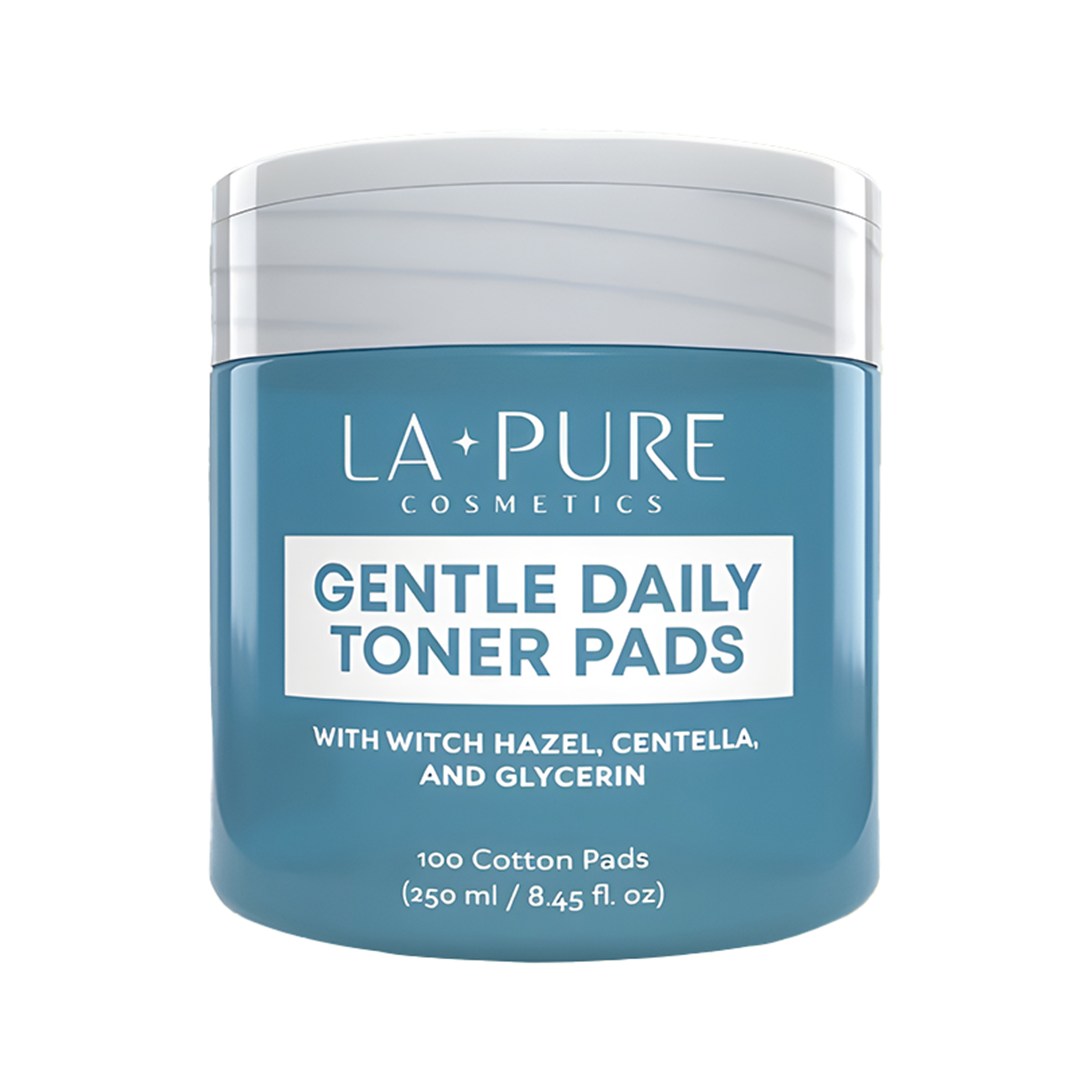
La Pure Cosmetics
Gentle Daily Toner Pads — Amazon Listing Design
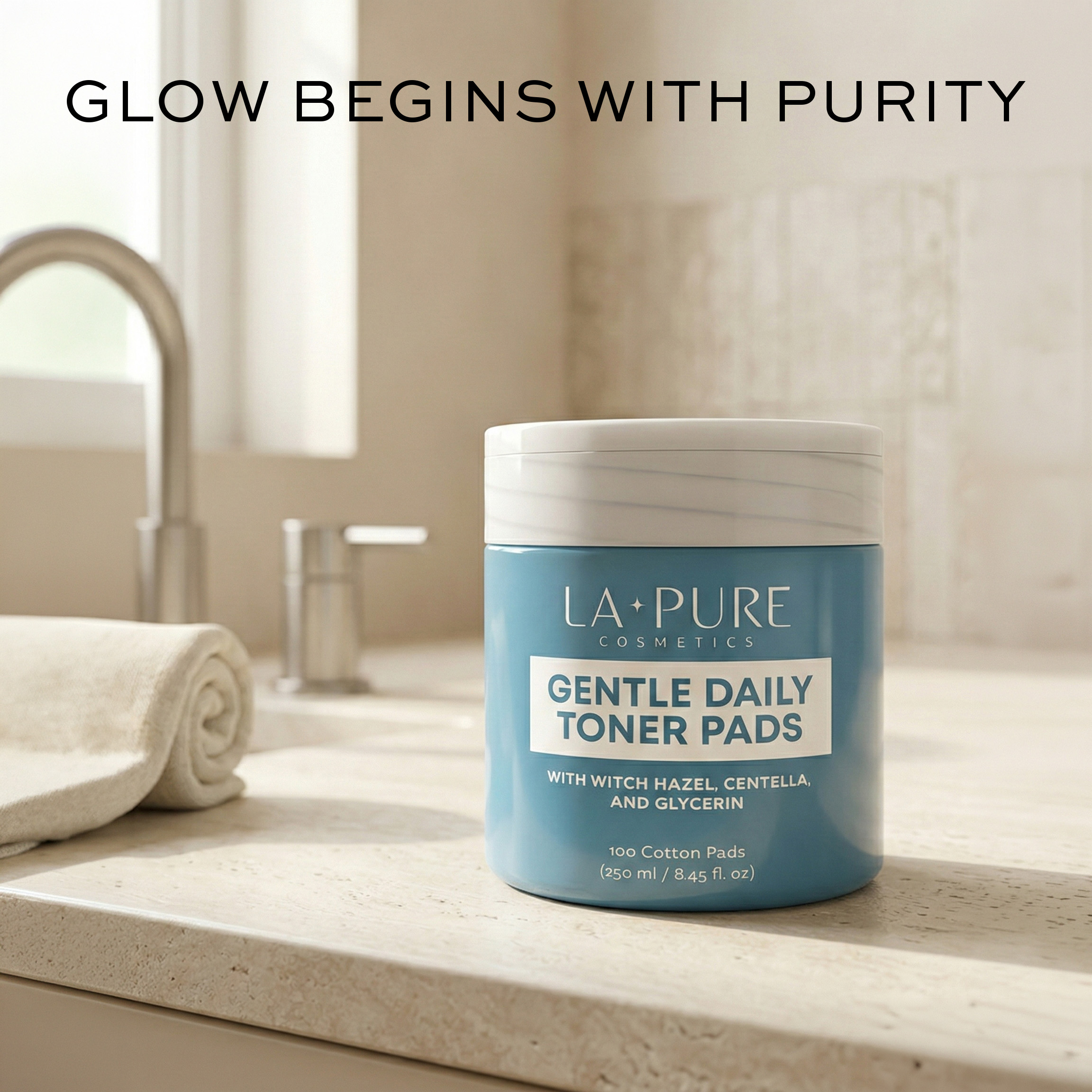
Hero
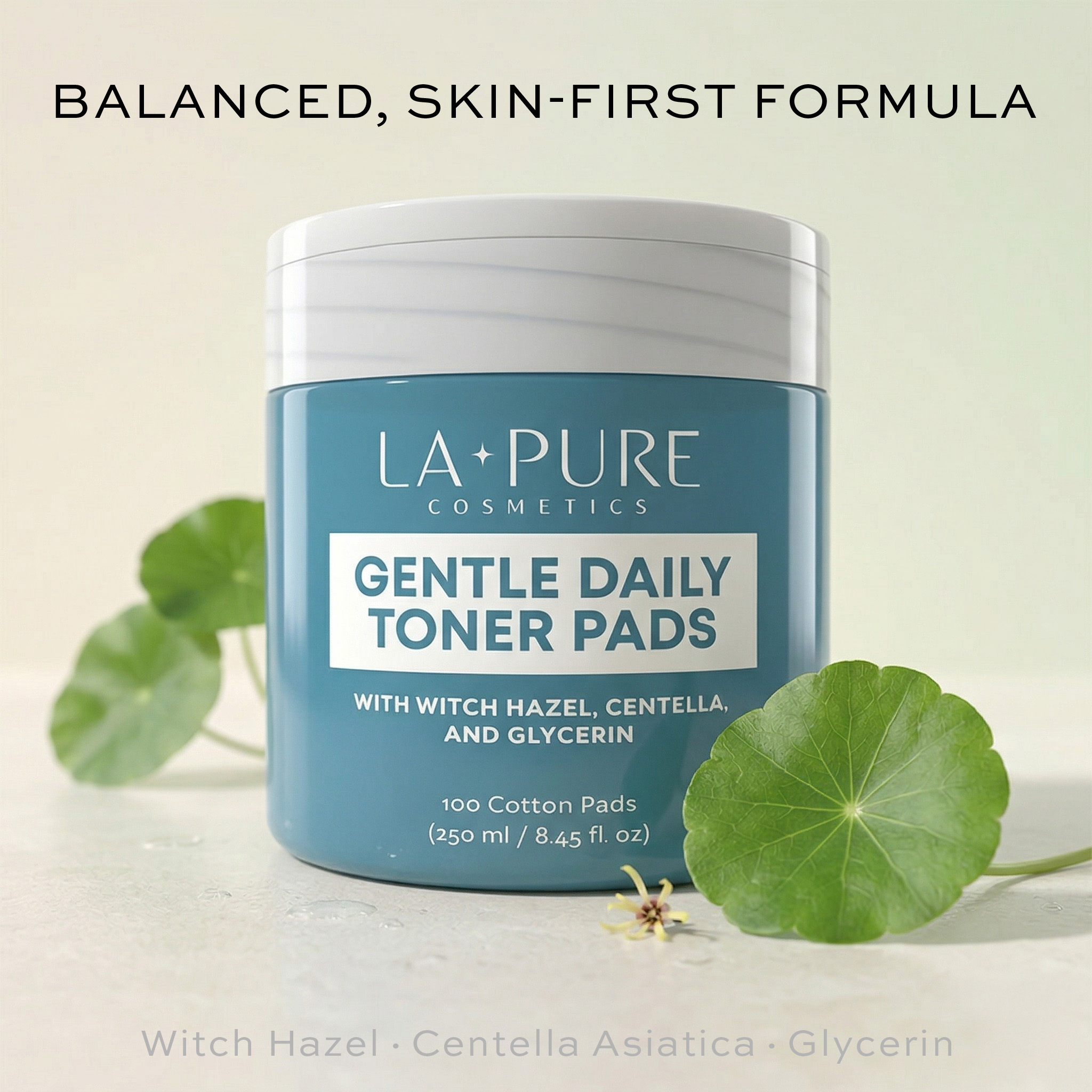
Ingredients
A+ ritual
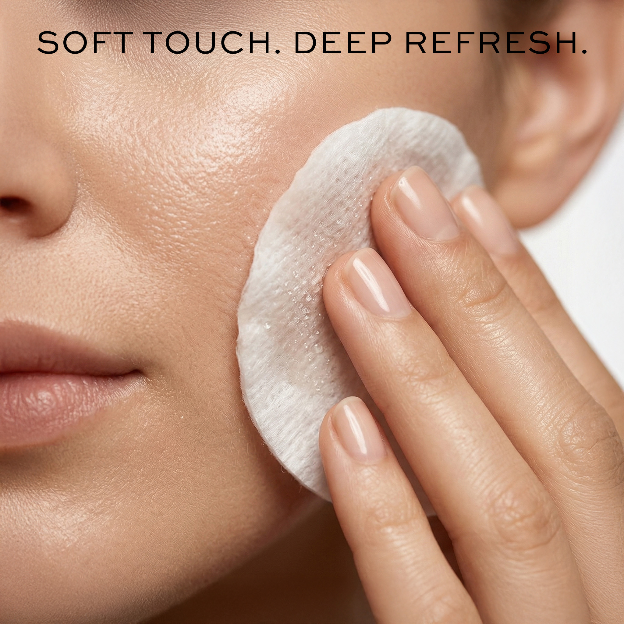
A+ radiance
The Challenge

A new brand entering a category dominated by Korean beauty giants. The client provided only a product jar. I developed the complete visual identity — color system, typography, voice, and all imagery — creating a listing that reads as if it came from a seasoned beauty agency.

Color Strategy
Teal/slate blue chosen to stand out on Amazon SERPs — communicating clinical credibility while warm neutral backgrounds soften it to approachable.
Copy as Brand Voice
Calm, confident, minimal. "Glow Begins With Purity." "Simple Care. Visible Glow." Each headline doubles as a brand statement.
A+ Ritual Narrative
Travertine, warm linen, amber glass — every A+ image designed for a specific aspirational morning ritual environment.
03
Consumer Tech PDP + A+ Narrative Design
Align
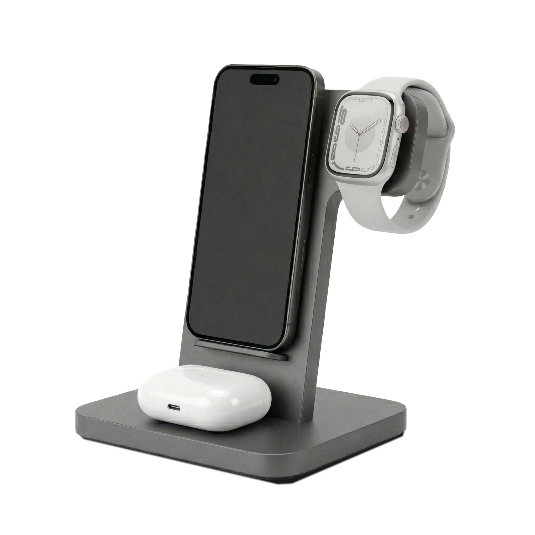
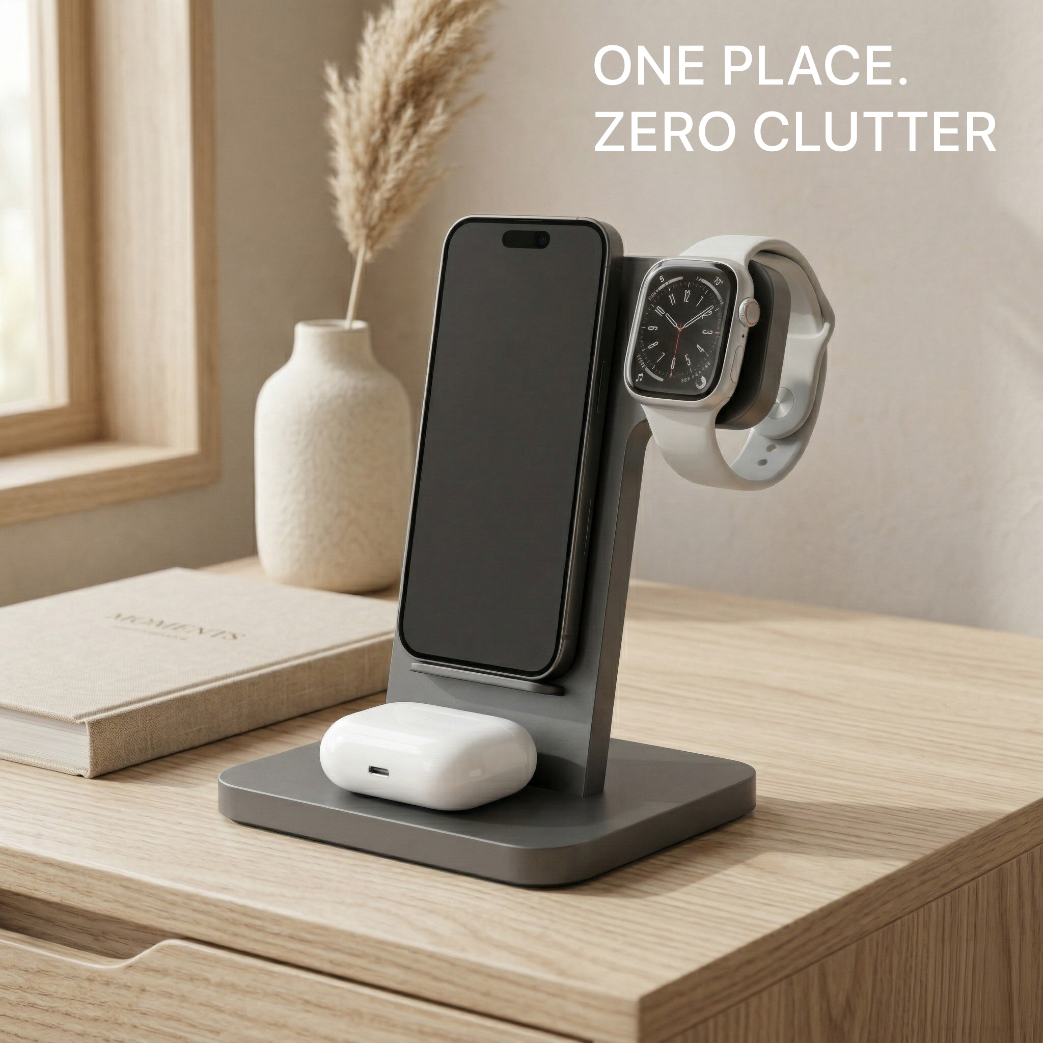
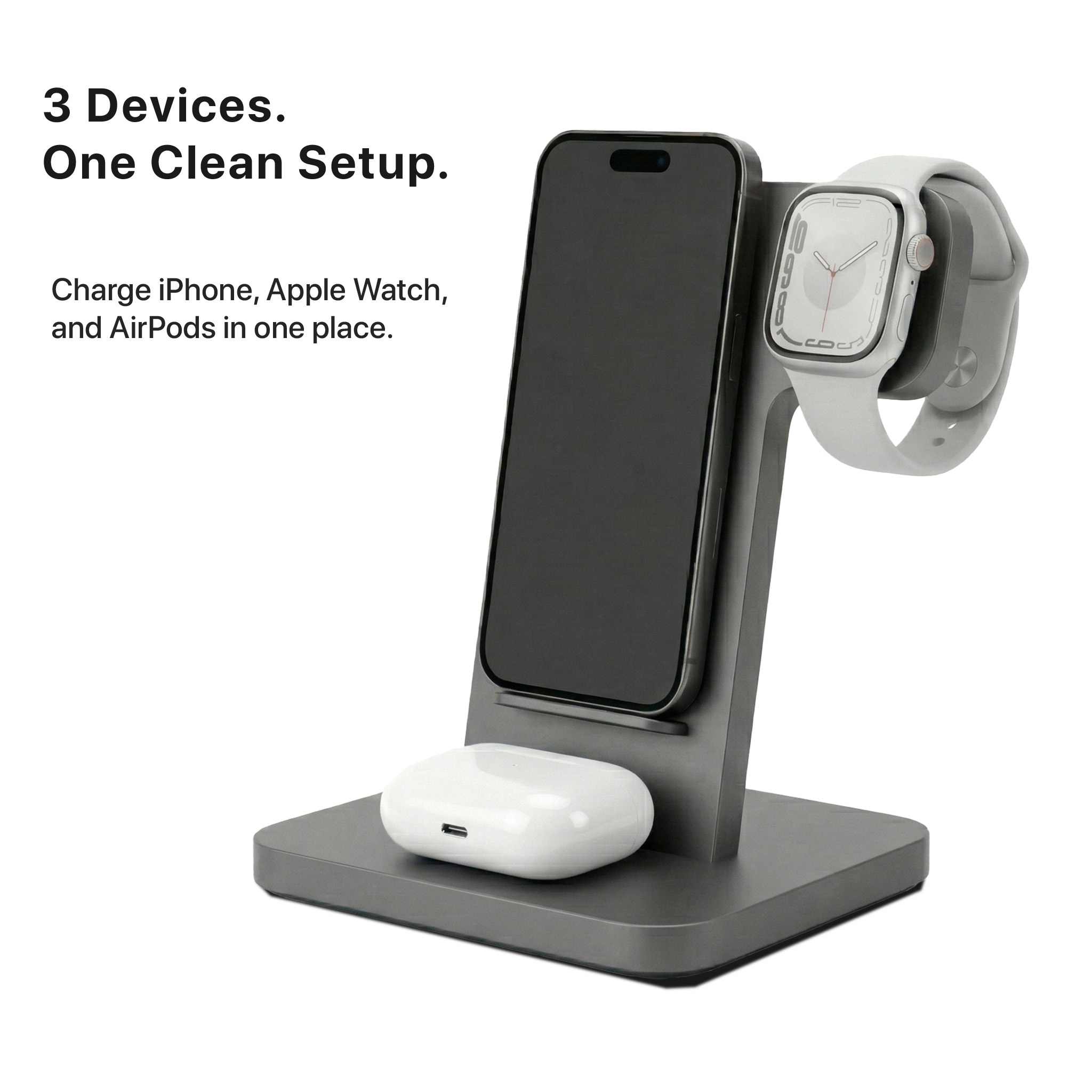
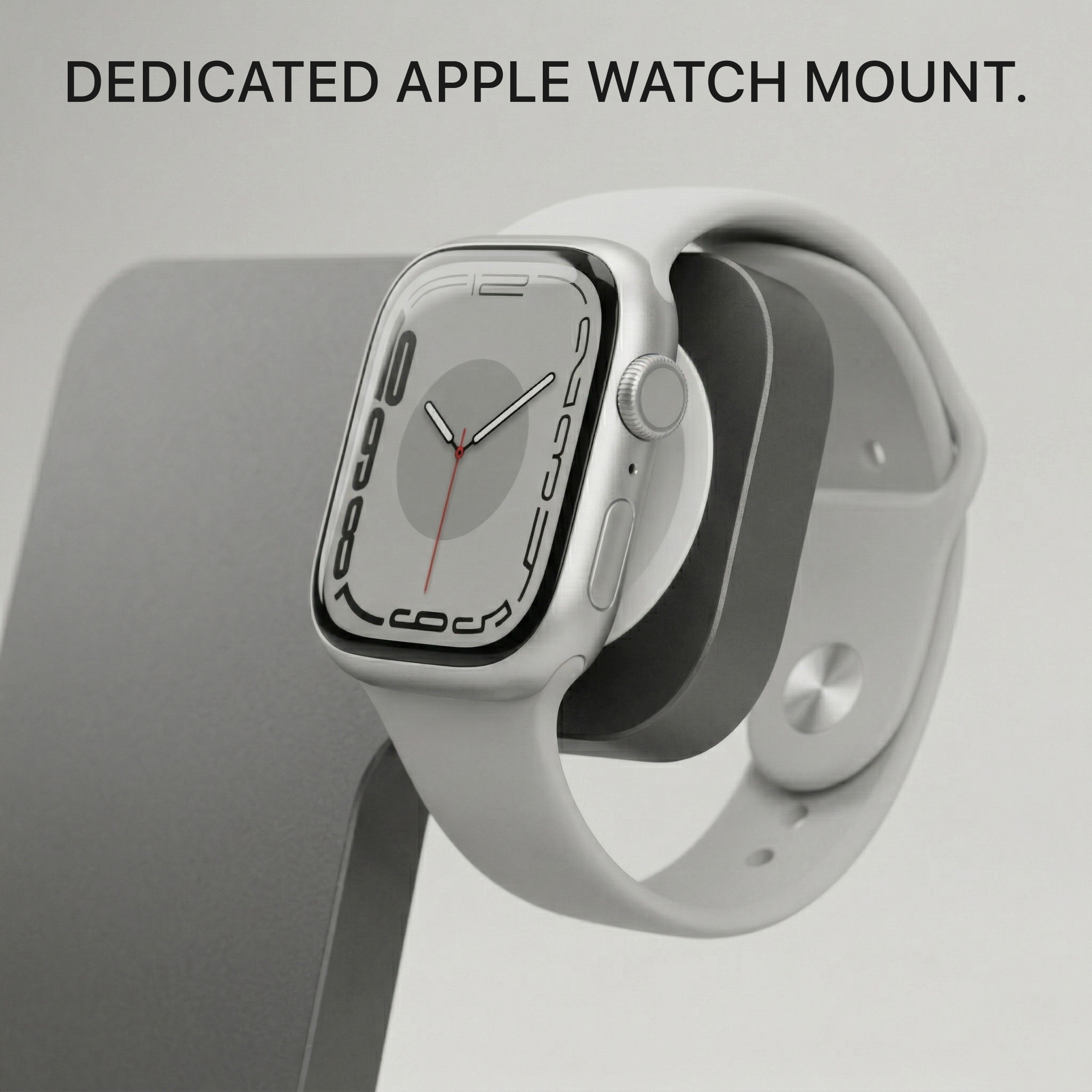
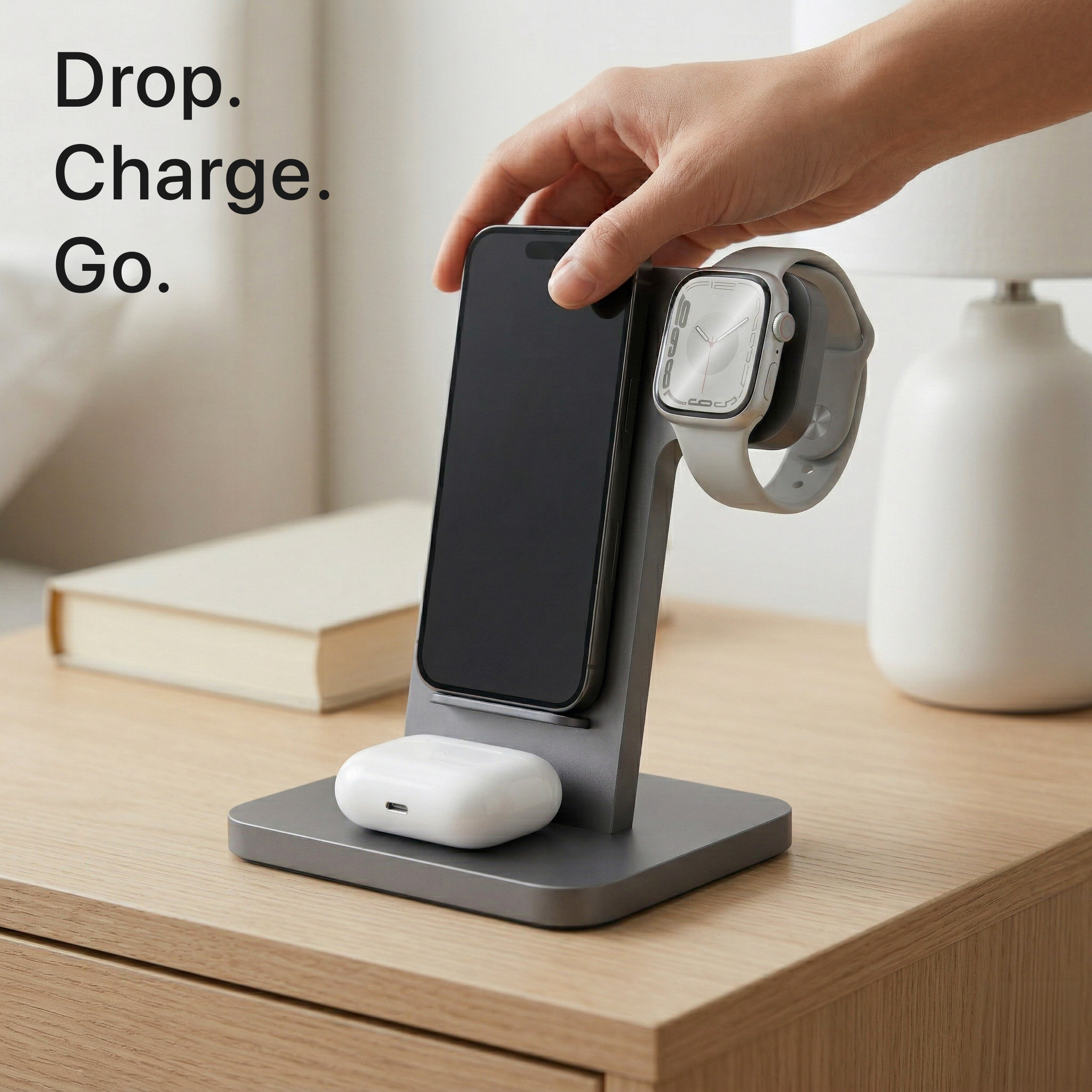
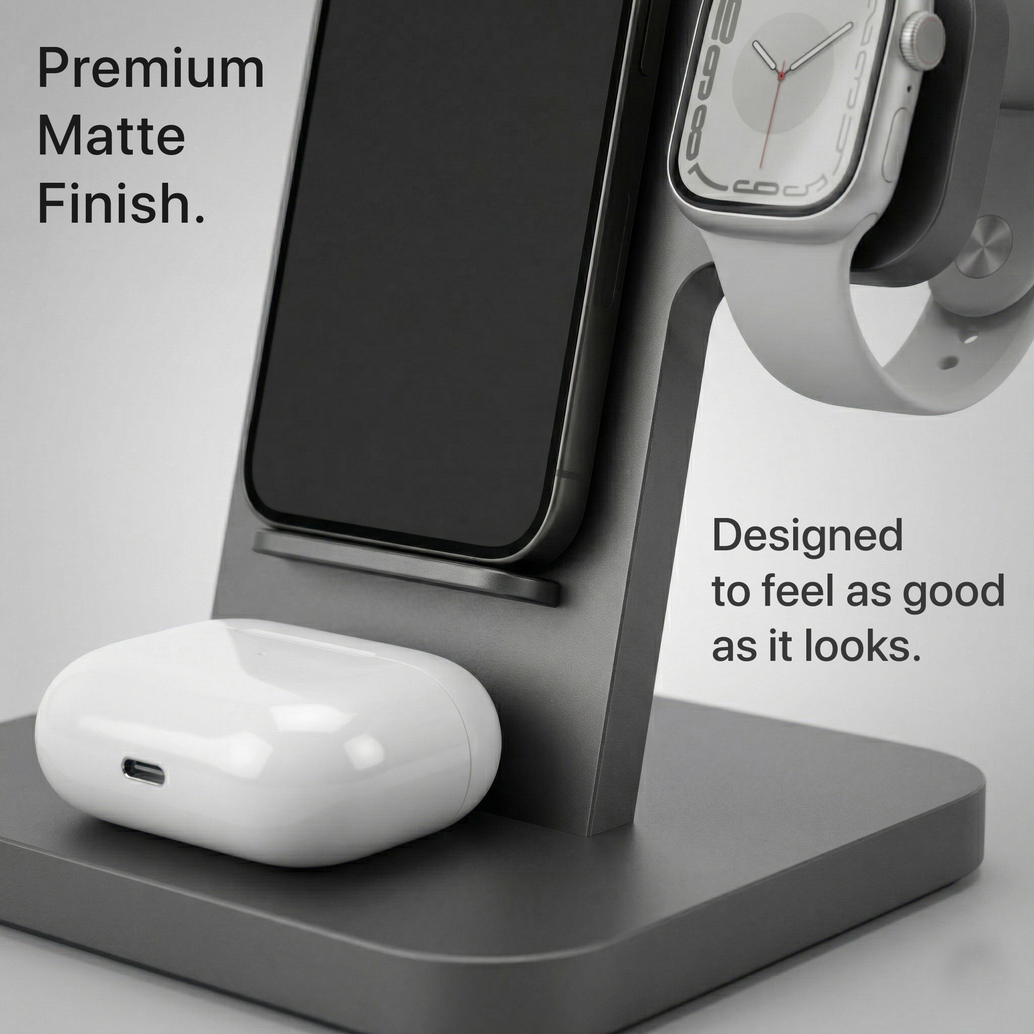
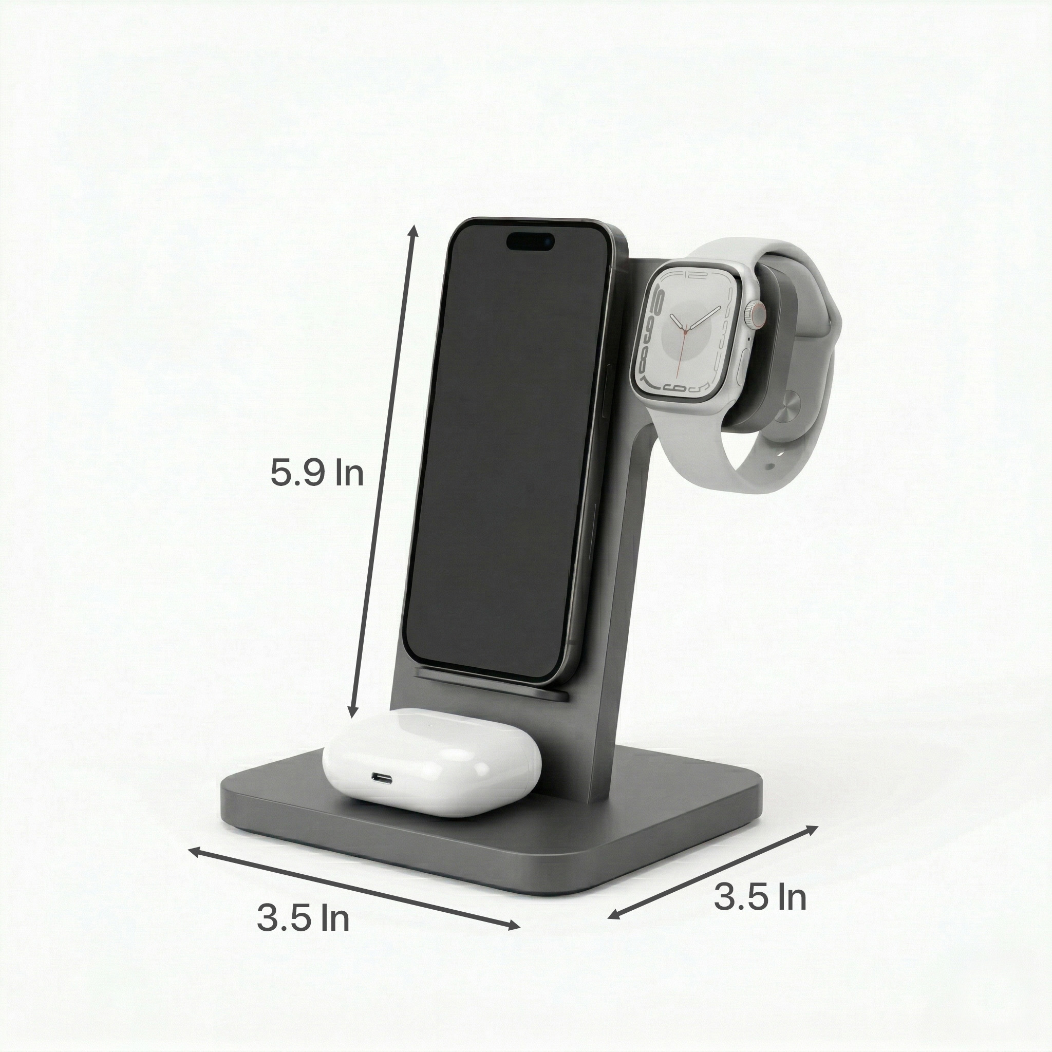
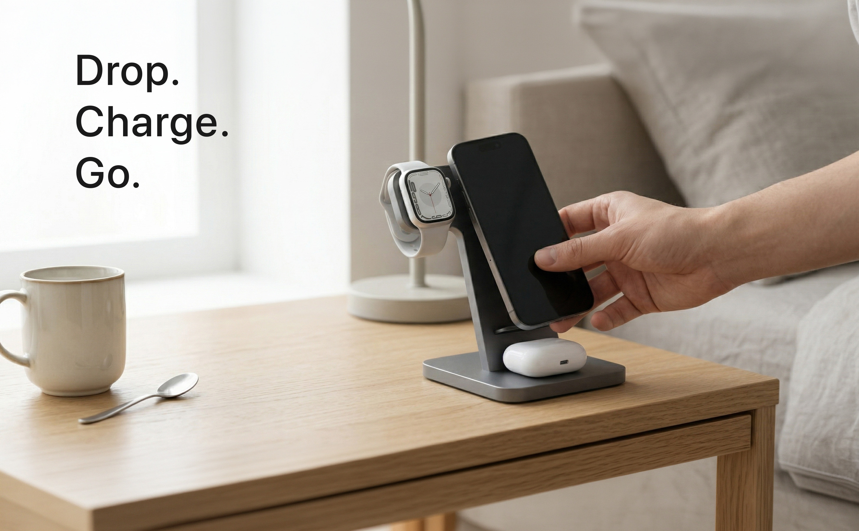
3-in-1 Apple Charging Station — Full Amazon Listing
Hero
Cable chaos
A+ banner
The Challenge

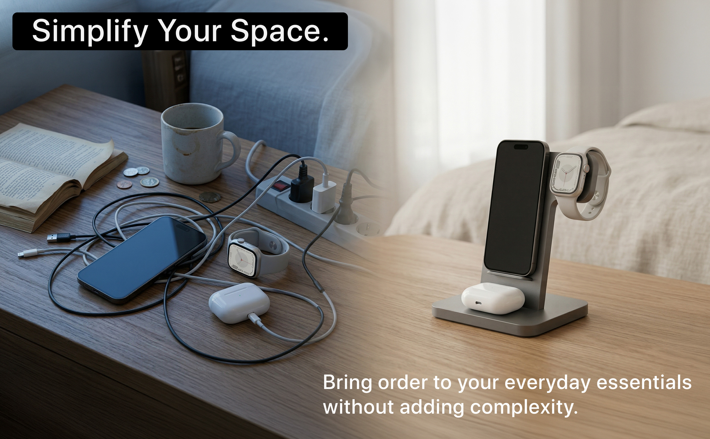
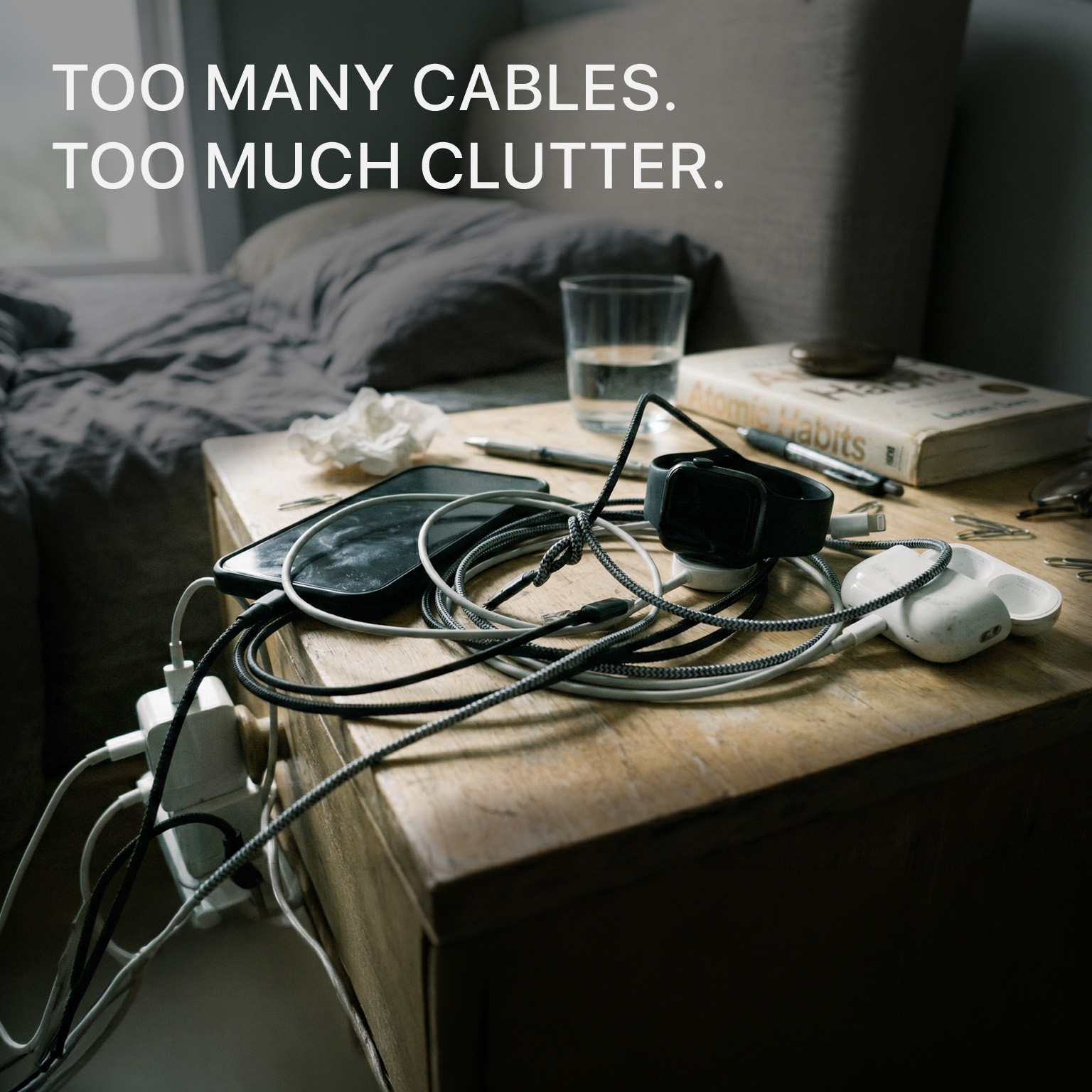
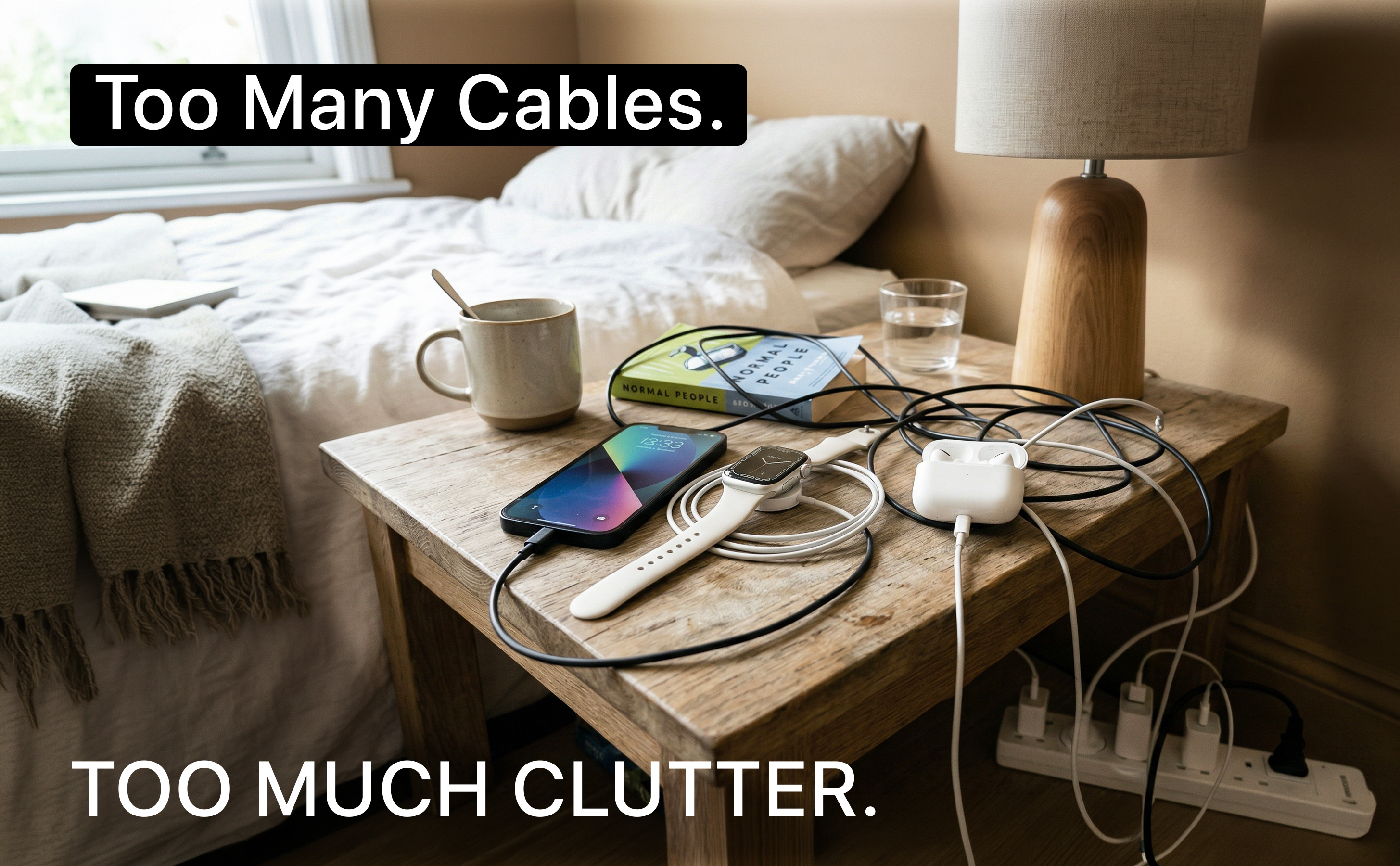
One of Amazon's most saturated electronics categories. I repositioned the listing so the real competitor wasn't other charging stations — it was cable chaos itself. Opening with the problem before showing the product created emotional resonance before the sales pitch begins.

Problem-First Structure
Tangled cables as image #2 — validating customer frustration and positioning the product as relief, not a feature list.
PDP vs A+ Tone
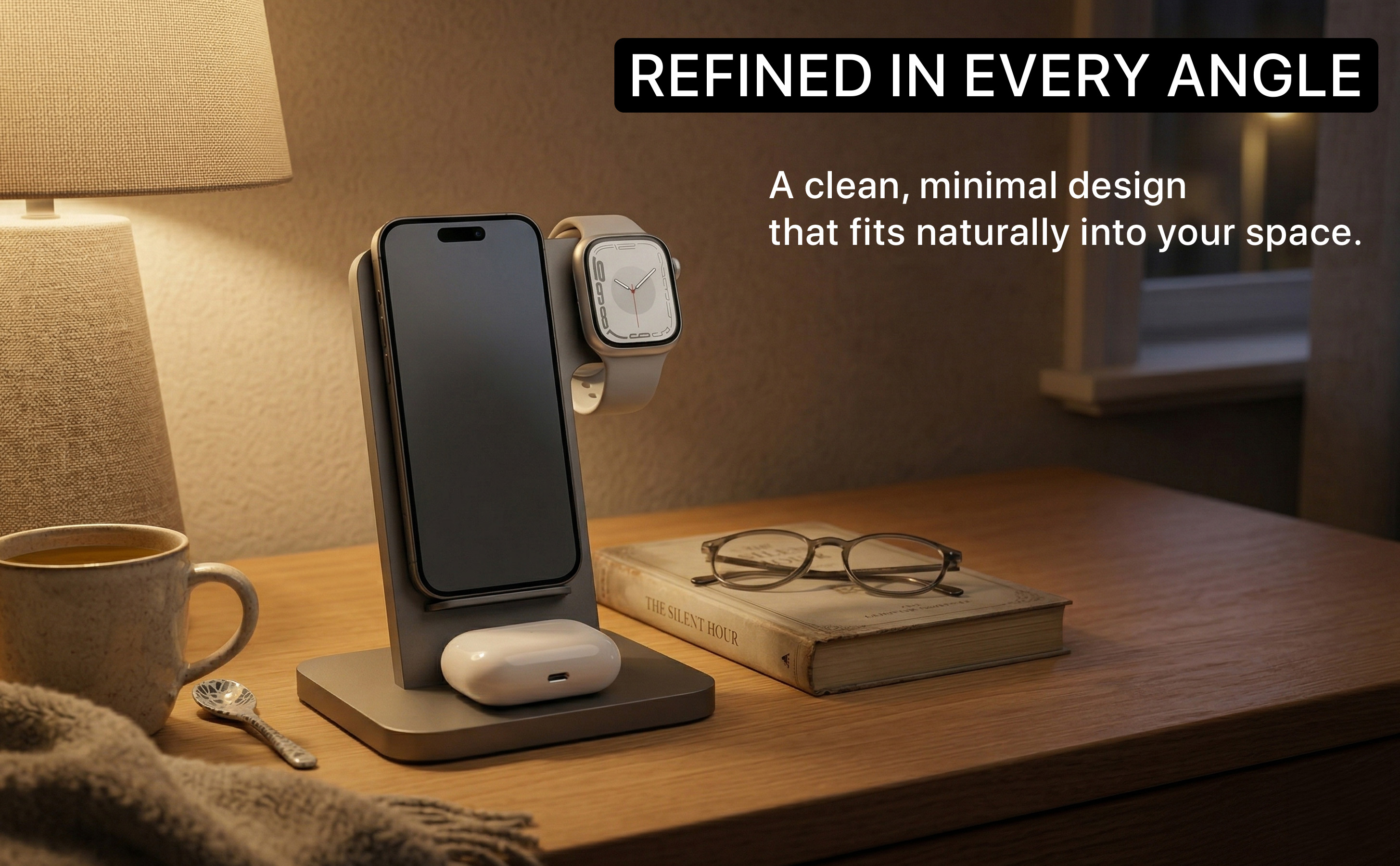
PDP is crisp and functional. A+ is cinematic and warm. Two voices, one system — each serving a different moment in the purchase journey.
Apple Ecosystem Aesthetic
No colored badges — a deliberate choice to align the visual language with the Apple ecosystem's own design standards.
04
Pet Care Brand Building PDP + A+ Creative Strategy Emotional Positioning
Pets are Kids
Dog Dental Spray — Full Amazon Listing
Hero
How to use
A+ 001
Because family
The Challenge

Starting from a single bottle image, I built a complete brand identity. The brand name — "Pets are Kids" — contained the entire strategic insight: the customer treats their dog as family. Every creative decision was filtered through that emotional truth.

Leading with Objection
Opening with a dog turning away from a toothbrush validates the customer's pain point before offering the solution.
Brand Intelligence
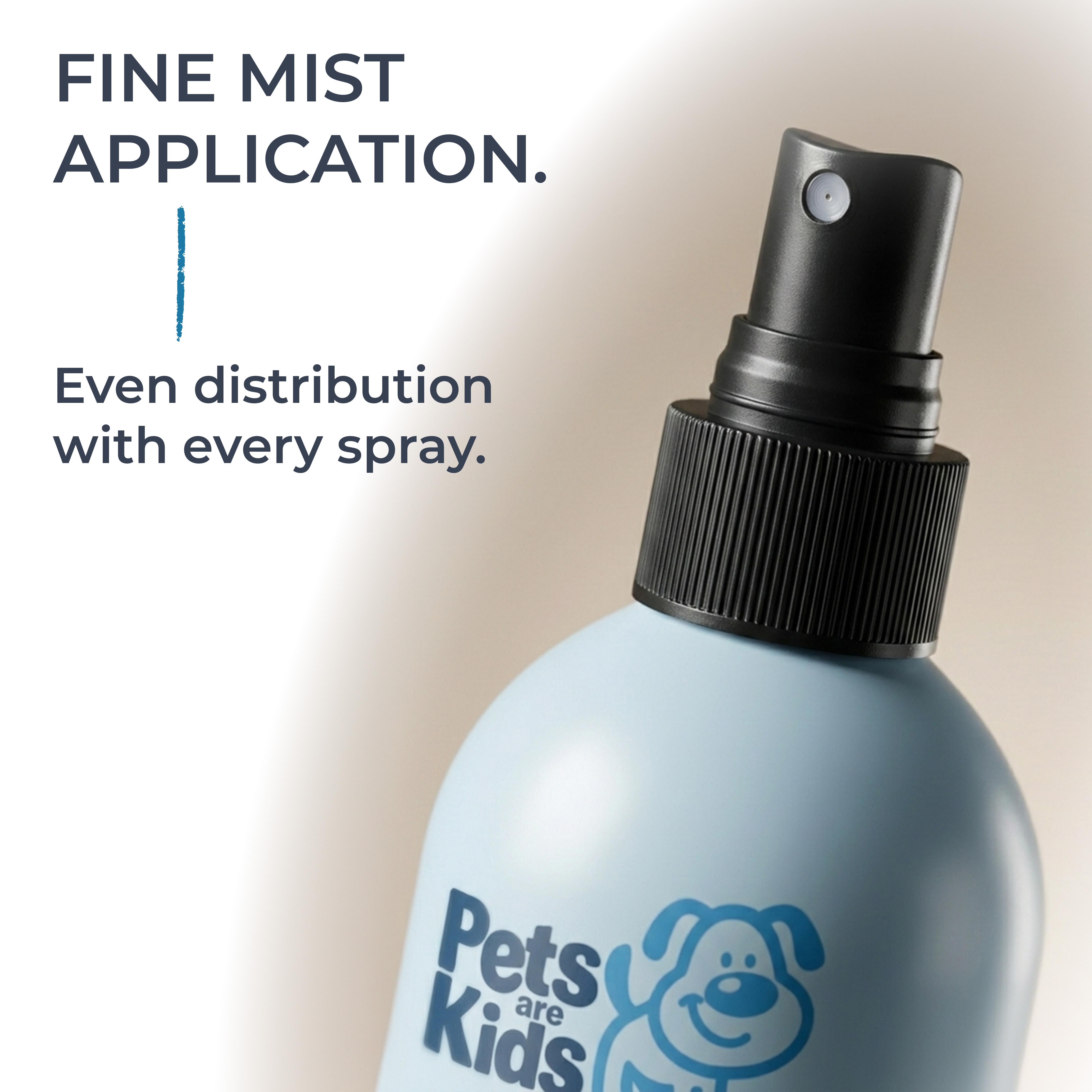
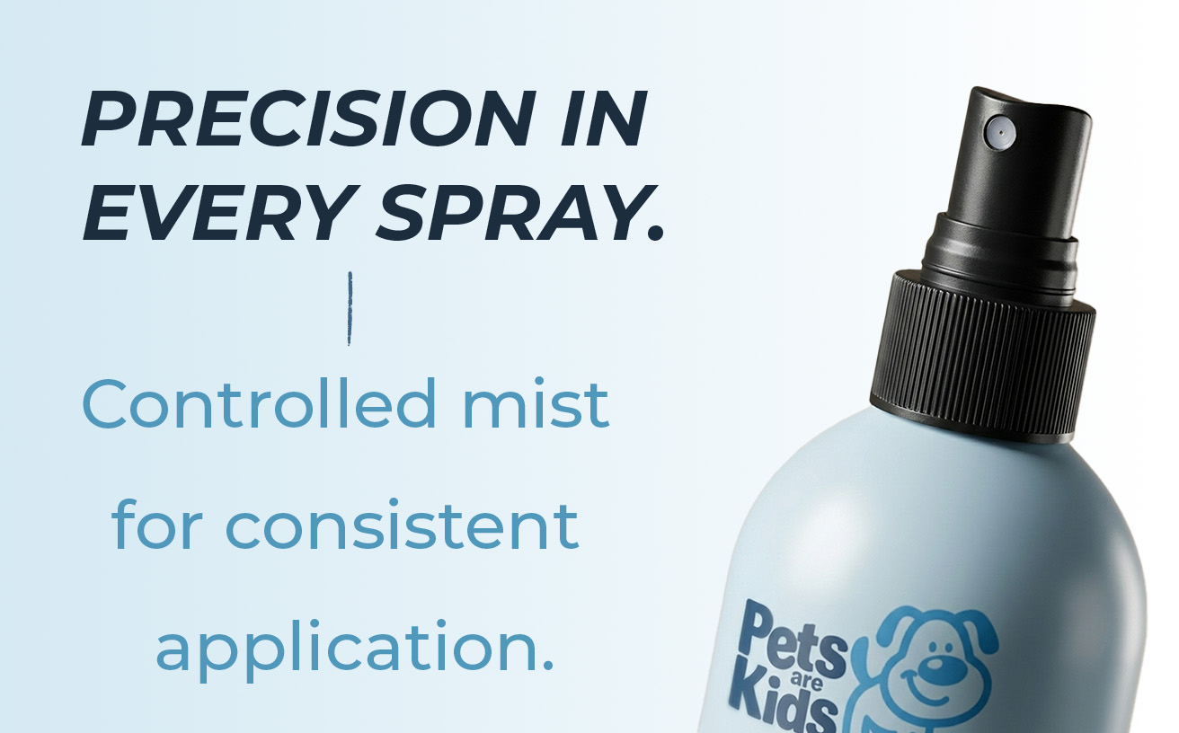
Sky blue amplified into a bold, energetic palette with italic bold headlines and a hand-drawn stroke accent — all extracted from a single product bottle.
Emotional Close
"Because They're Family. Care that feels like love." — The last A+ frame restates the brand's core promise as the final impression before reviews.
05
Home Appliances Established Brand PDP + A+
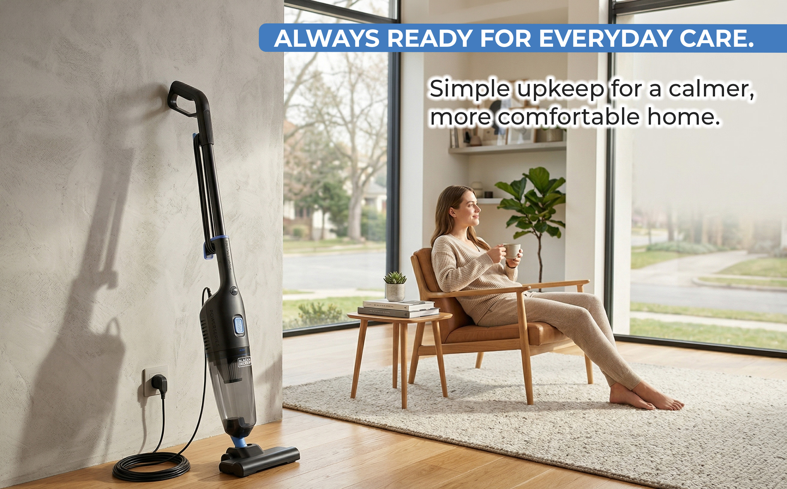
Black+Decker
Power Series Vacuum — Amazon Listing Design
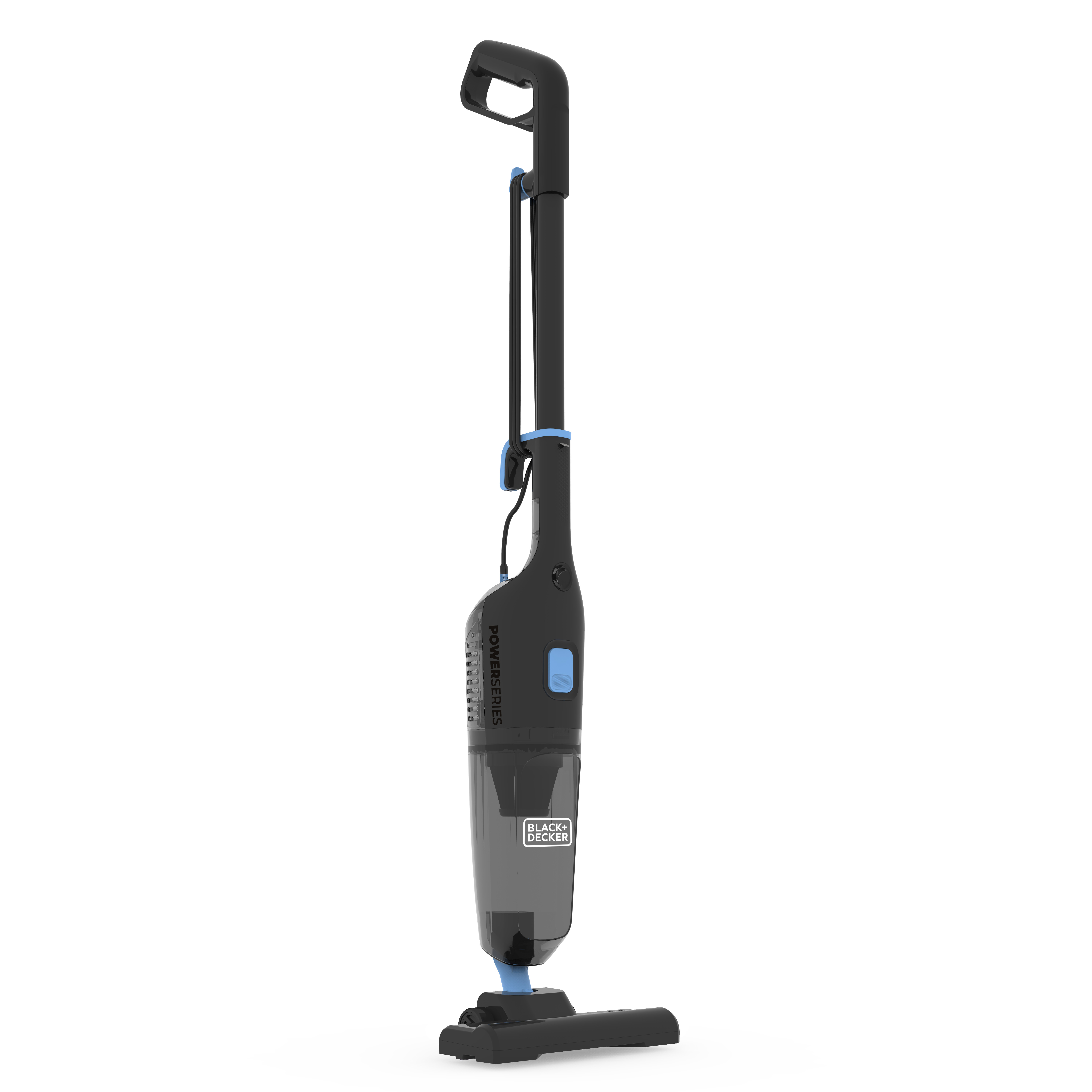
Hero
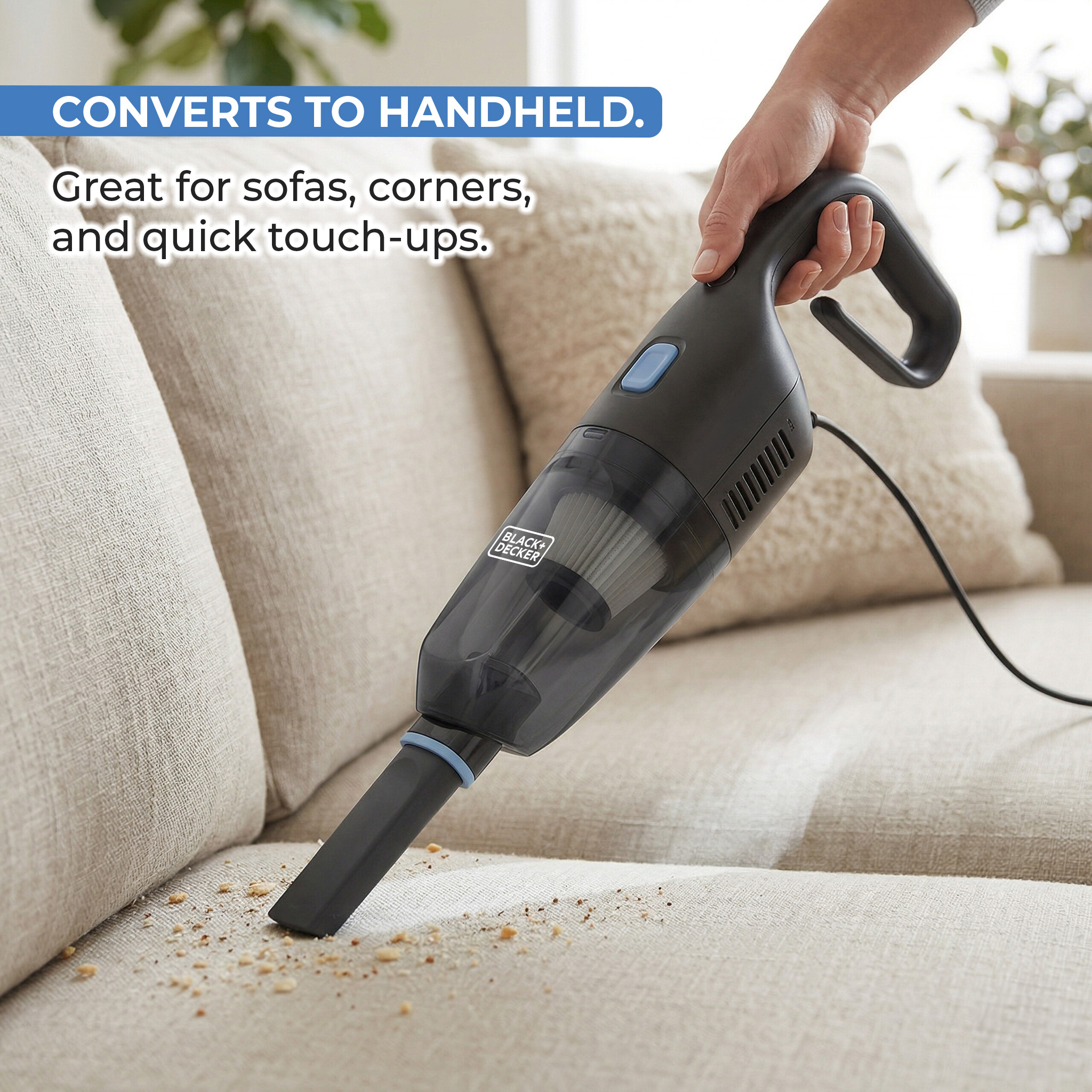
Converts to handheld
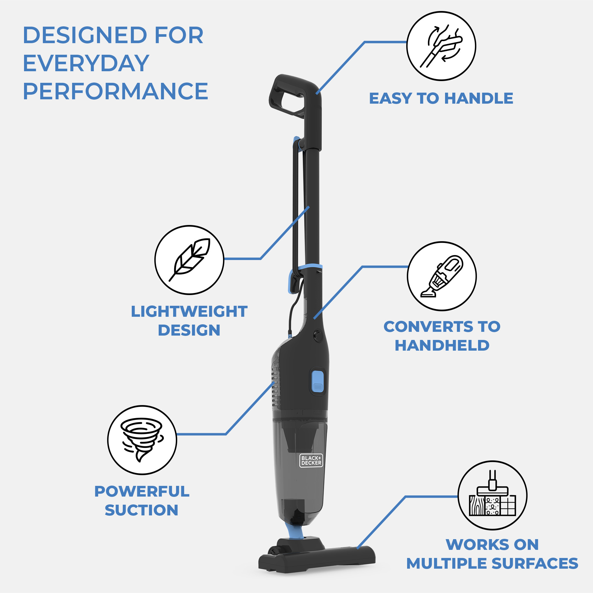
Features infographic
The Challenge

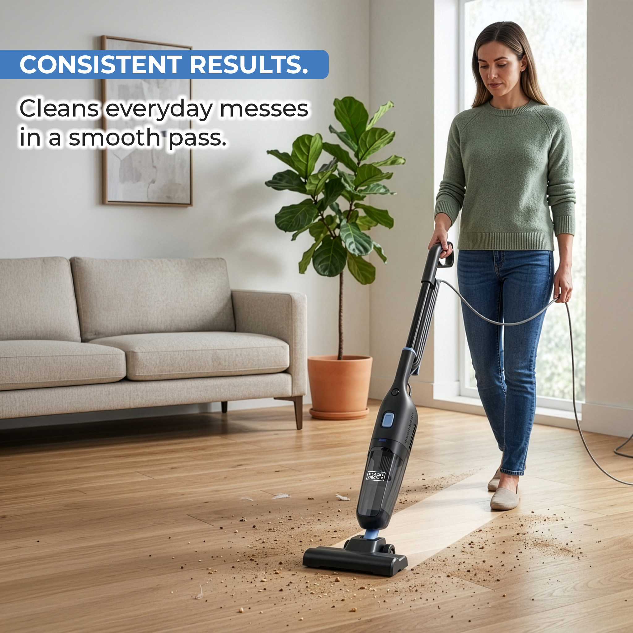
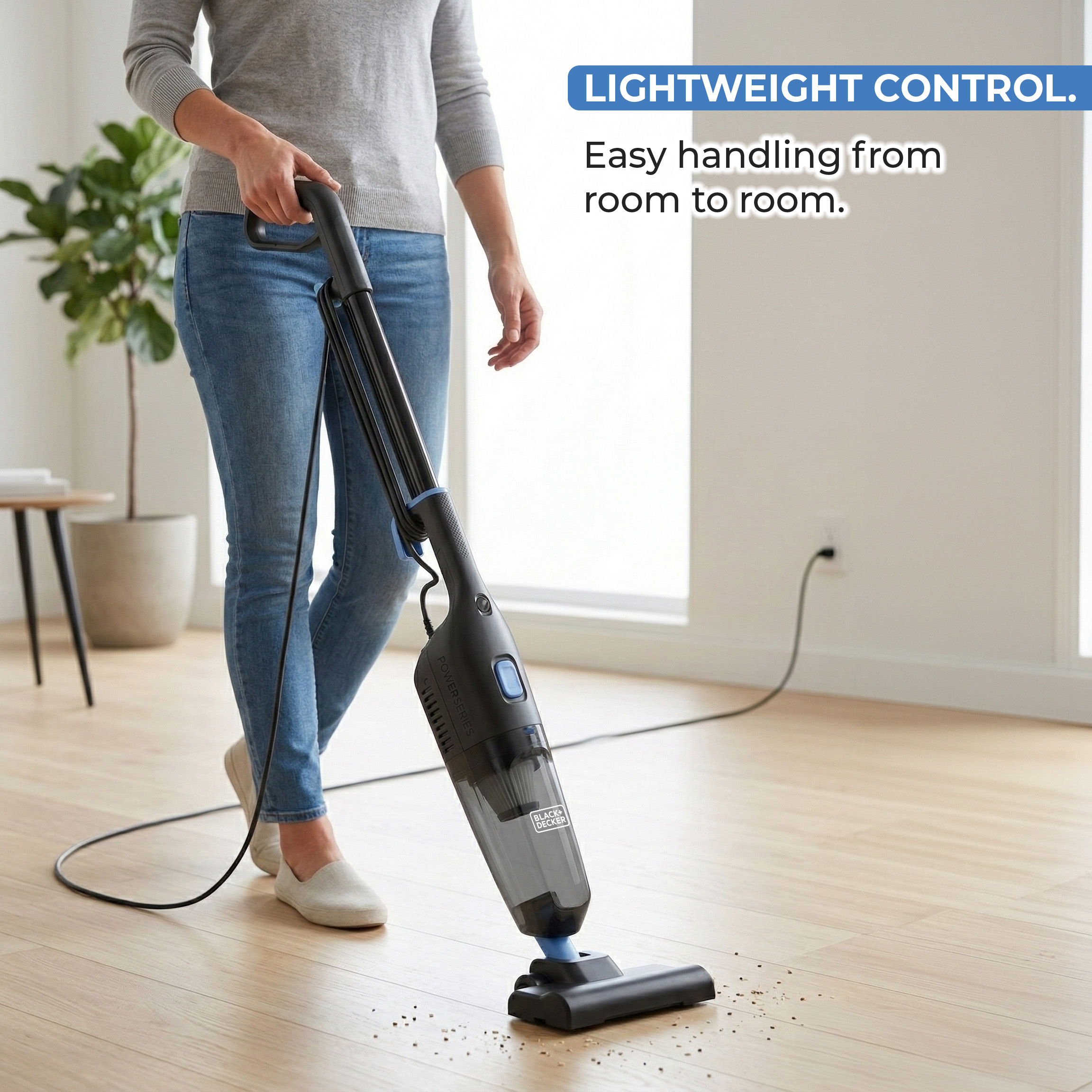
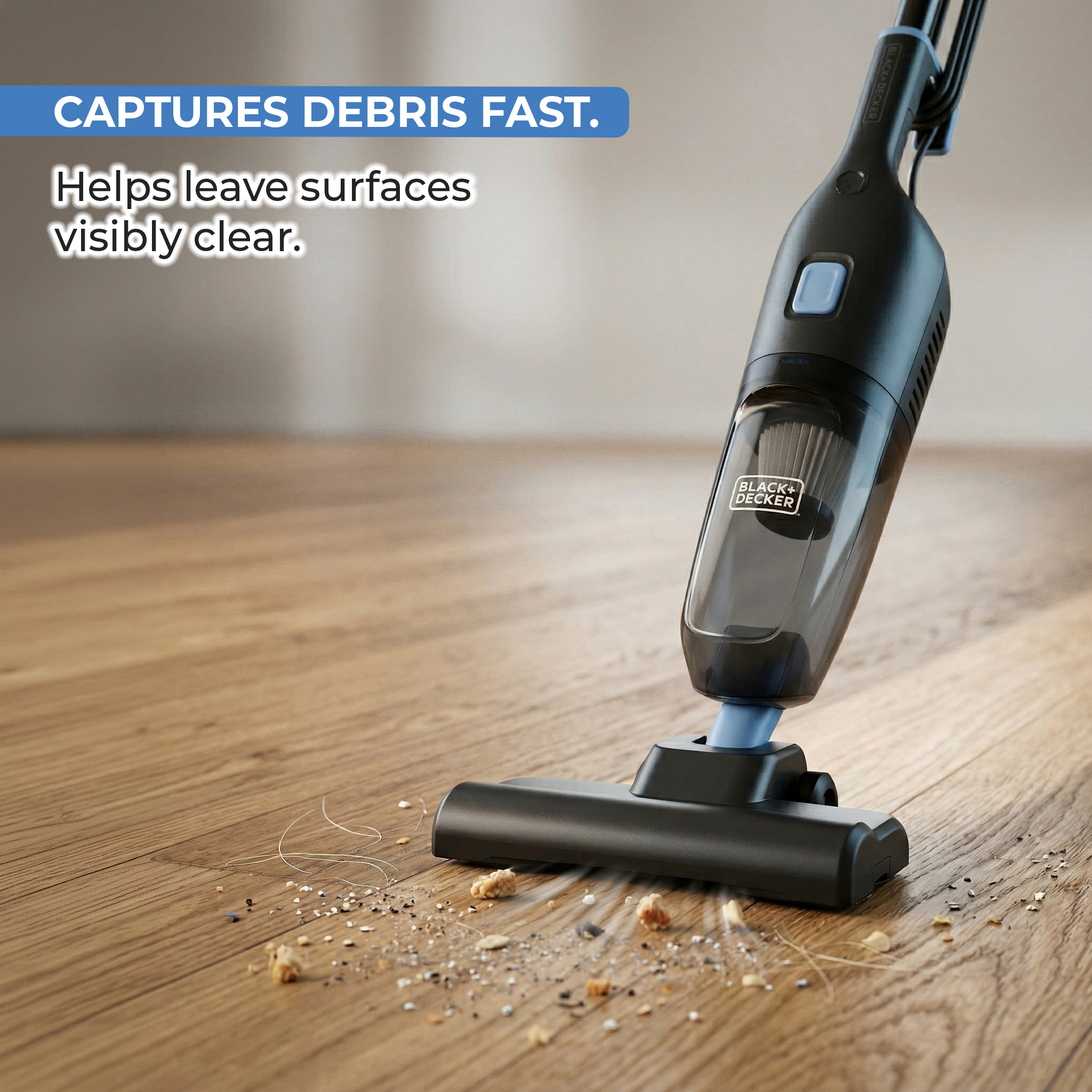
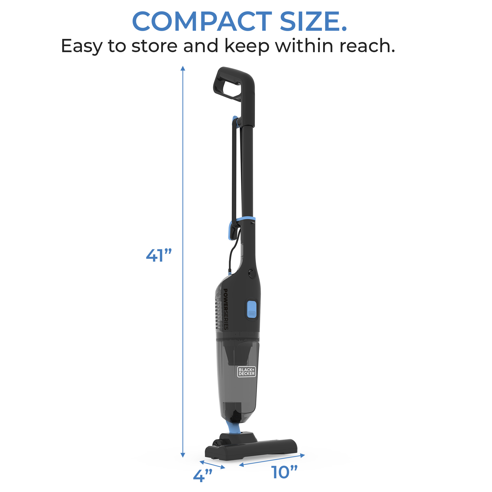
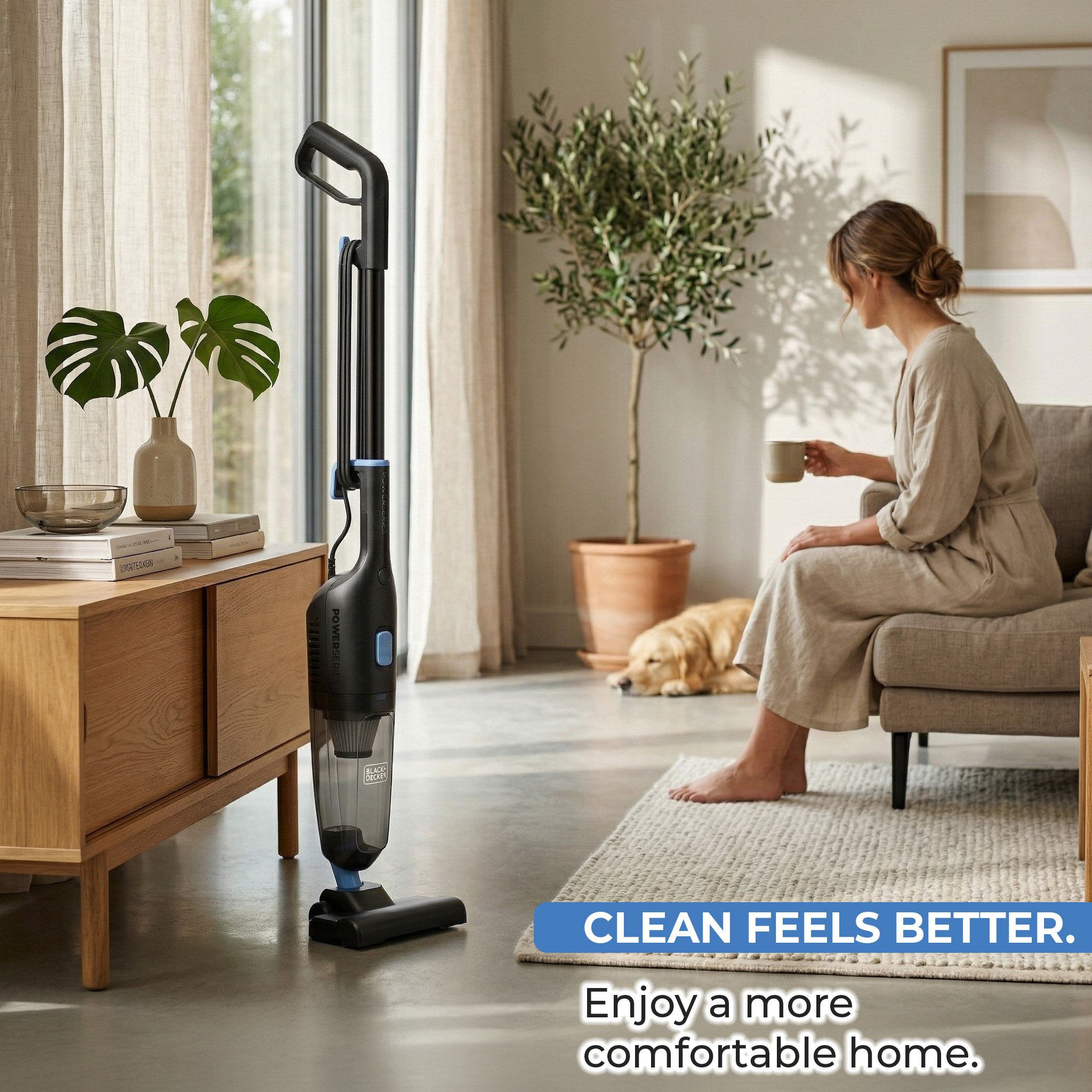
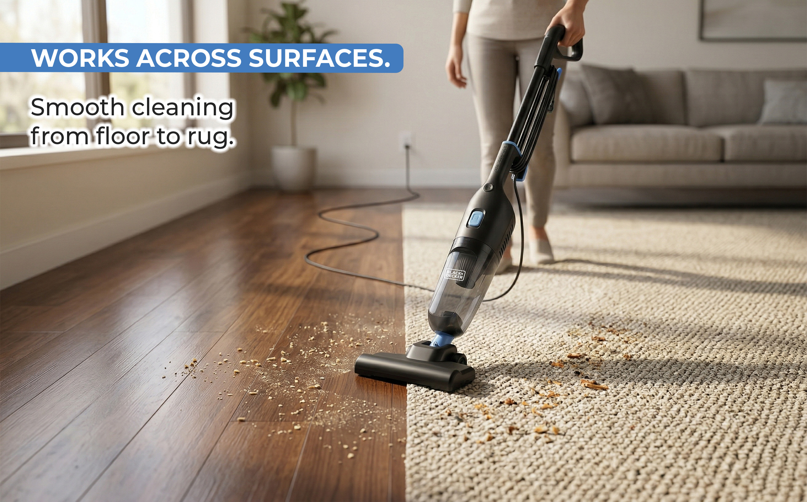
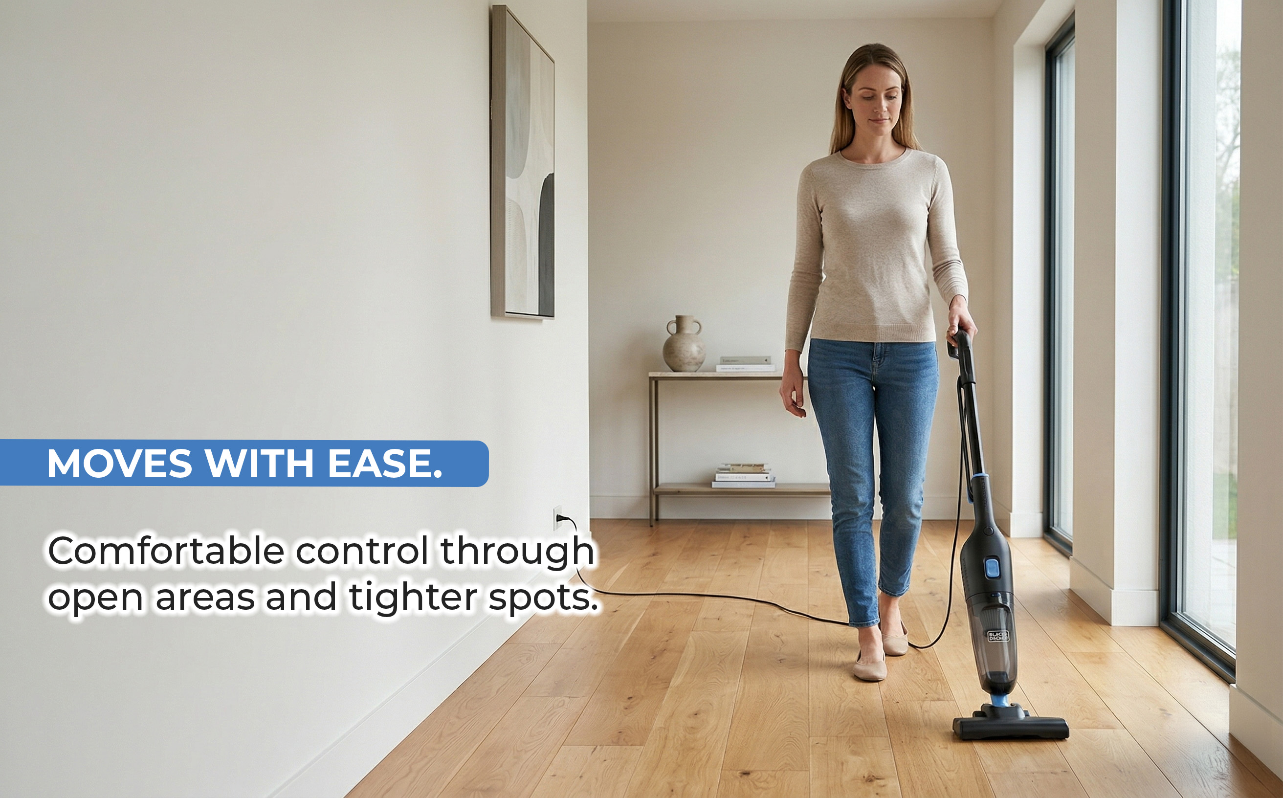
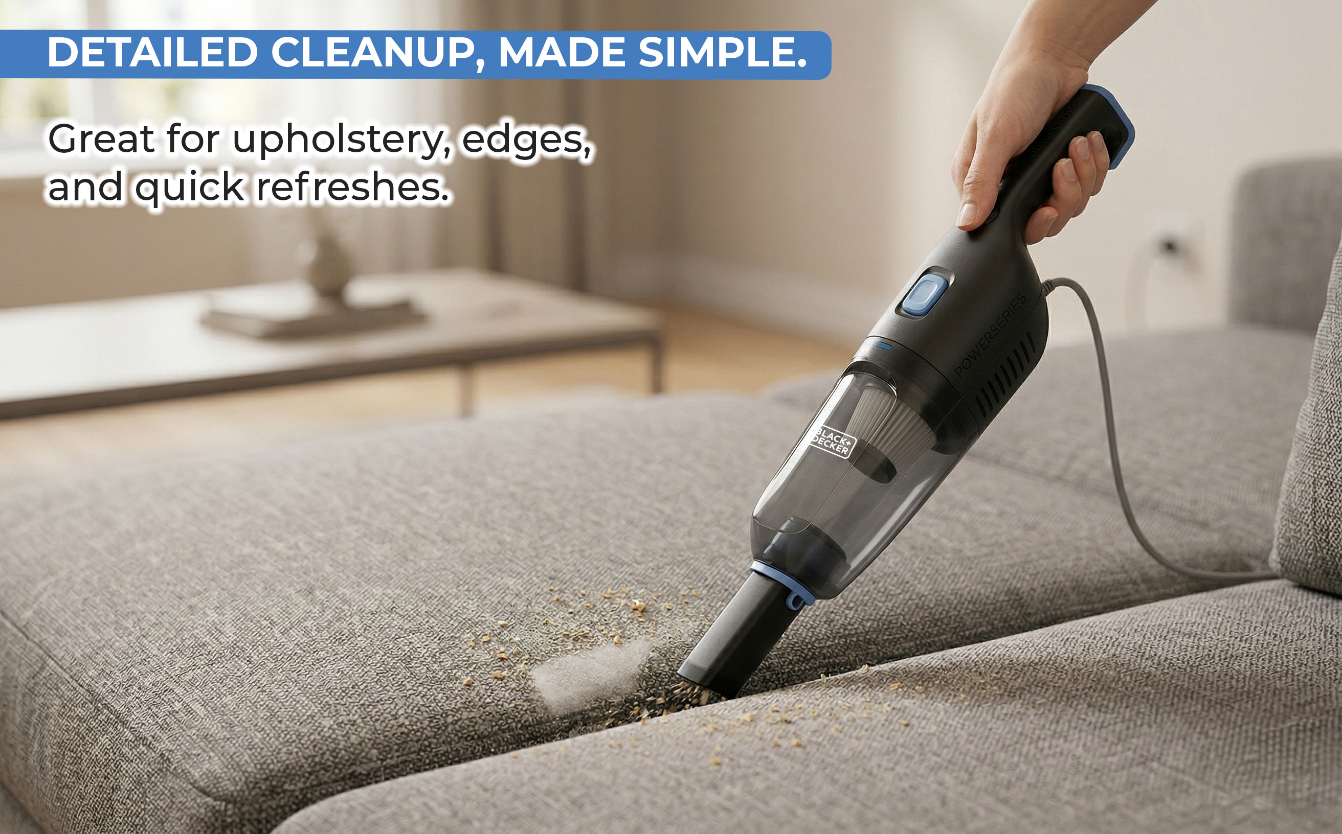
Designing within Black+Decker's established brand framework while building a complete image sequence that communicates the product's key differentiator: a full-size vacuum that converts to handheld in seconds.

Sequential Narrative
Product → use → emotional benefit. Each image answers one shopper question in the order they naturally arise during scroll.
Conversion Feature First
Dedicated image for the handheld conversion — the product's most differentiating feature communicated visually, not buried in bullet points.
Brand Alignment
Respected Black+Decker's institutional blue and badge system while elevating lifestyle photography to a premium home environment standard.
06
Global Brand Brand Intelligence Creative Strategy PDP + A+ Banners
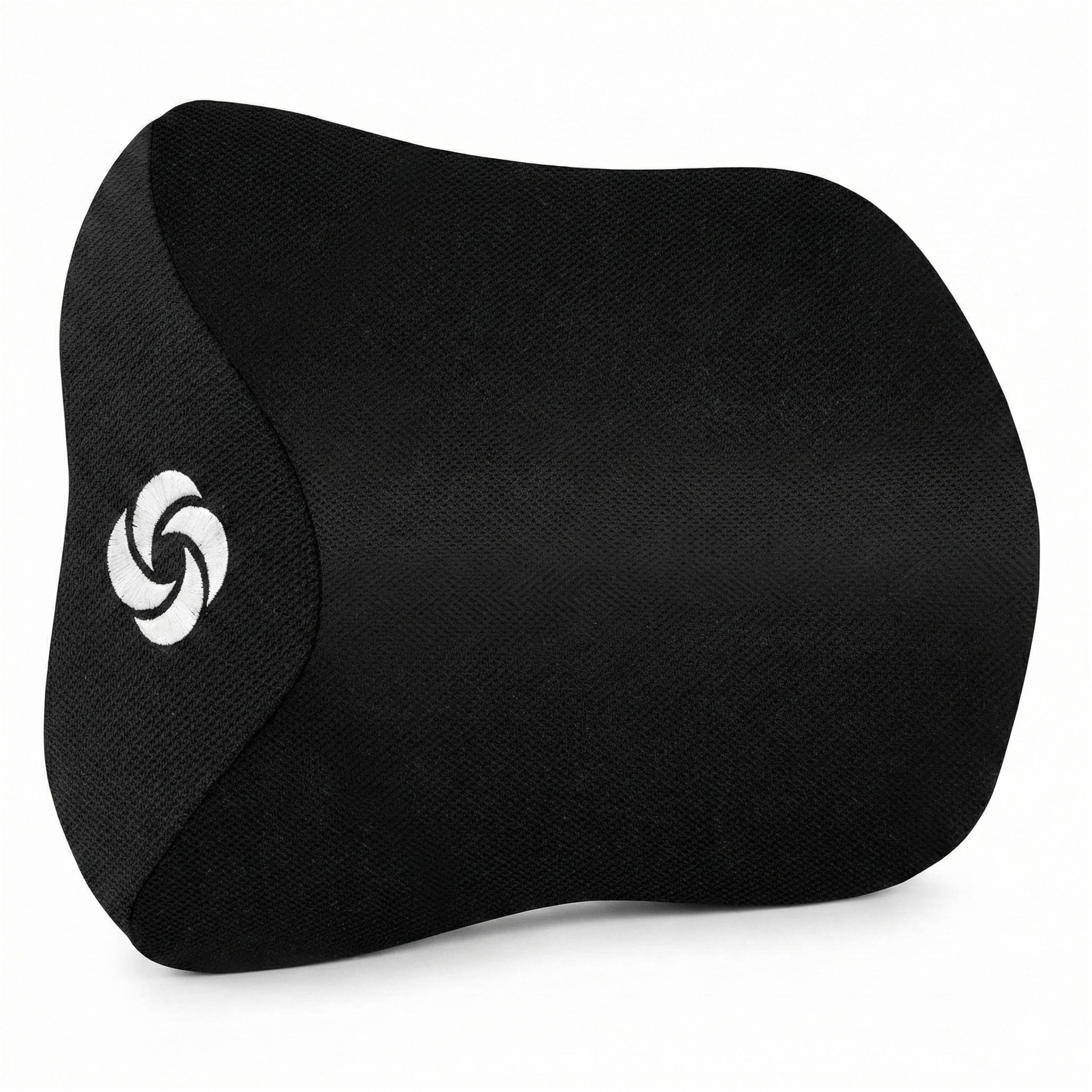
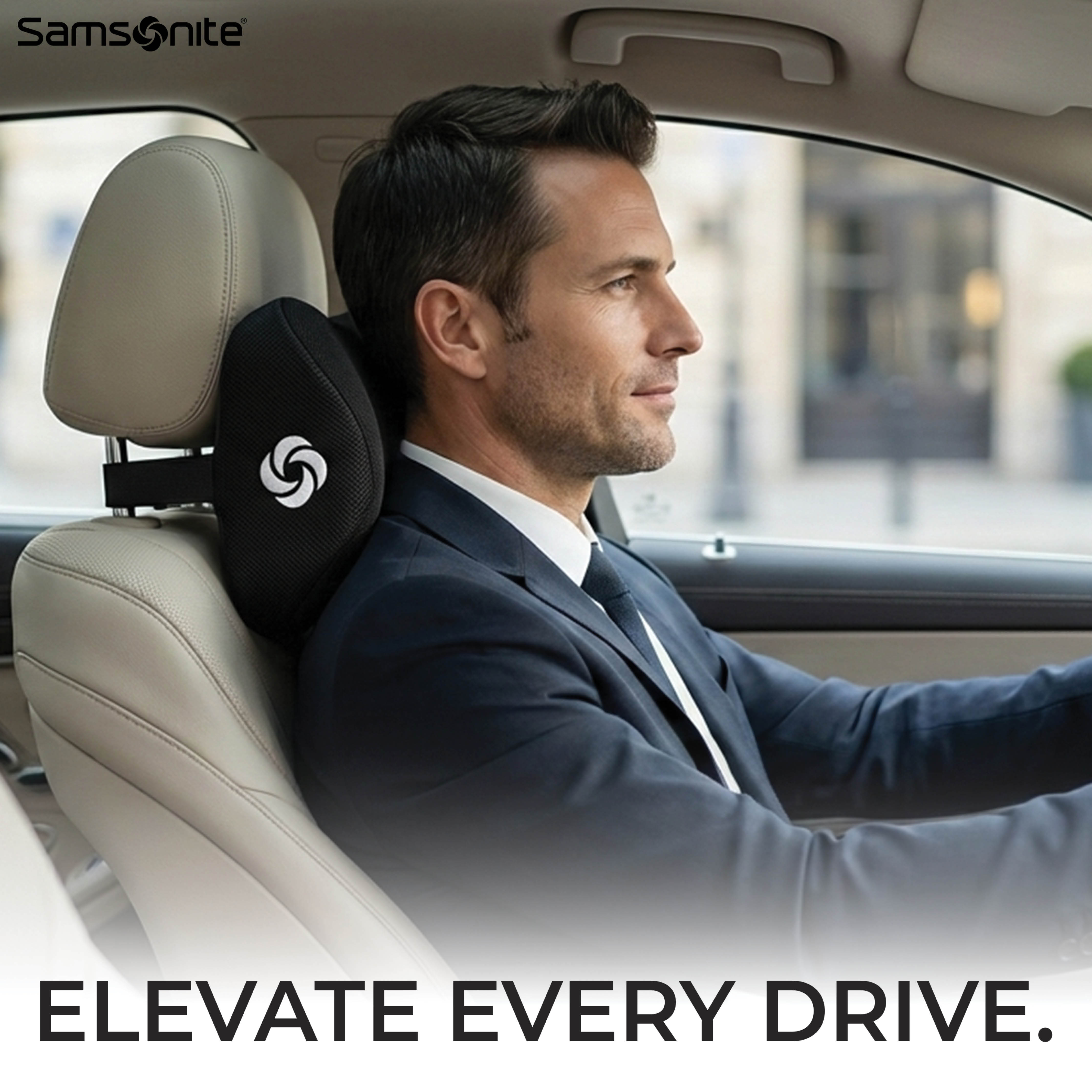
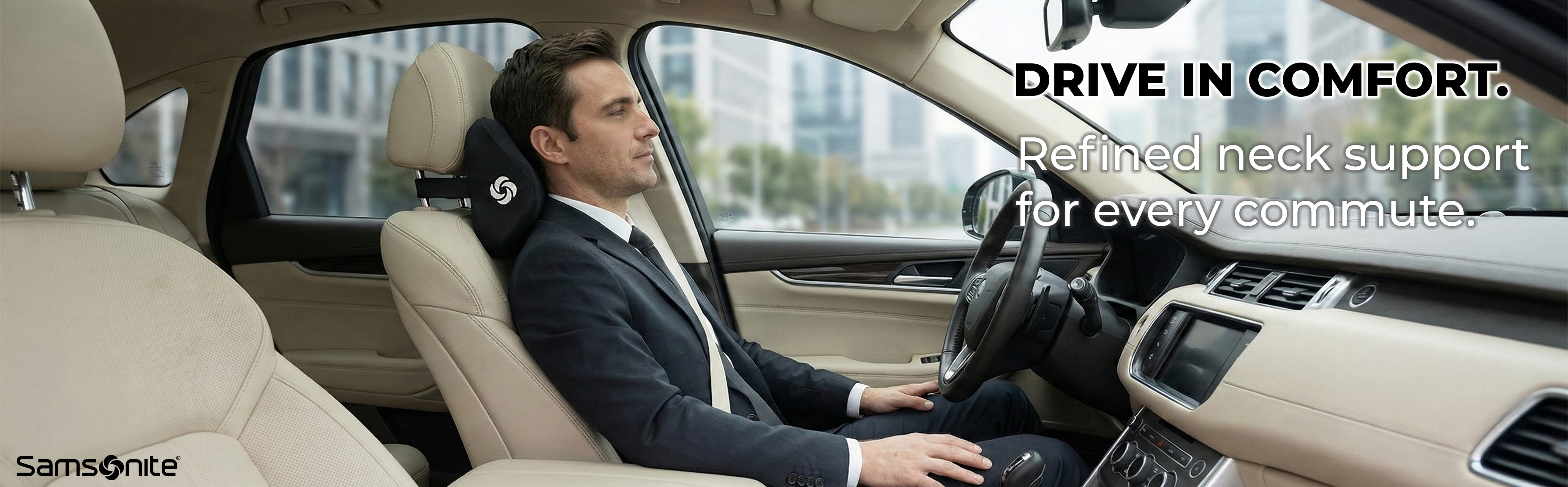
Samsonite
Neck Support Pillow — Full Amazon Listing
Hero
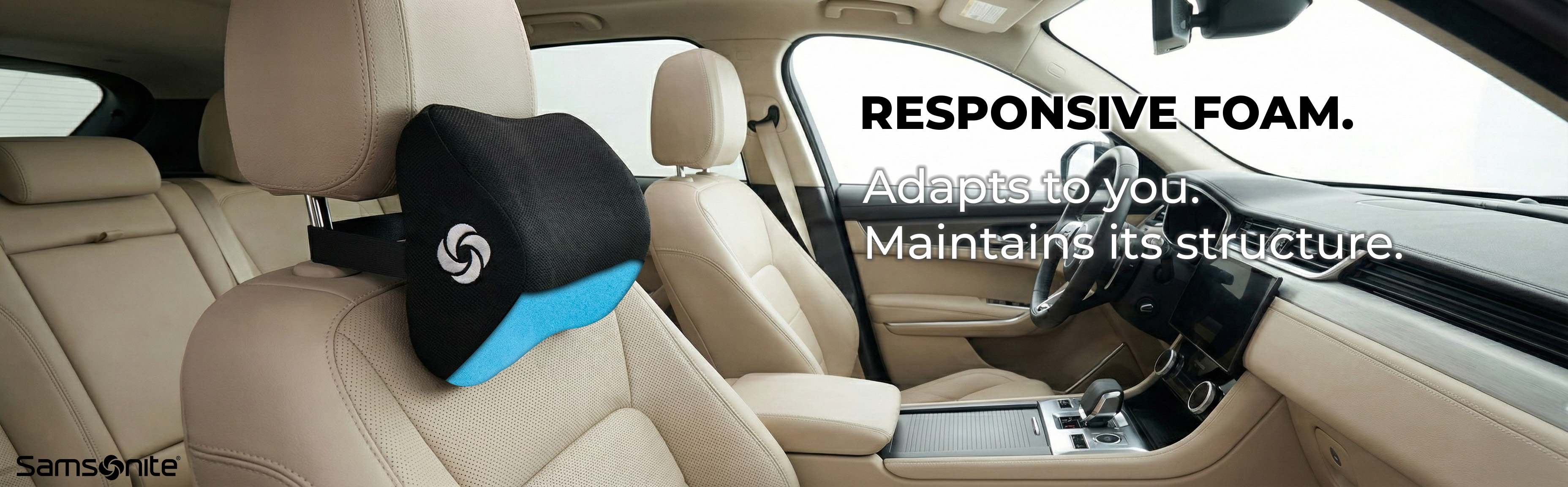
In-car use
A+ banner 001
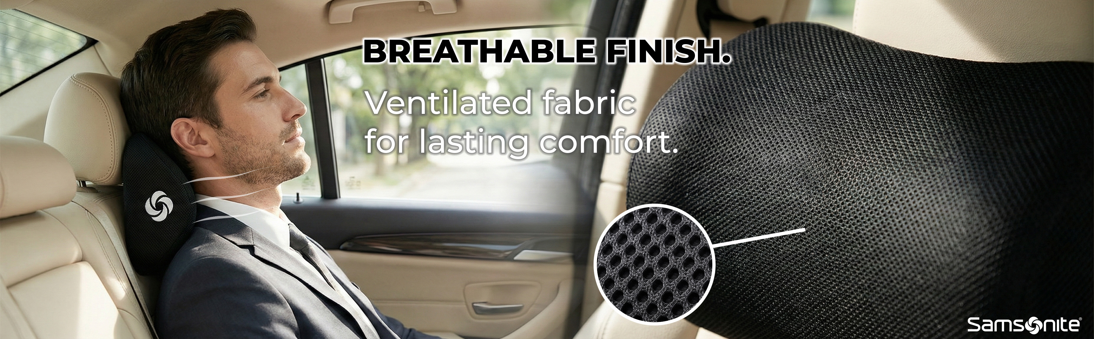
Fabric detail
The Challenge

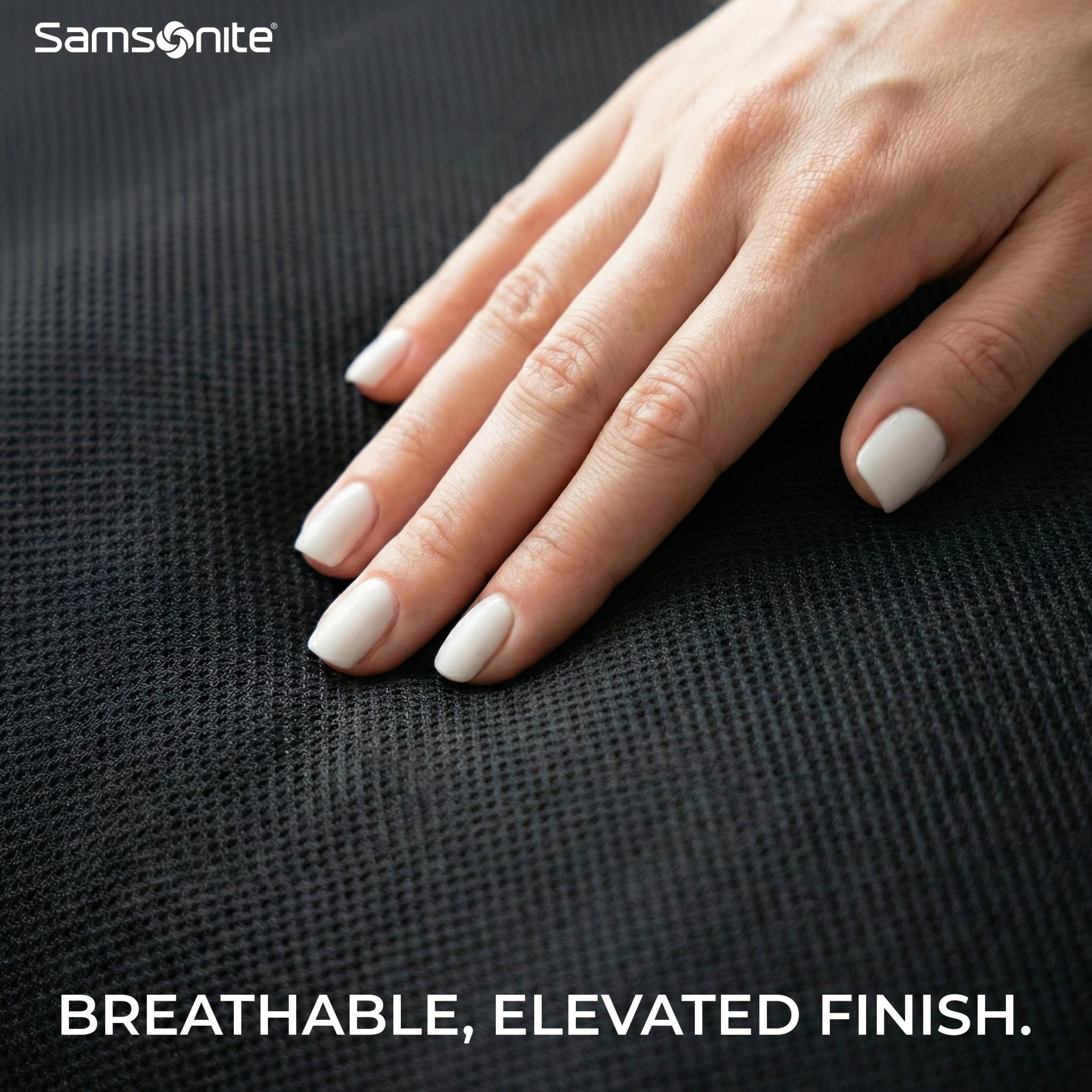
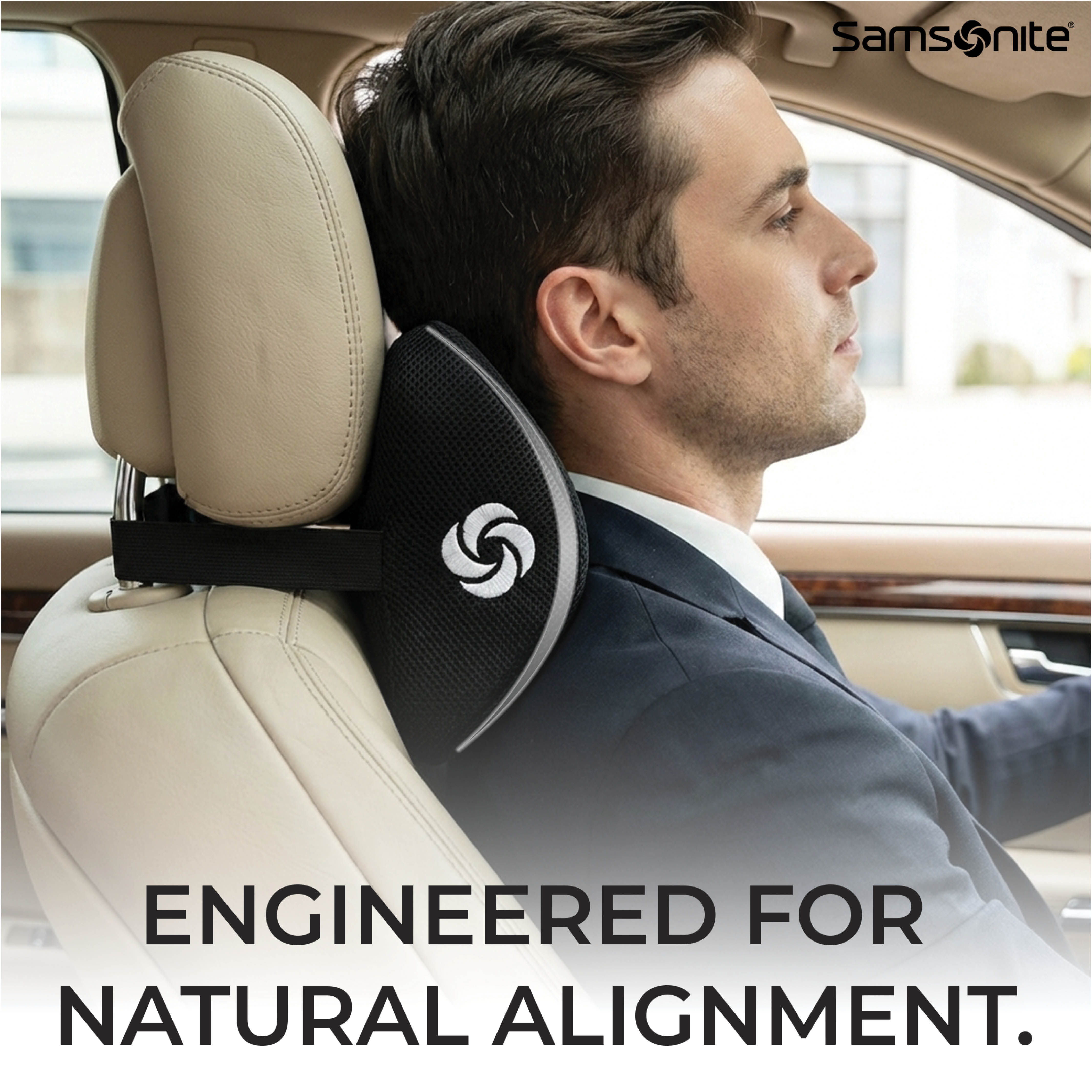
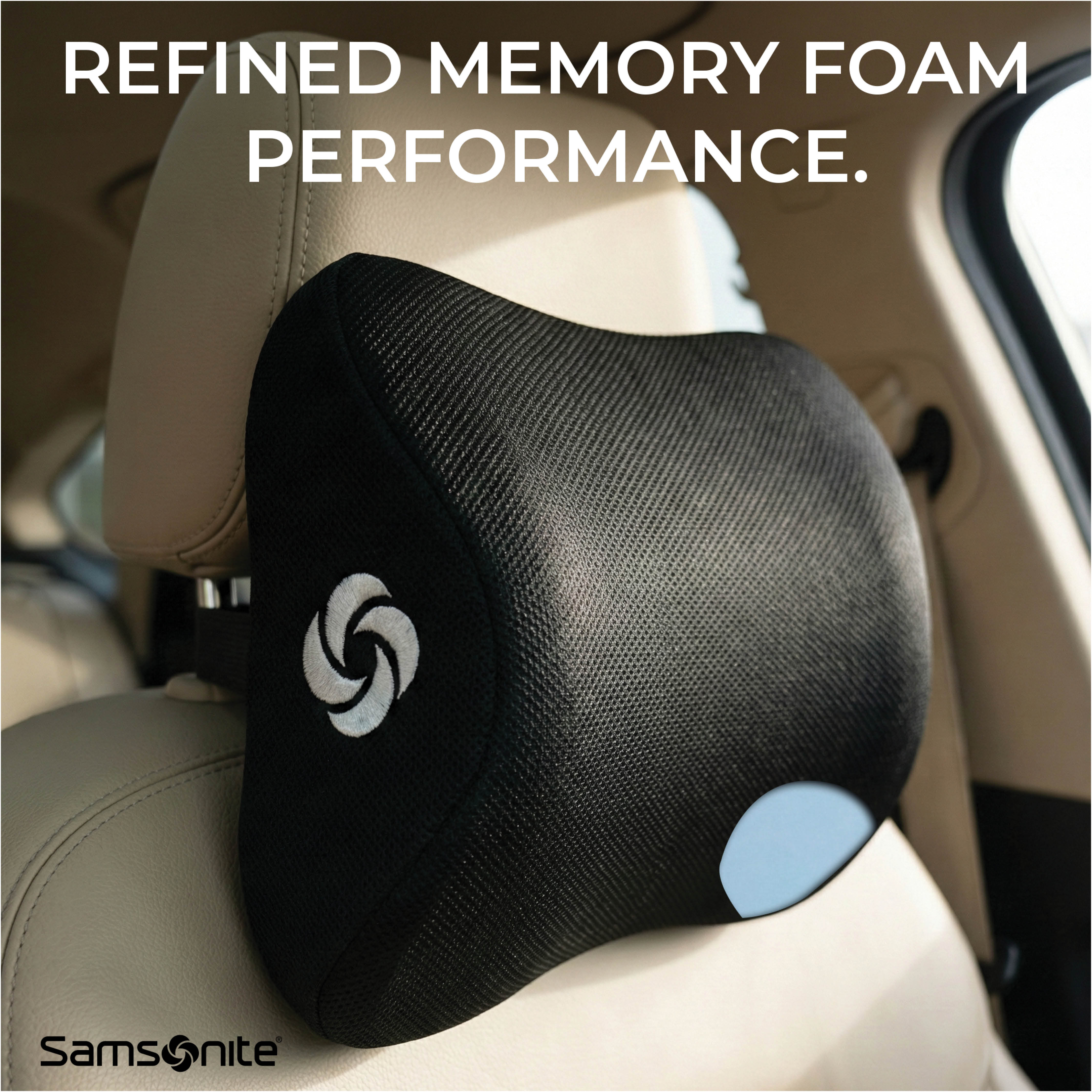
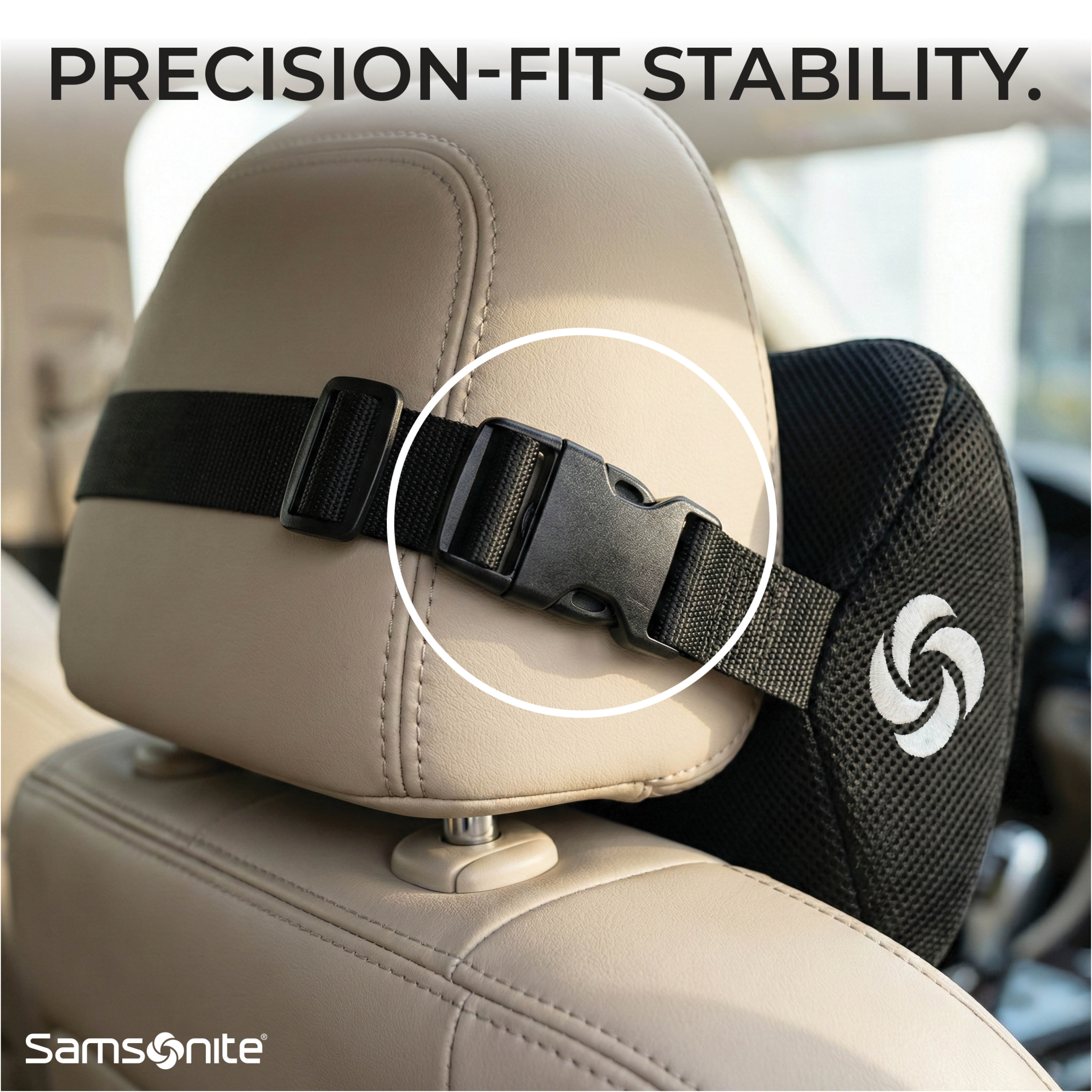
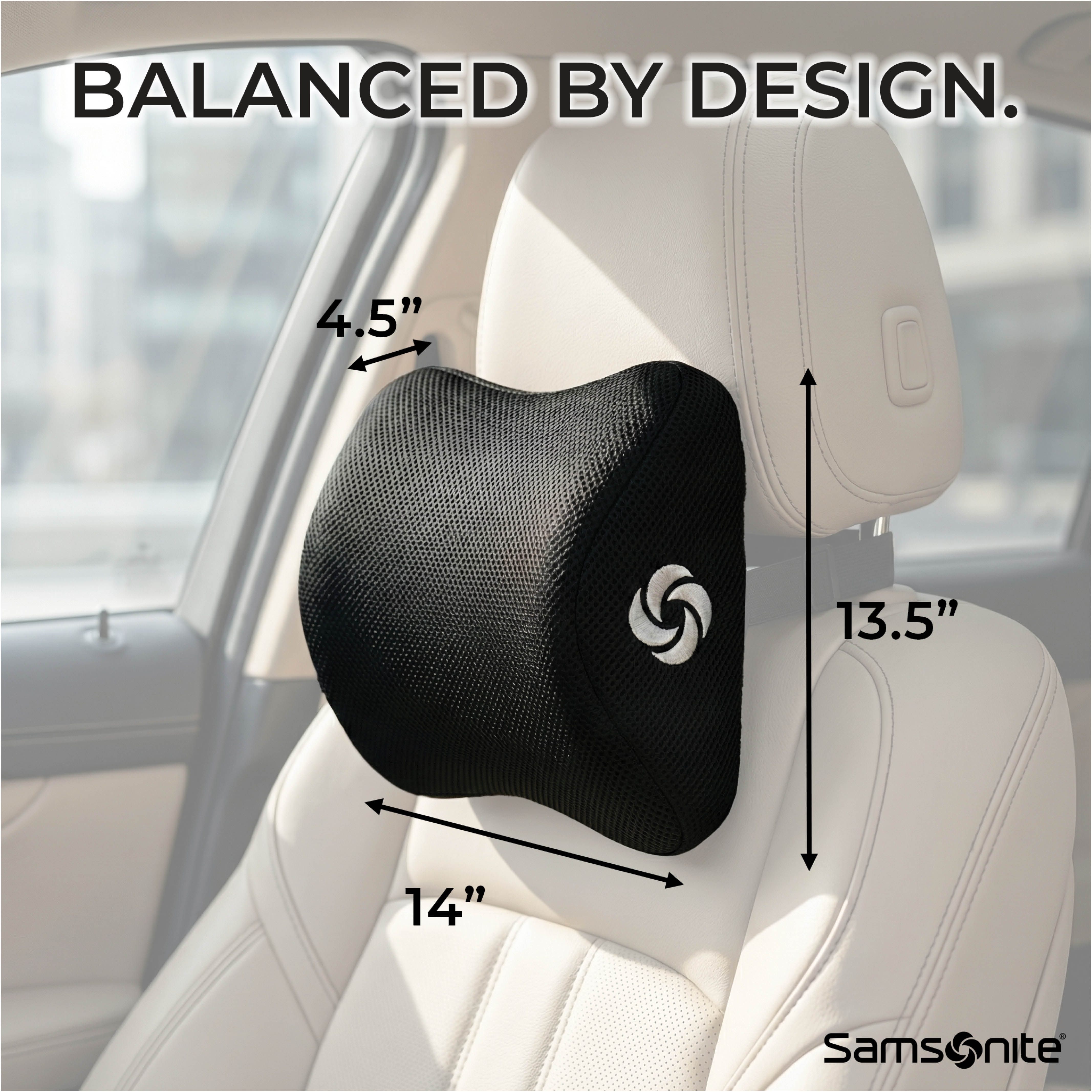
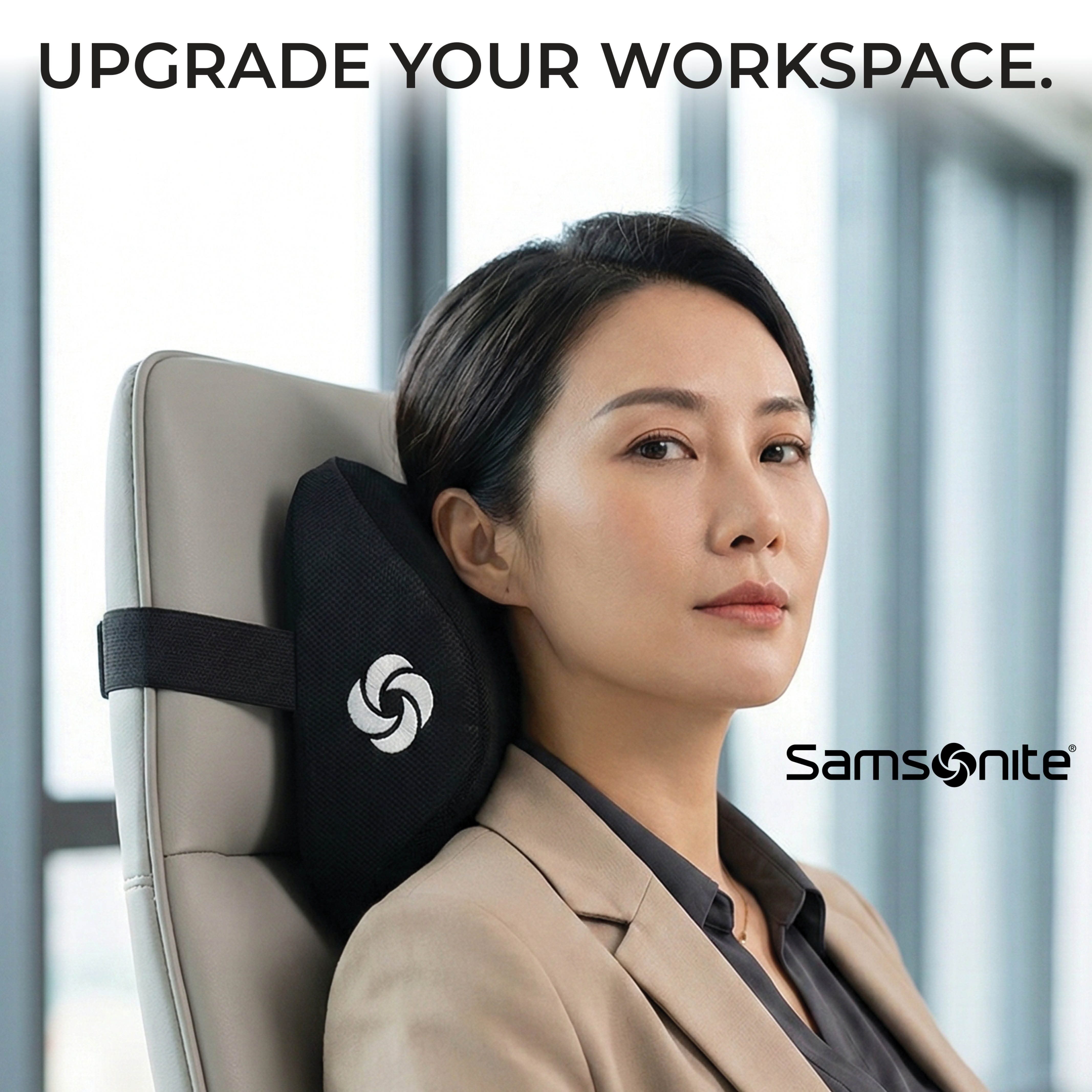
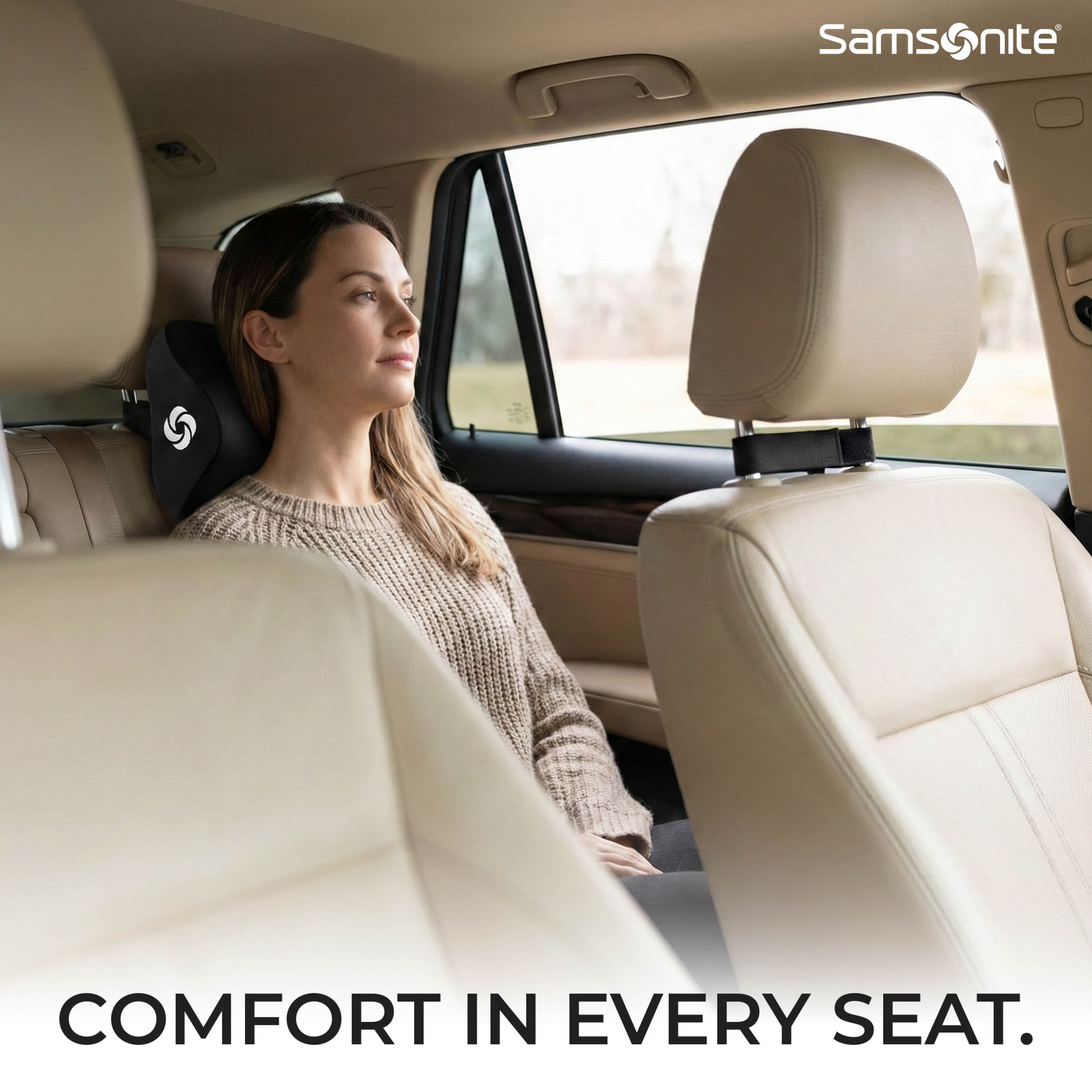
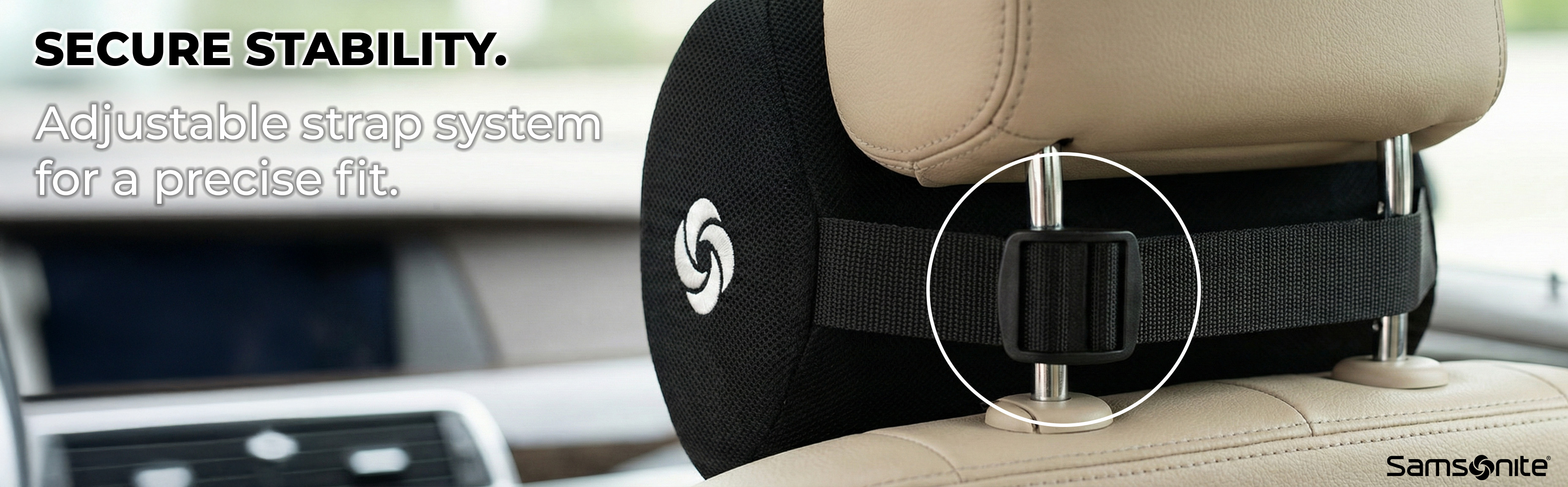
Designing for Samsonite with no style guide — only a product image. I decoded the brand's visual DNA from their existing presence and built a 15-image system that respects one of the world's most recognized premium brands, using brand intelligence as the only guide.

Brand Stewardship
Reverse-engineered Samsonite's three pillars — precision, mobility, quiet confidence — and filtered every creative decision through that lens without a single briefing document.
Multi-Context Use Cases
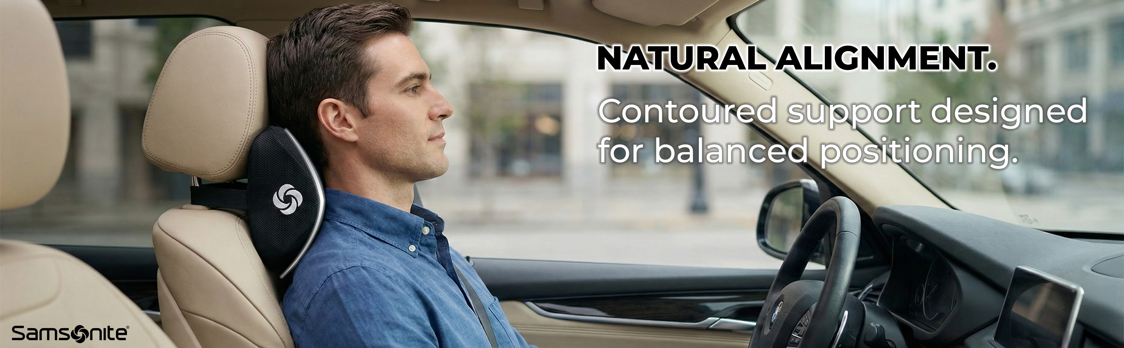
Car driver, passenger seat, and office chair — expanding perceived value beyond "car accessory" to justify the Samsonite price premium.
Cinematic A+ Banners
Full-bleed automotive photography that reads like brand campaign advertising — not typical e-commerce A+ content.
07
Global Brand Brand Intelligence PDP + A+ Technical Design
Goodyear
Lumbar Support Pillow — Full Amazon Listing
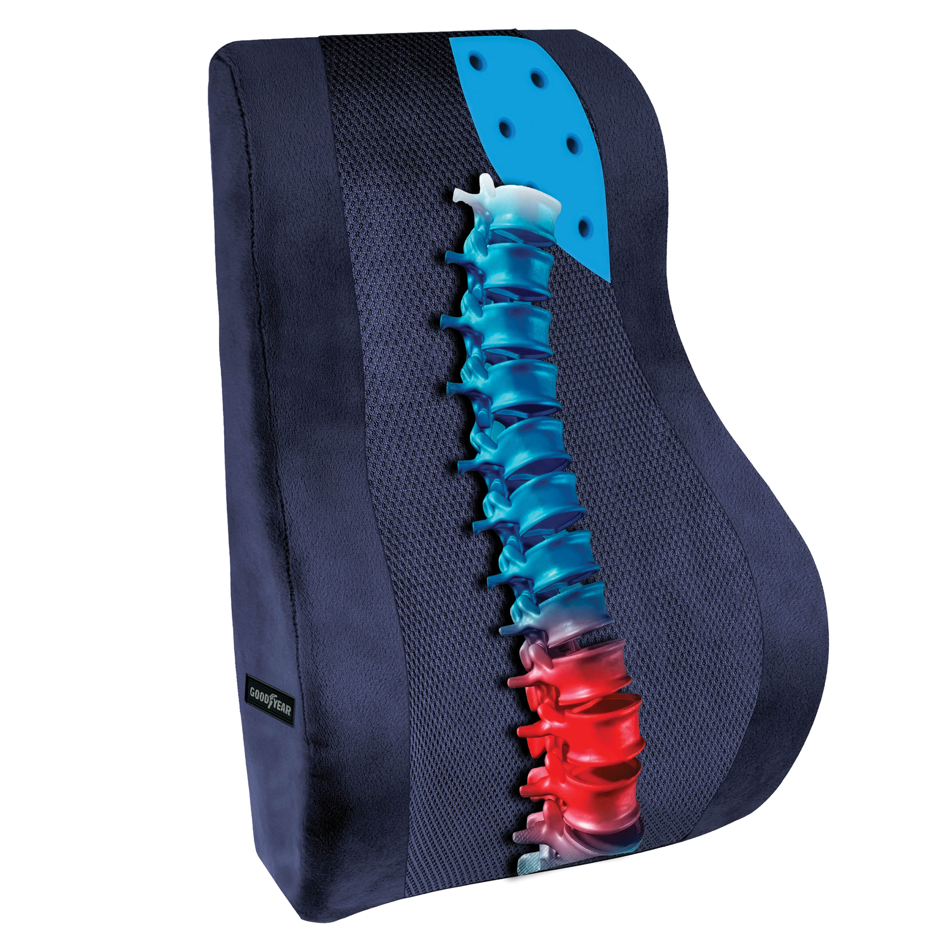
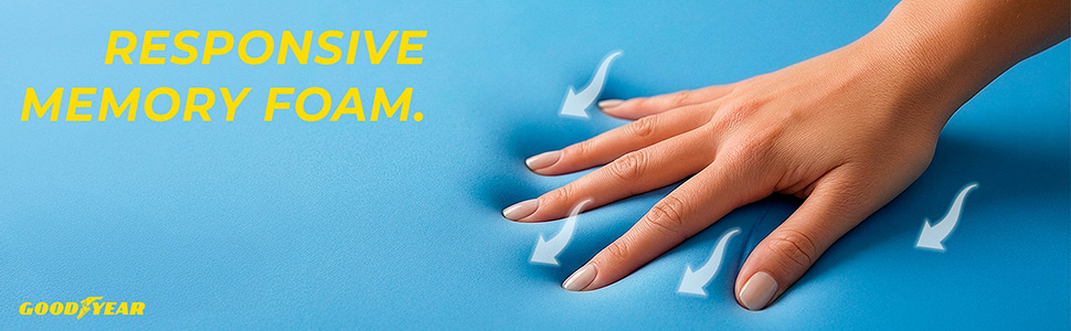
Hero with spine
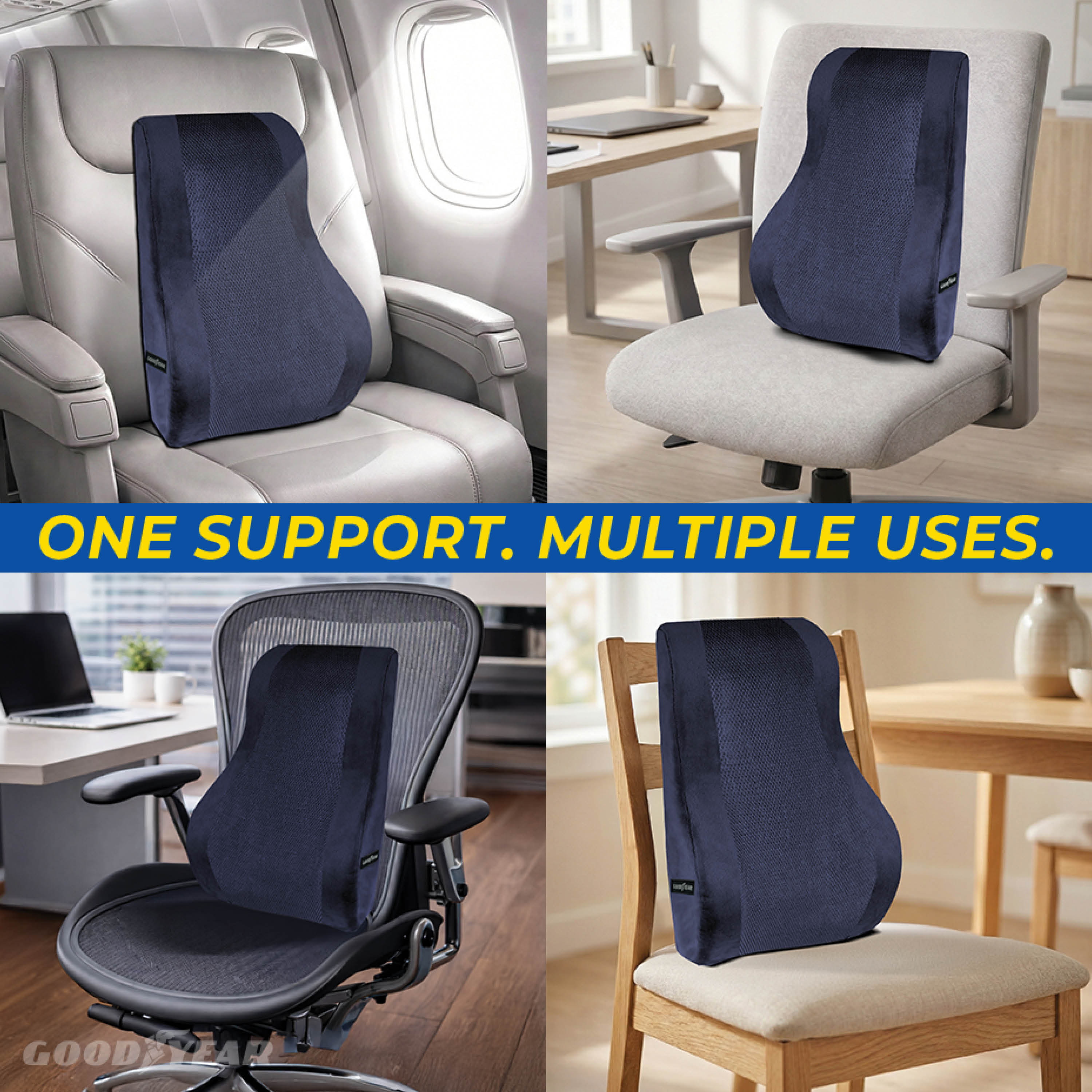
Multi-use grid
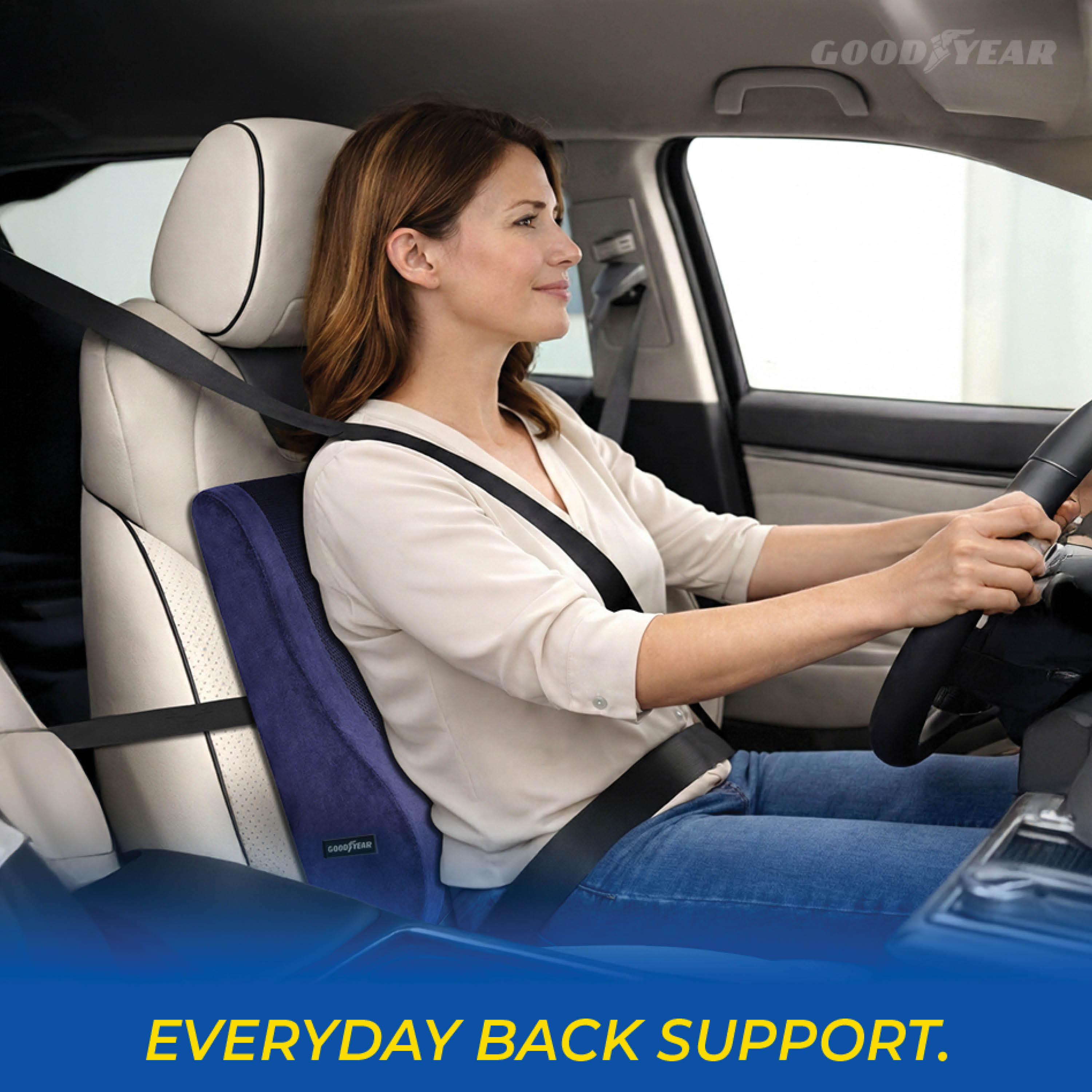
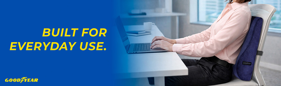
In-car use
The Challenge

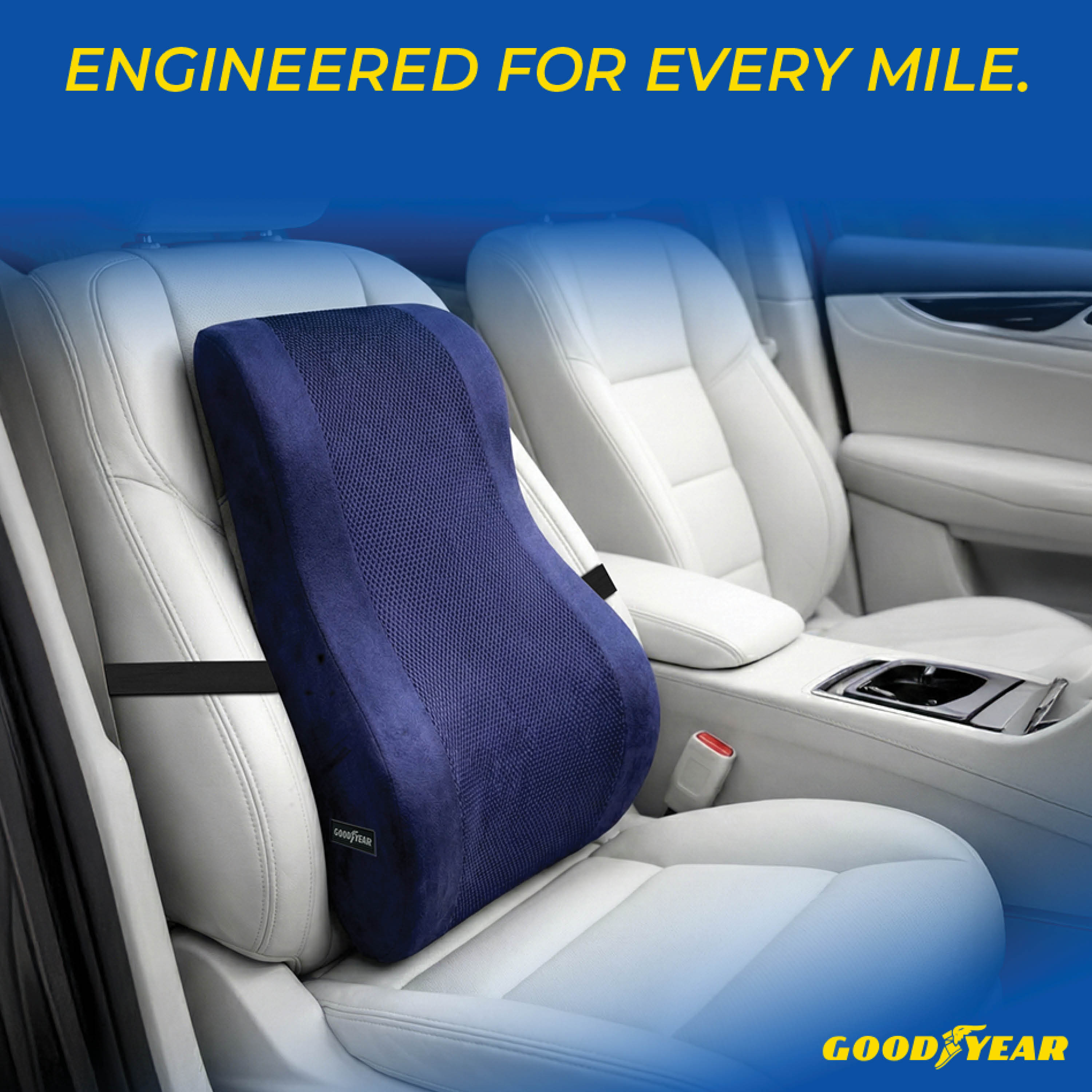
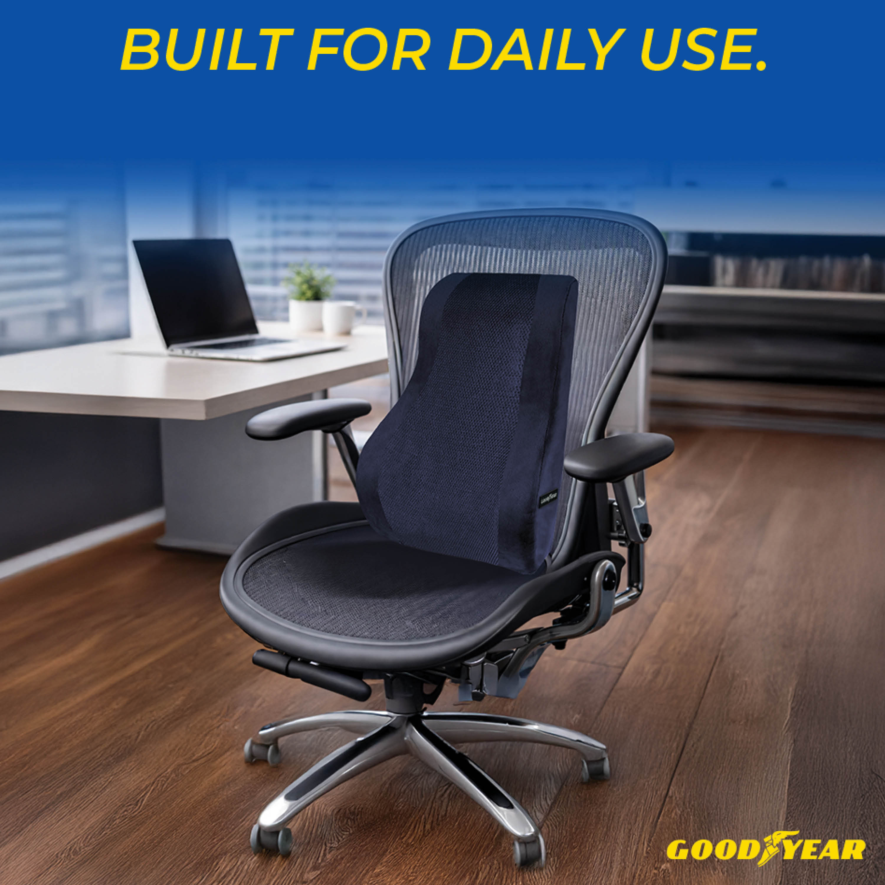
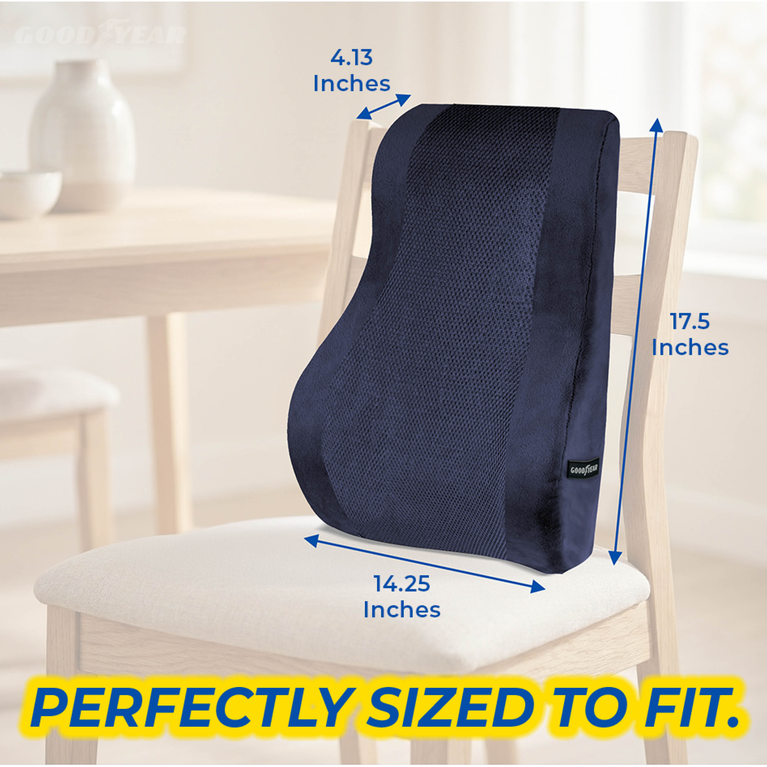
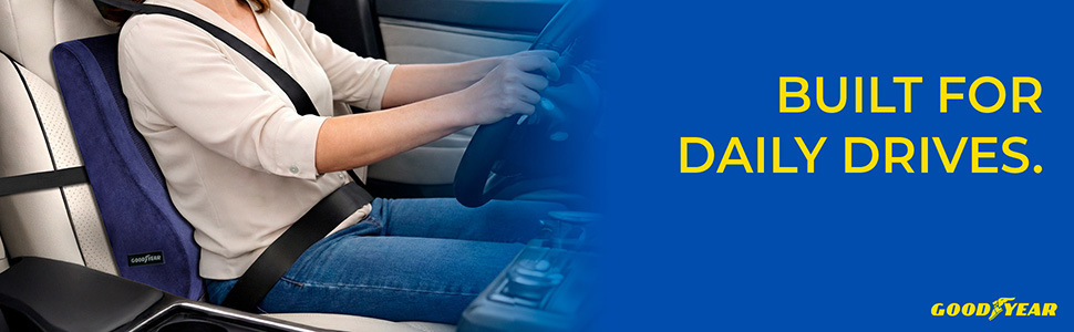
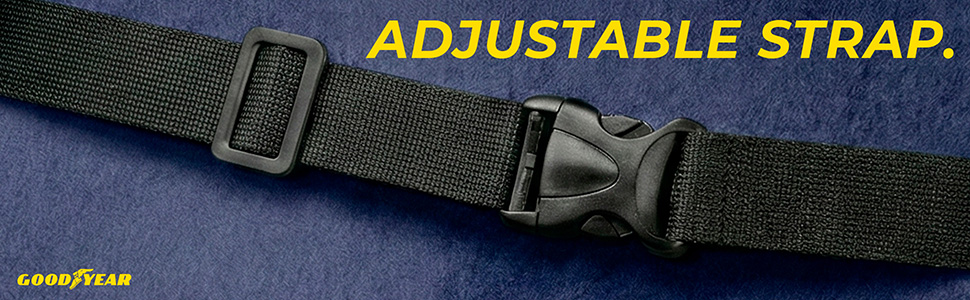
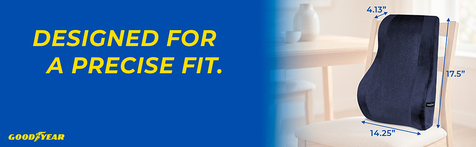
Adapting Goodyear's automotive performance identity to a comfort product — bridging engineering credibility with everyday usability. Starting from one product image, I translated tire-brand energy into ergonomic language without losing the brand's iconic identity.

Hero as Concept
A 3D spine illustration overlaid on the product — upper vertebrae in blue (alignment), lumbar in red (pain point) — engineering language applied to human anatomy.

Performance Vocabulary
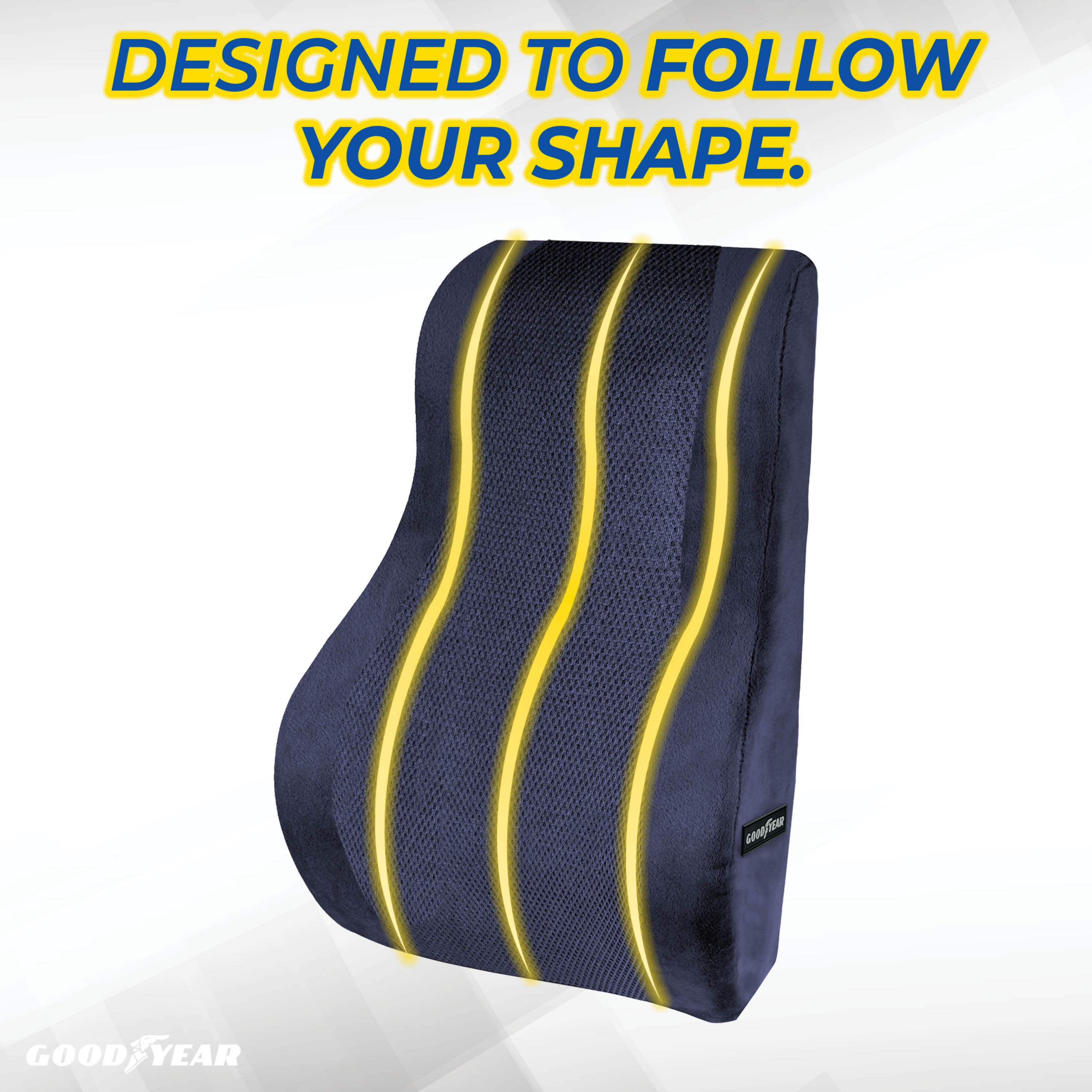
Glowing contour lines, motion arrows, bold italic yellow headlines — Goodyear's automotive tech language adapted to communicate ergonomic performance.

Category Expansion
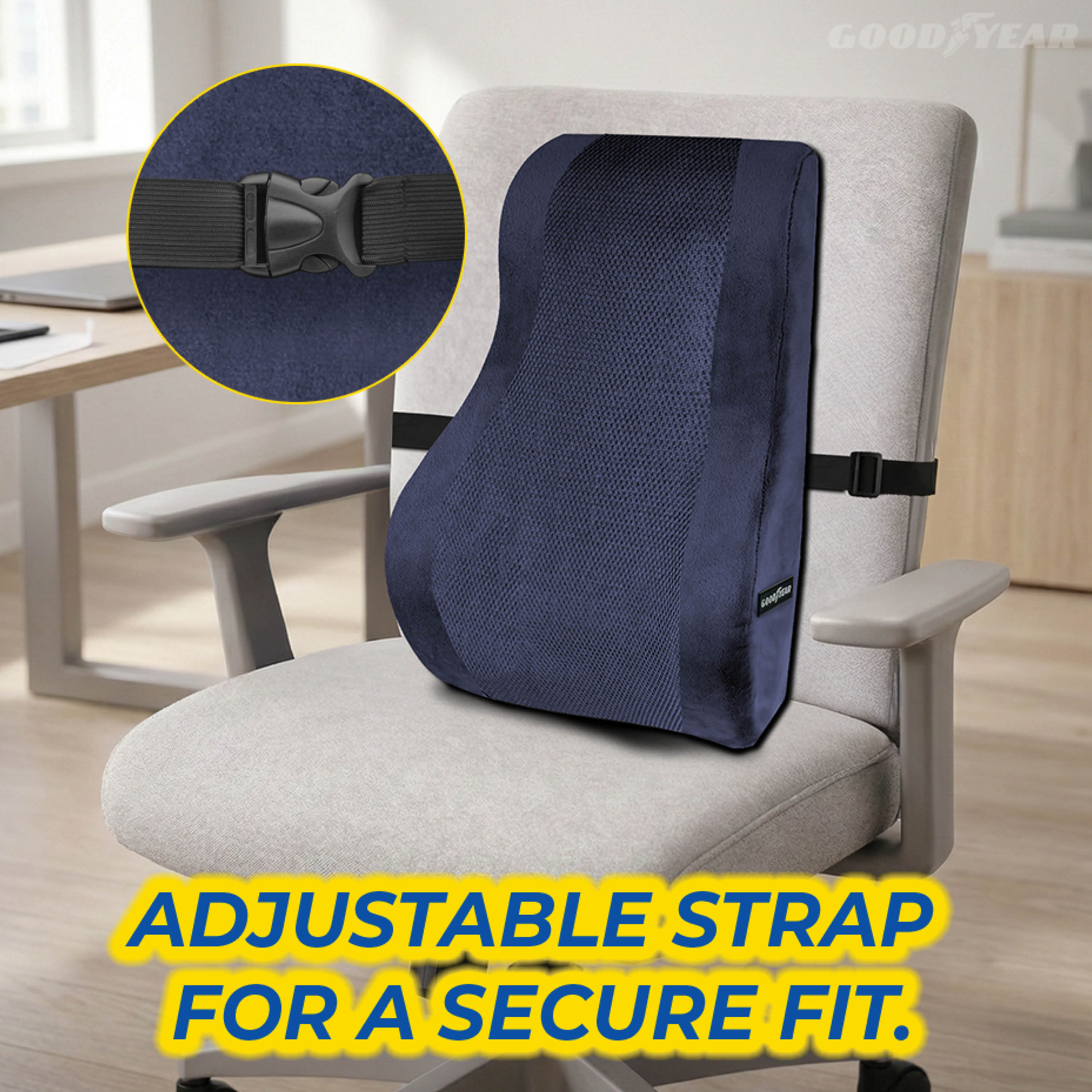
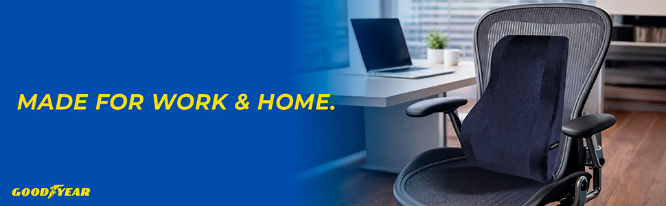
4-context grid showing airplane, office chair, ergonomic desk chair, and dining chair — one image that multiplies perceived value simultaneously.
08
Global Brand Brand Intelligence Walmart Listing PDP Design
Goodyear
Steering Wheel Cover — Full Walmart Listing
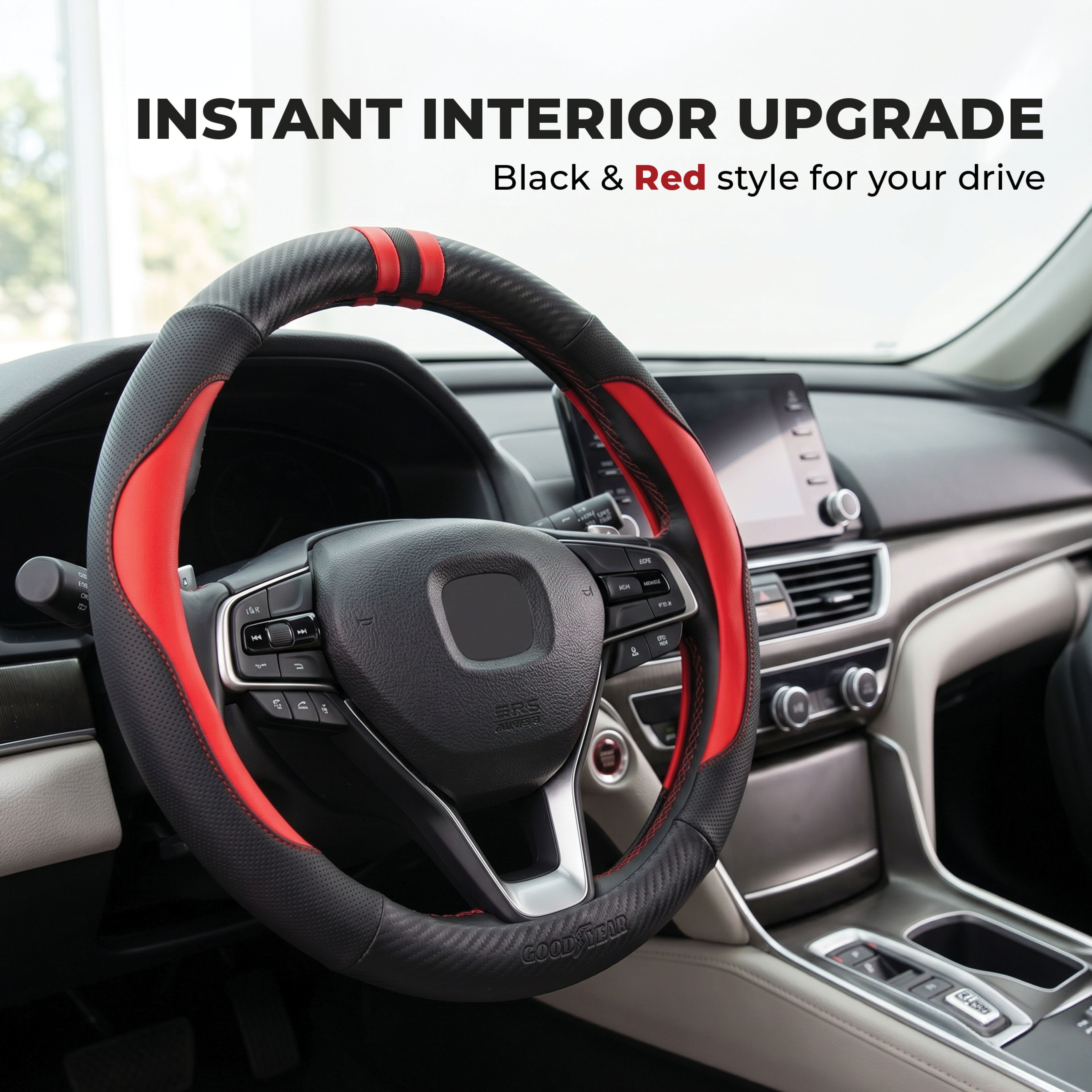
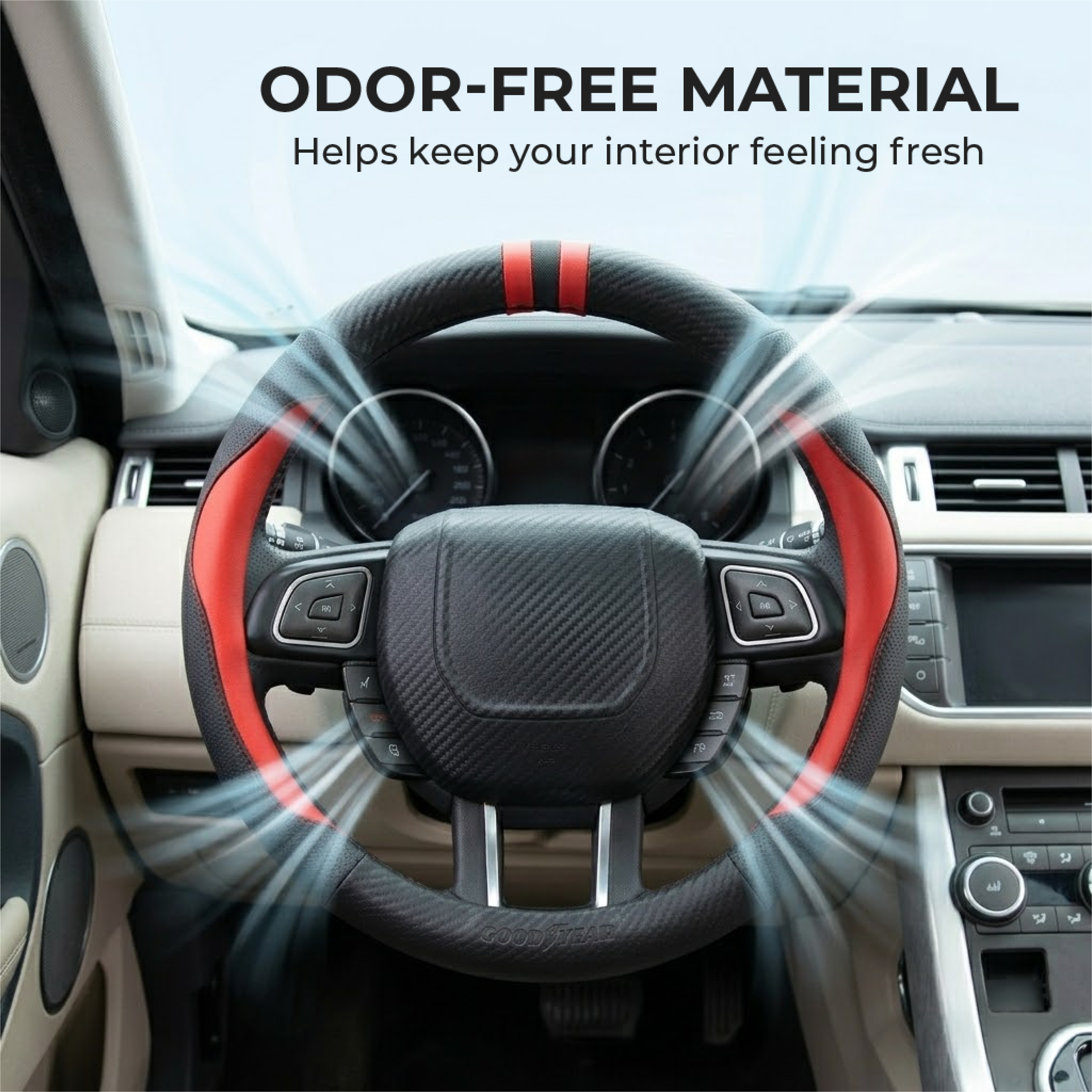
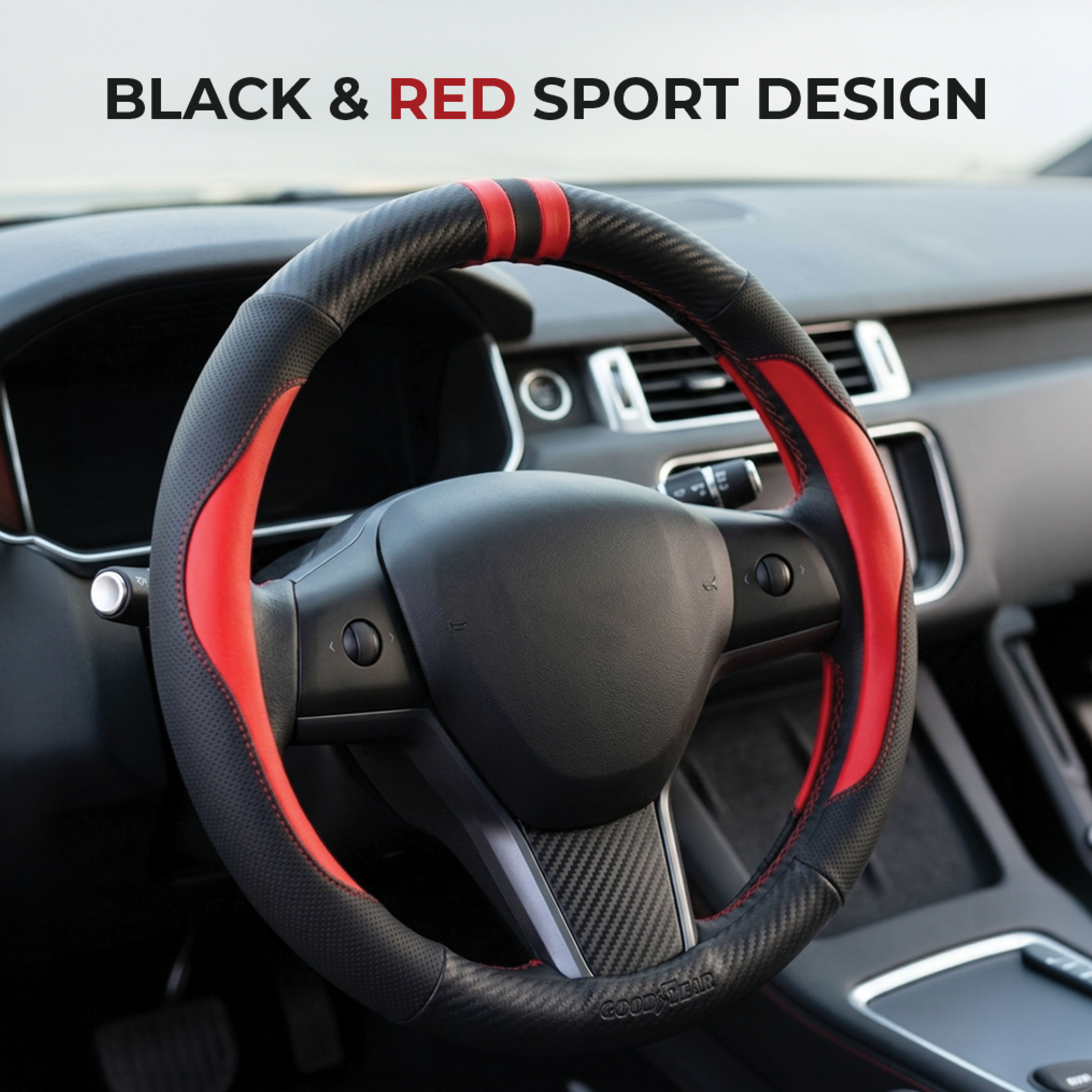
Interior lifestyle
Before & After
Grip close-up
The Challenge

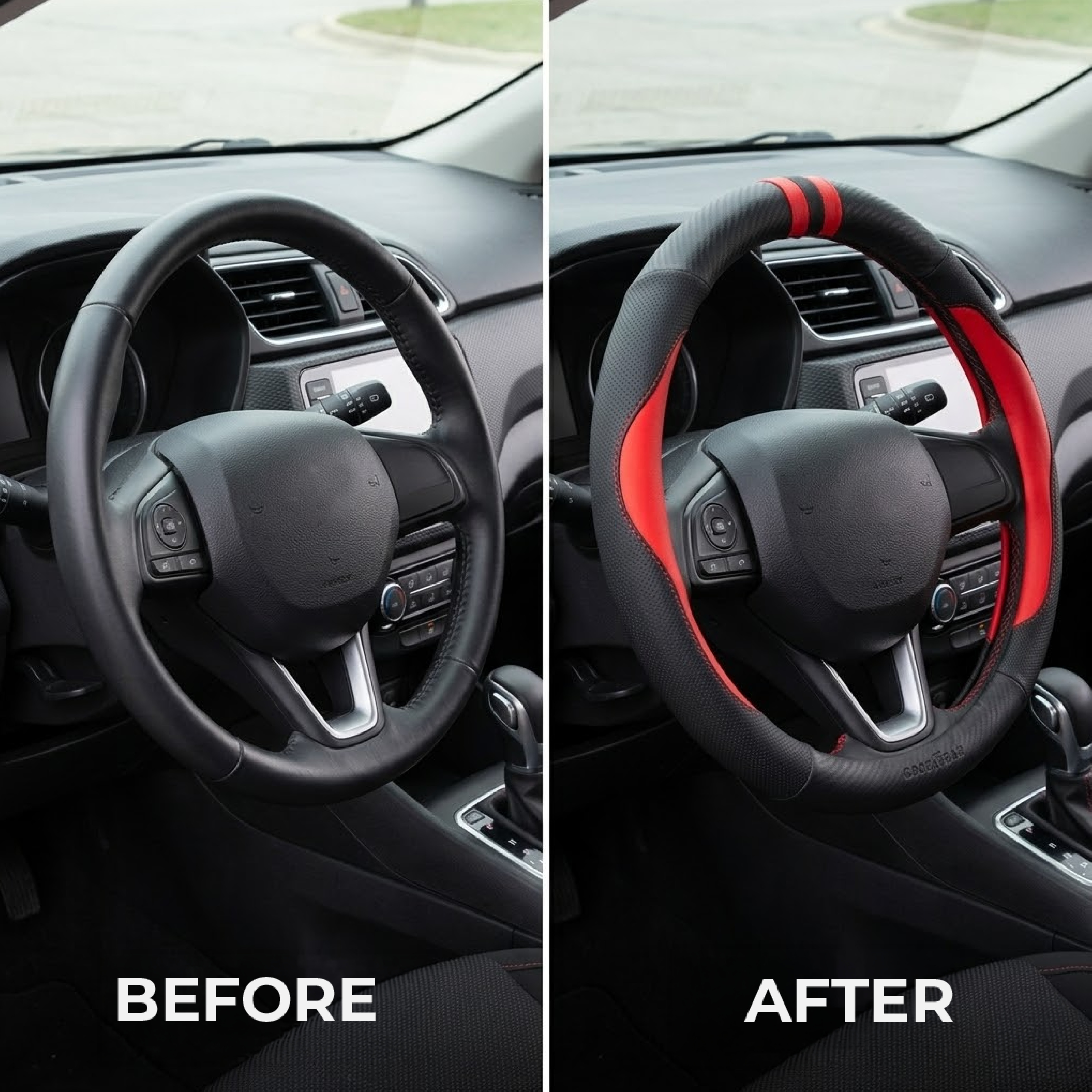
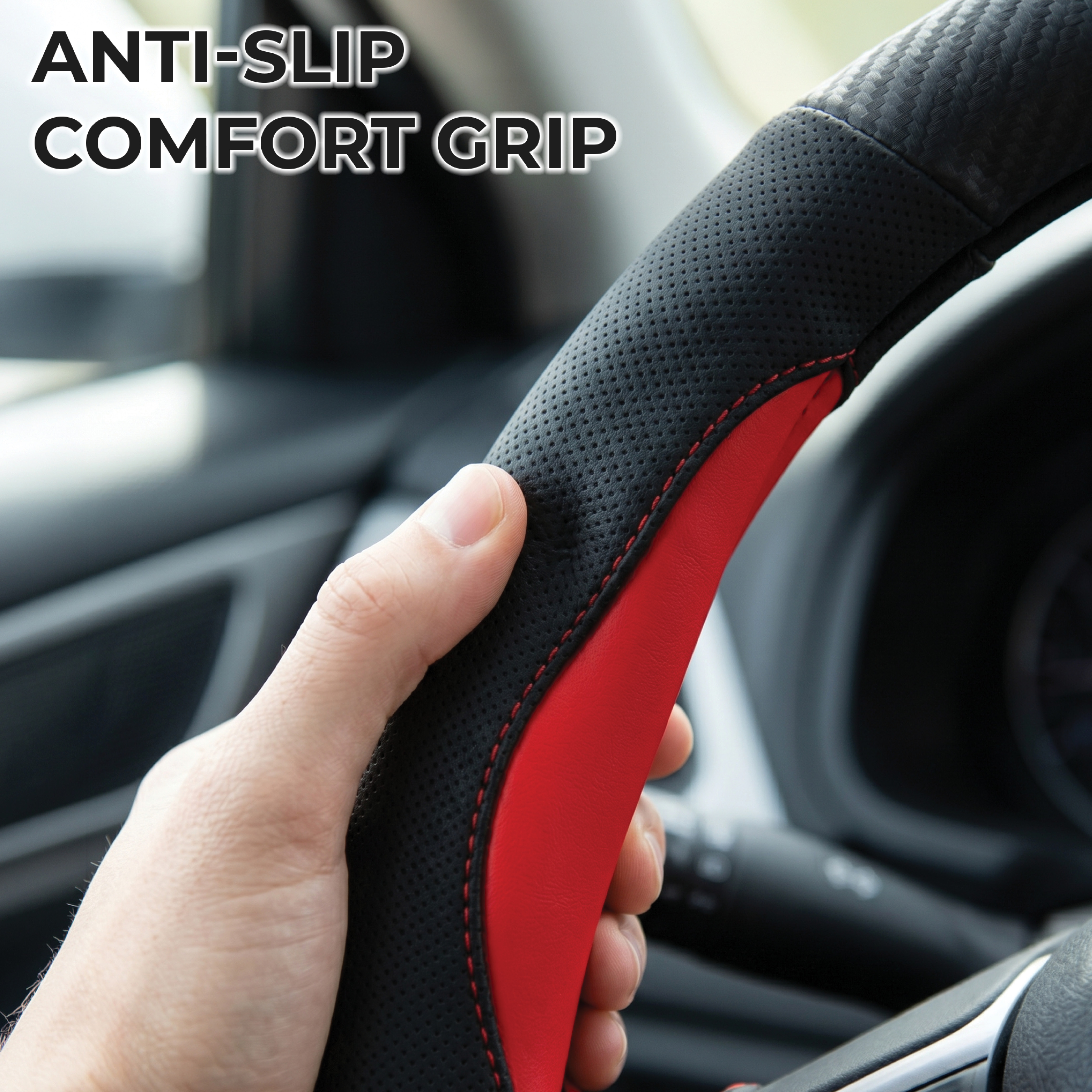
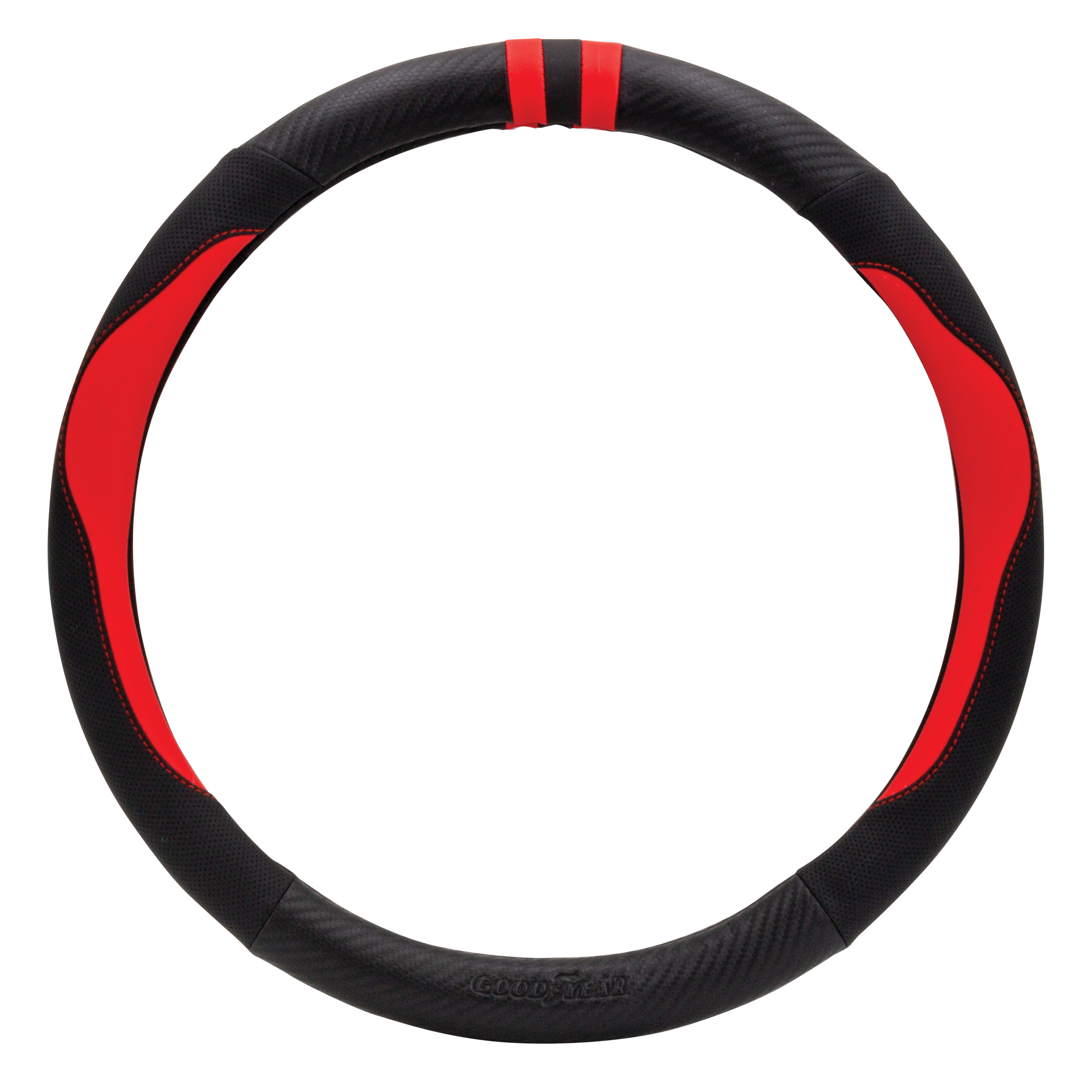
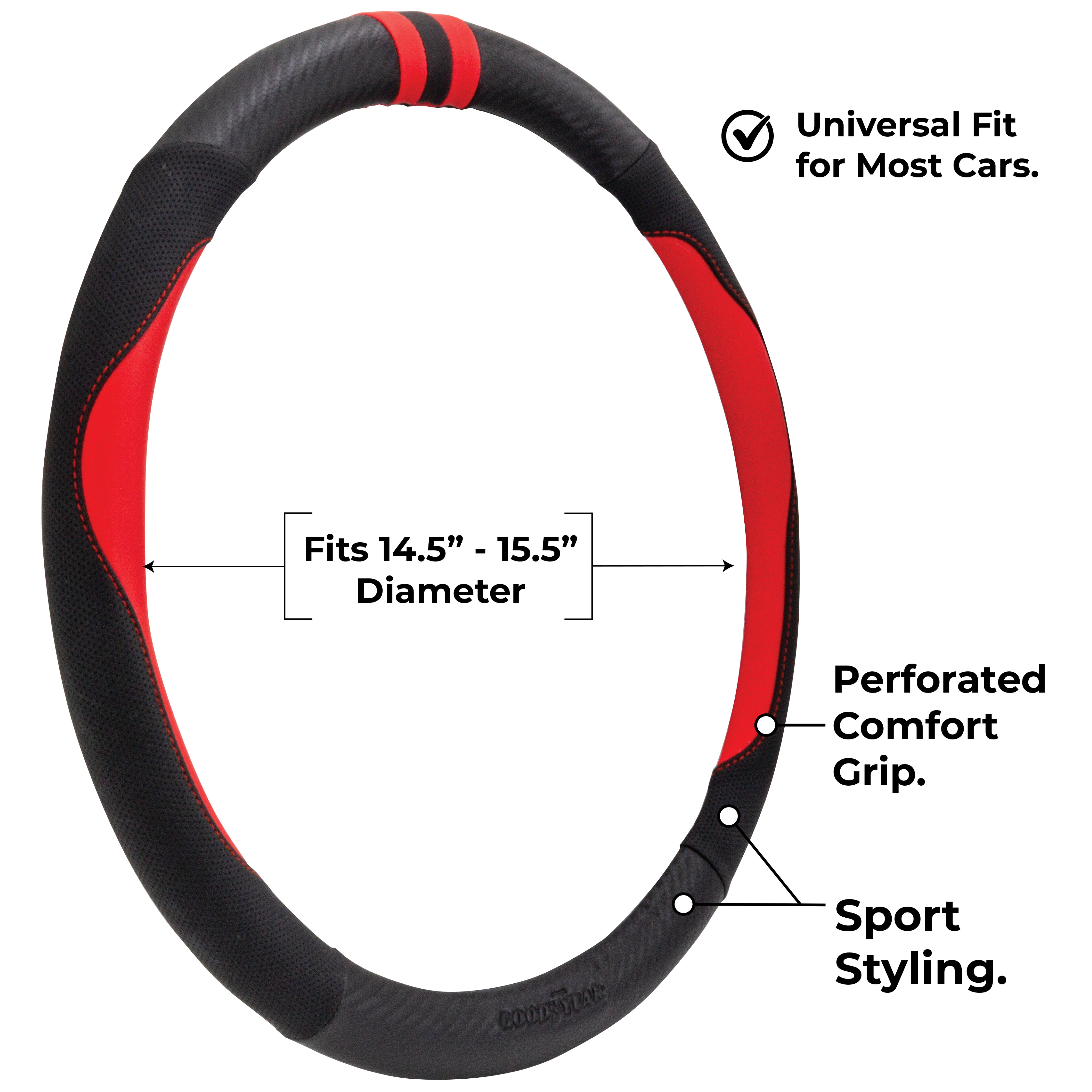
Translating Goodyear's performance-first identity into a Walmart listing for a steering wheel cover — a product that lives at the intersection of utility and style. Starting from a single product image, the challenge was to build a cohesive 7-image set that communicates brand trust, physical feel, and functional value without any briefing document or style guide.
Lifestyle Over Catalog
Every in-context shot was placed inside a premium car interior — reinforcing Goodyear's performance positioning and elevating the product beyond a basic automotive accessory.
Before & After as Anchor
A side-by-side transformation image communicates the product's value in under two seconds — the single strongest conversion tool in the entire set.
Feature-Driven Visual Language
Each slide isolates one benefit — grip texture, size specs, odor-free material, sport styling — turning technical features into visual stories that work at Walmart's scroll speed.
09
Global Brand Brand Intelligence Retail Listing PDP Design
Goodyear
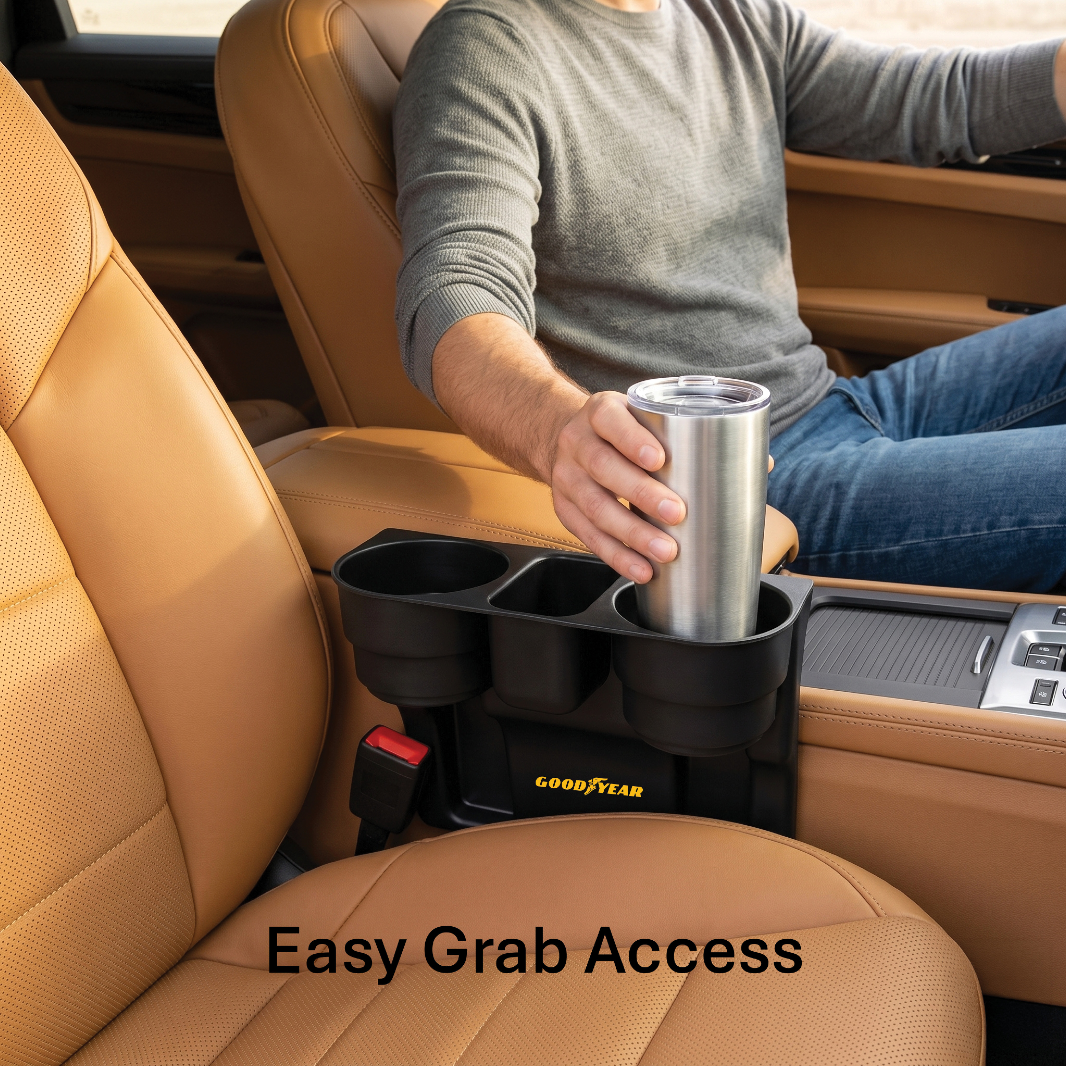
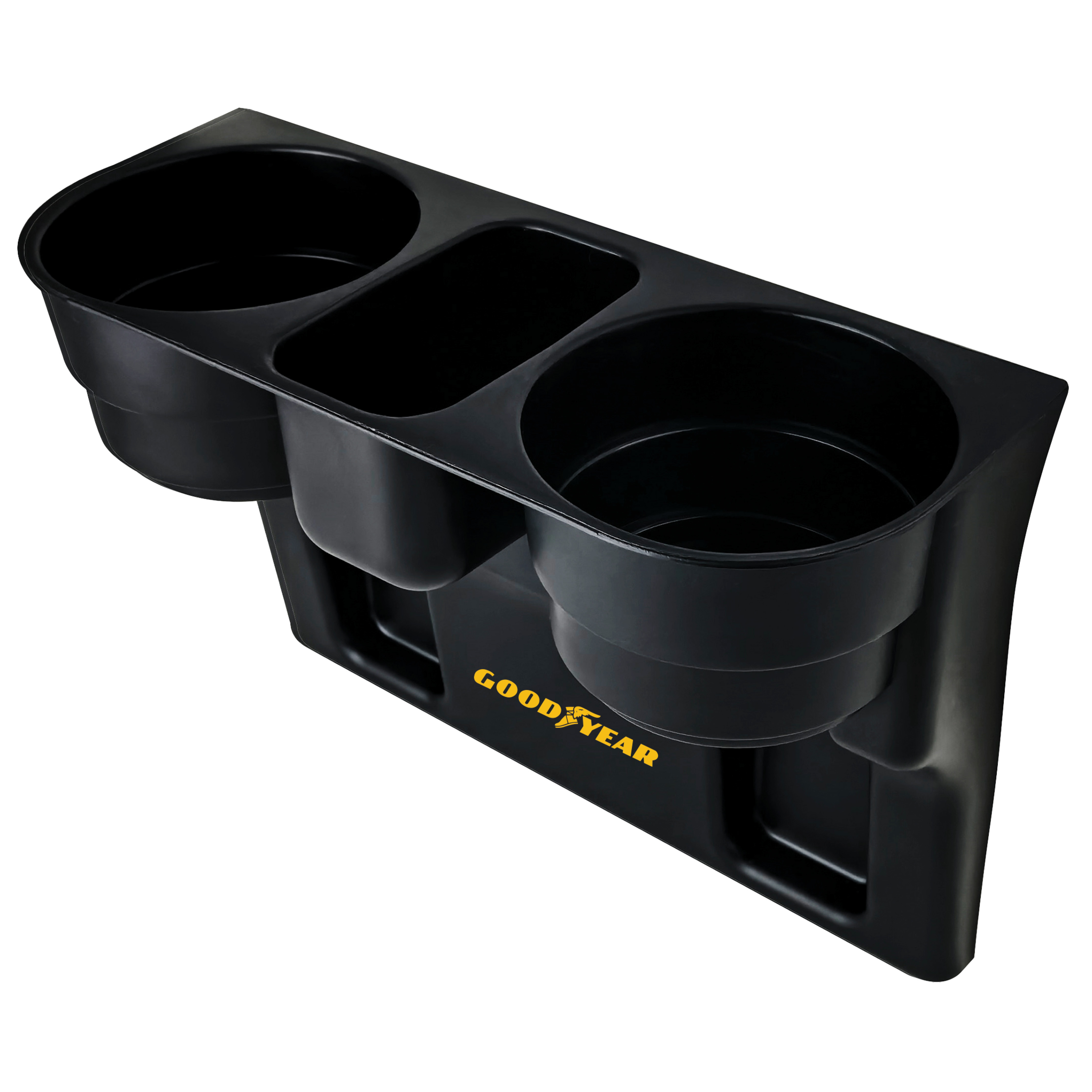
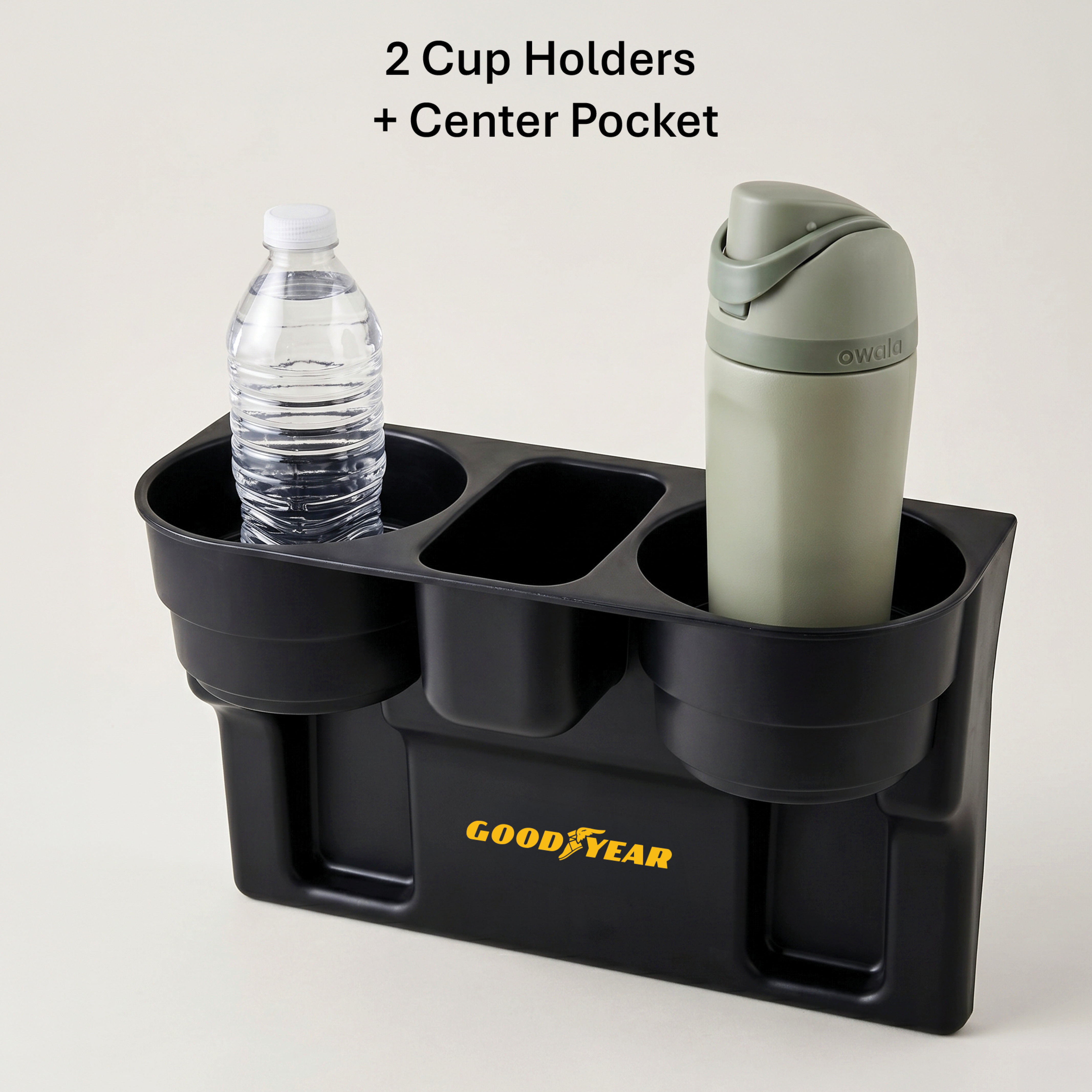
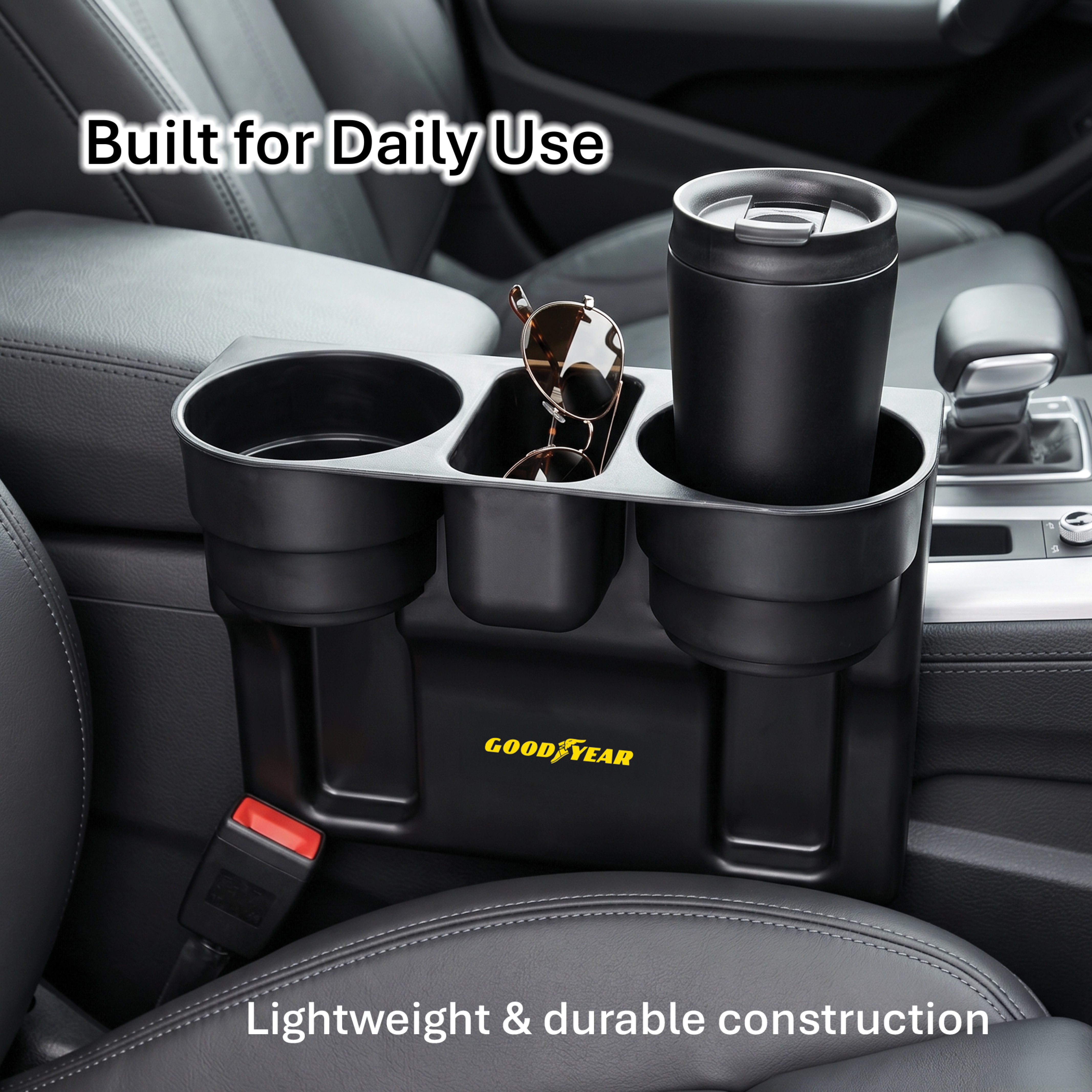
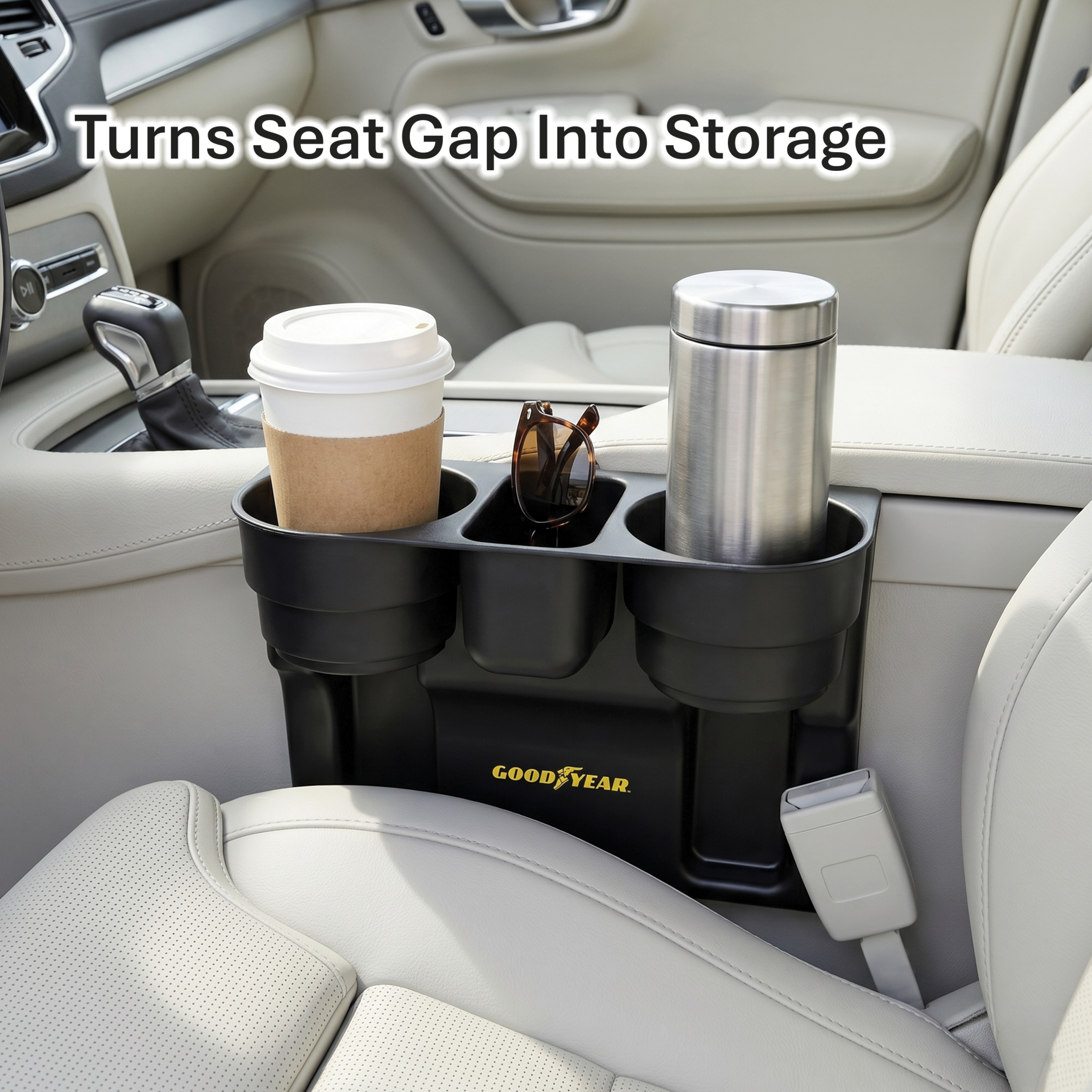
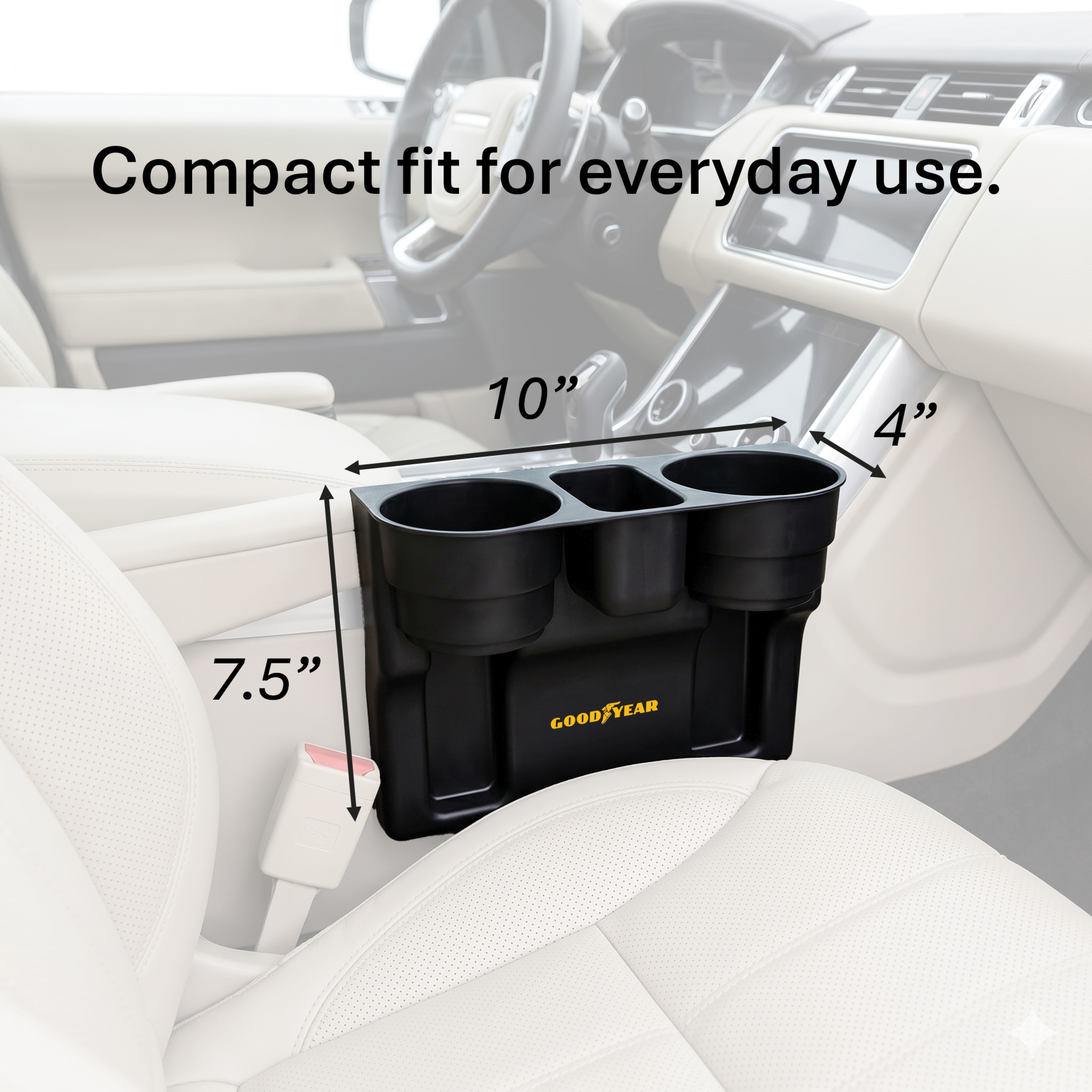
Auto Front Seat Organizer — Full Retail Listing
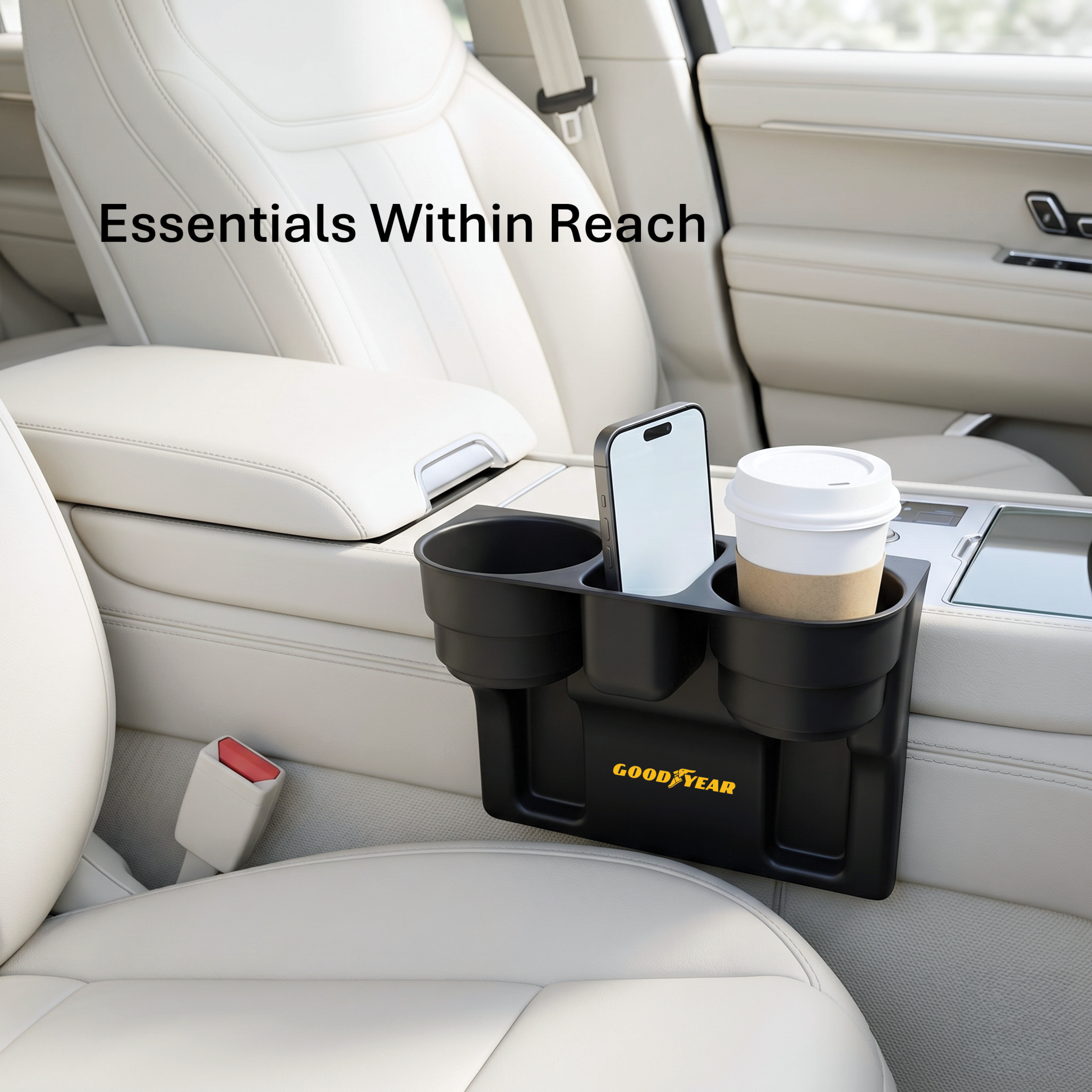
Lifestyle in car
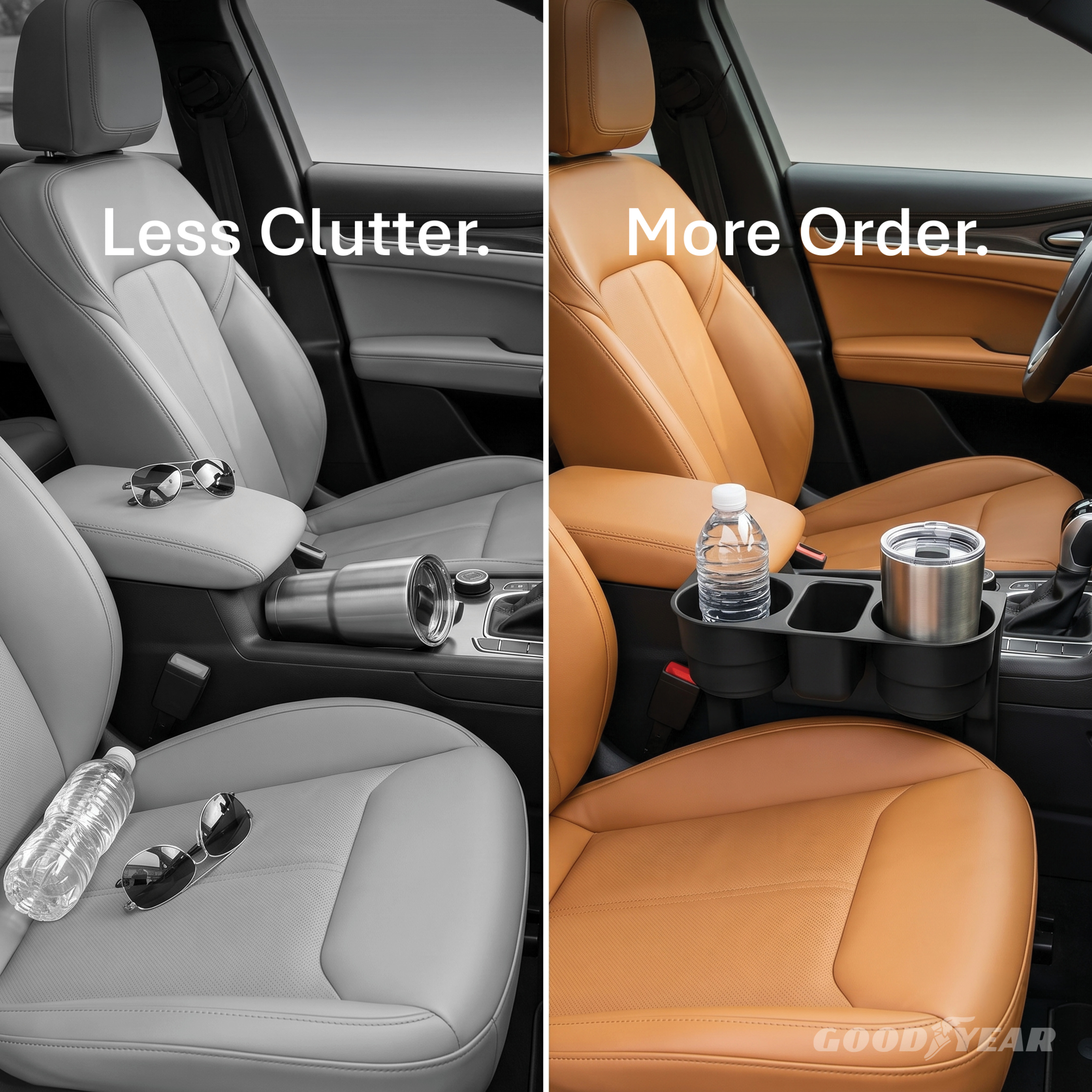
Less Clutter More Order
Easy Grab Access
The Challenge

Building a complete retail listing for a Goodyear car seat organizer — a functional, utilitarian product that needed to feel premium and purposeful without relying on brand heritage alone. Starting from a single product shot, the challenge was constructing a 8-image set that communicates organization, fit, and everyday value to a driver who hasn't seen the product in person.

Contrast Over Catalog
Instead of a standard before/after, the split image — "Less Clutter. More Order." — was framed as a lifestyle statement. Desaturating the problem side and keeping the solution in full color makes the value proposition land in under two seconds.
Premium Interior Context
Every lifestyle shot was placed inside a high-end car interior — tan leather, clean dashboards, natural light. This elevates the product beyond a generic automotive accessory and aligns it with Goodyear's performance brand positioning.
Feature-First Visual Sequence
Each slide isolates one specific benefit — cup capacity, storage depth, seat gap fit, dimensions — creating a logical flow that builds confidence and reduces purchase hesitation across the full listing scroll.
10
Home & Auto Multi-Platform PDP Design Retail Listing Full Production
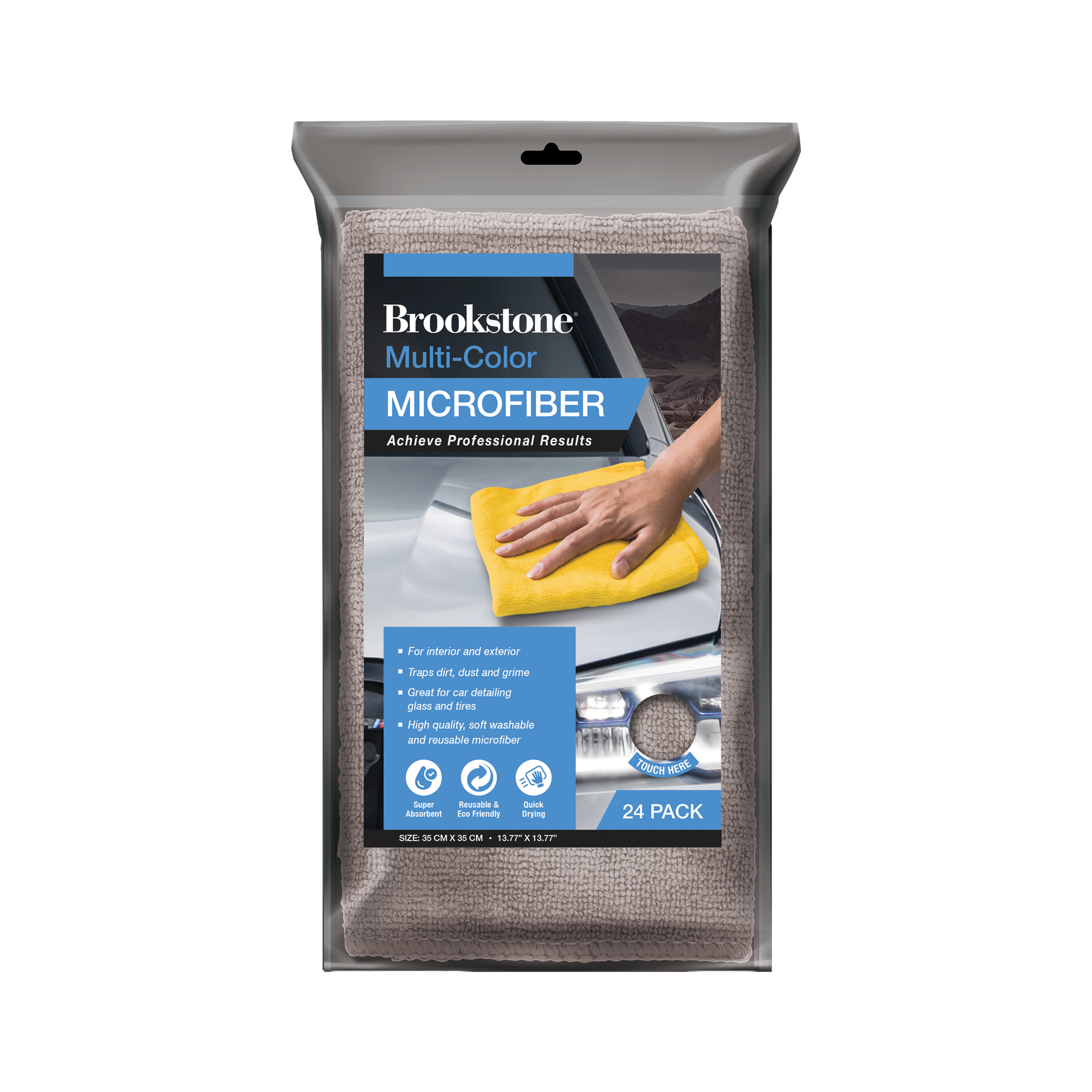
Brookstone
Multi-Color Microfiber Cloth Set — Amazon & Walmart Listing
Hero packaging
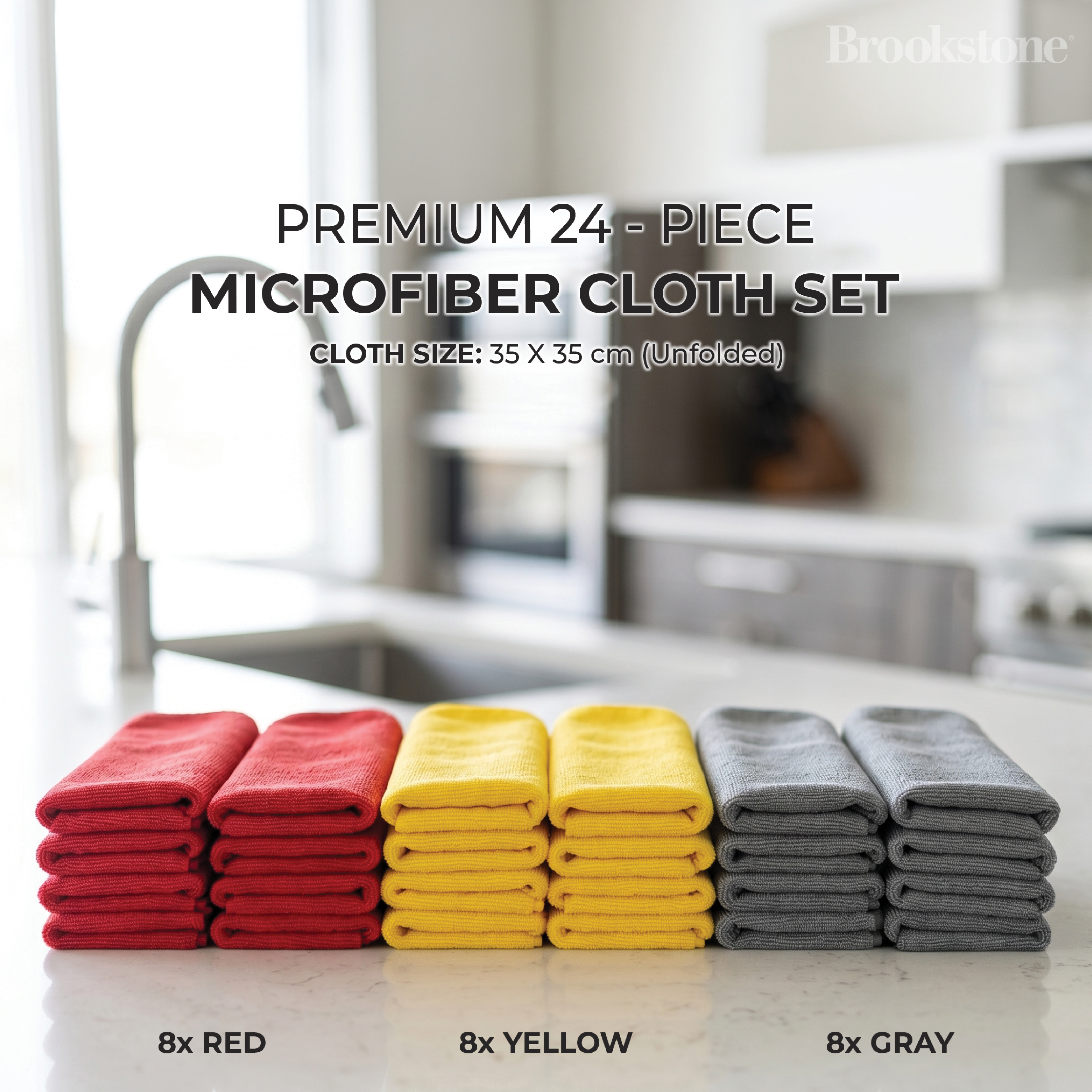
24-piece color set
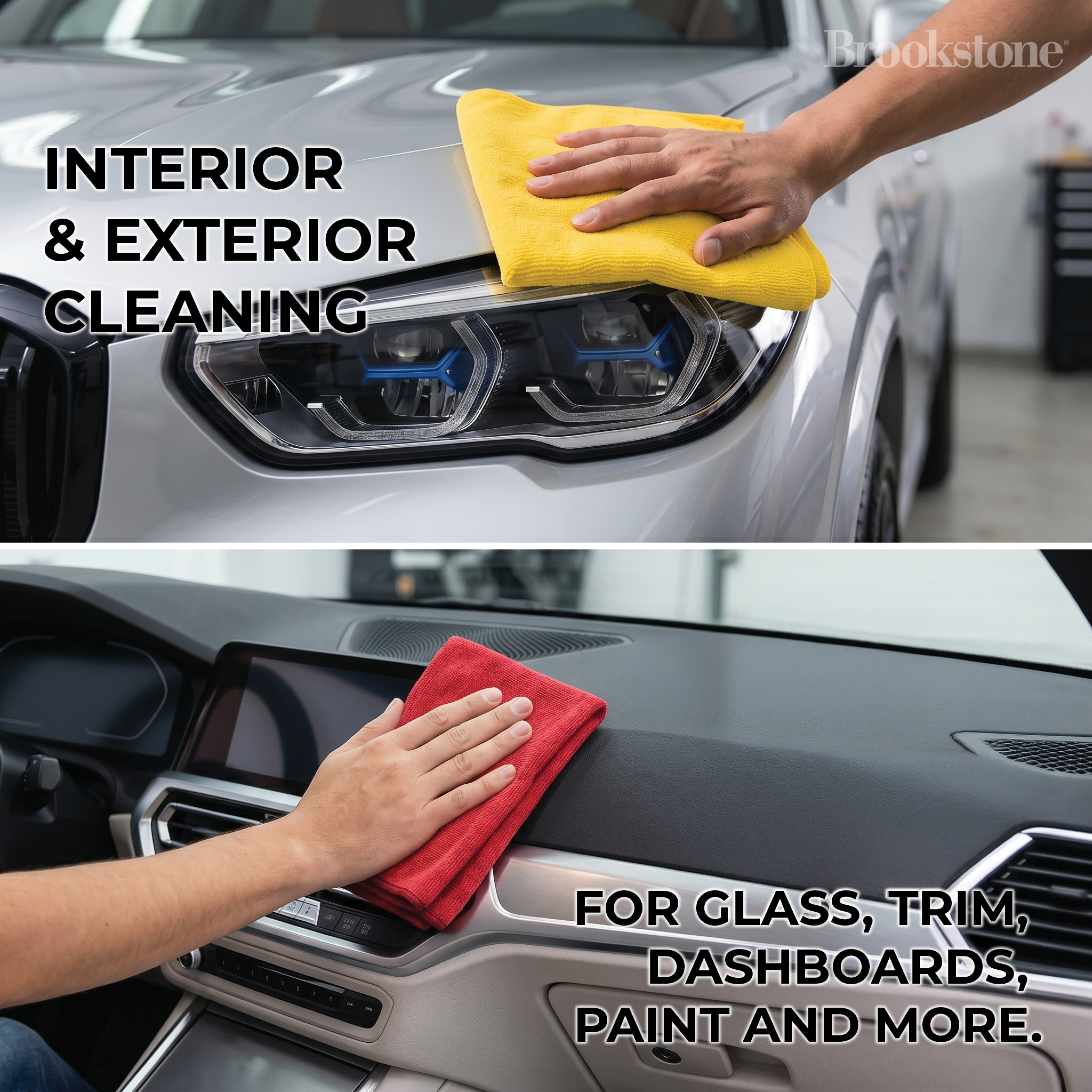
Interior & exterior use
The Challenge

A microfiber cloth is one of the hardest products to sell visually — it's utilitarian, low-excitement, and lives in a category flooded with near-identical listings. The challenge was to build a complete multi-platform listing for Amazon and Walmart that elevates the product beyond commodity through clear quantity value, smart color coding, and lifestyle staging that makes the buyer feel the product's versatility before they add it to cart.

Packaging as Hero
Opening with the retail package — not a loose cloth — communicates the 24-piece value at a glance. The "TOUCH HERE" tactile badge reinforces premium physical quality in a format where customers can't feel the product.
Color as Architecture
Three stacked color groups — red, yellow, gray — turned a quantity claim (8+8+8) into a visual system. Organización visual that communicates value without a single word of copy.
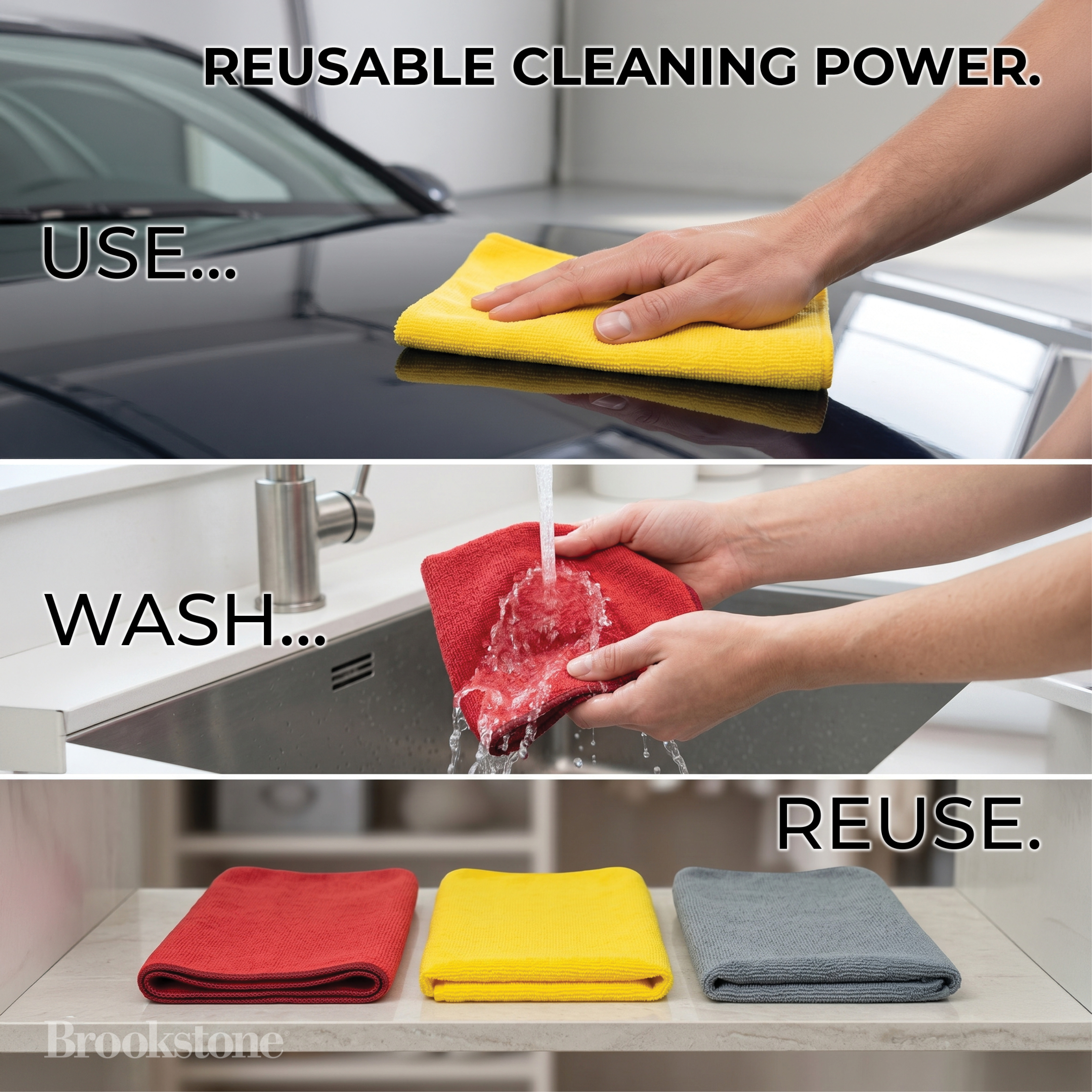
Use-Case Sequencing
Interior cleaning, exterior detailing, glass, trim, dashboards — each surface photographed as a discrete use case. The USE / WASH / REUSE closing frame repositions the product as an investment, not a consumable.
11
Global Brand Multi-Platform PDP Design Lifestyle Photography Full Production
Goodyear




Performance Work Gloves — Amazon & Walmart Listing

Hero gloves

Built to work lifestyle

Touchscreen ready
The Challenge

Work gloves are a brutally competitive category — hundreds of near-identical products separated only by price. Designing for Goodyear meant using the brand's performance authority to justify a premium position while building a complete 8-image set for both Amazon and Walmart that communicates protection, versatility, and job-site confidence — all from a single product shot, without a briefing document or style guide.

Front & Back Hero
Showing both sides of the glove on white — palm and dorsal — in one clean hero image eliminates the buyer's biggest question before they even scroll. Palm padding, grip texture, touchscreen fingertips: all visible in two seconds.
Workshop Staging as Trust Signal

Every lifestyle shot was photographed in a real workshop environment — tools on the pegboard, workbench grit, actual mechanical parts. Authentic staging outperforms a studio shot in a category where the buyer is a hands-on professional who can spot a fake set immediately.
Feature-per-Frame Discipline
Built to Work → Durable Coverage → Padded Palm → Flexible Fit → Touchscreen Ready → Multi-Use → Ready for Any Job. Each slide owns one idea. No feature competes with another, and the sequence builds a complete mental picture of the glove before the buyer reads a single bullet point.